Archive

Tag Archives: national gallery london

On the Railway Platform, Afternoon

Opposite me, on the up platform, a man in blue overalls drinks a can of diet coke and eats a giant Mars bar. There are three fluorescent stripes on each of his trouser legs; a man of equivalent importance to his (substantial) poundage. Is it logical to assume that stripes, placed on clothing in certain positions in certain ways, denote importance?

Yellow and Orange Fluorescent Tabards

The Fluorescent Tabard: the New Cloak of Invisibility.

The number of fluorescent stripes on orange or yellow tabards, on sleeves or trouser legs of workmen/ firemen etc. should tell us their rank. In fact the opposite seems to be true, the yellow tabard is the new cloak of invisibility, and the poor souls you see working at night (repairing roads perhaps) despite entire officer classes of stripes, seem to be at the bottom of any class structure.

Reversal.

Where else does this reversal work? The scruffier the schoolchild, the greater their importance in their peer hierarchy? I once went to a History of Art conference at the incredibly grand Westminster School, next to Westminster Abbey. As I walked through the porters gate, a vast black car deposited the filthiest school boy I have seen for a very long time. In other contexts he would have been of great interest to the social services, yet he was a boy of some importance, greeted by the porter no less, as his chauffeur drove the enormous black conveyance away.

Princes as Beggars?

We are not talking about disguise here, the Shakespearian complexities of the beggar revealed as the prince. All concerned in this reversal know who they are. Neither is it a form and function debate, the dissonance between occupation (function) and formally considered outward appearance (form) is clearly deliberate. Are the abundance of fluorescent stripes merely someone, as it were, using existing cultural signifiers to ‘talk up’ their status.

“Good Morning. This is the Guard speaking, would any passengers requiring the purchasing of tickets for their onward journey this morning please make themselves known to myself as I pass back down through the train this morning”

Uniform Response.

Sometimes we genuinely mistake a person’s status, function, rank through their clothing, Veronese’s ‘The Family of Darius’ plays on this. Although I first came across it as an example of an artist exploiting the power of the colour red, and that perhaps is the clue.

Paolo Veronese: ‘The Family of Darius before Alexander’, 1565-7. oil on canvas, 236 x 475 cm. National Gallery, London

Can one ever take the violent artificial virulence of fluorescent orange or worse, yellow, as indicator of gravitas? If you want power from that end of the colour spectrum, look at the red of the central standing figure who waves his left hand.

Paolo Veronese: ‘The Family of Darius before Alexander’ 1565-7, oil on canvas, 236 x 475 cm. National Gallery, London. Detail: Alexander and Hephaestion?

He is painted in red lake (derived from crushed cochineal beetles) his companion in yellow and orange is painted in orpiment and realgar. Realgar is a relatively rare, and powerfully poisonous, arsenic containing mineral, you can also see it in fellow Venetian, Titian’s, painting of the Bachante’s drapery.

Titian: ‘Bacchus and Ariadne’, 1520-3, oil on canvas, 177 x 191 cm. National Gallery, London

The yellow leg of Veronese’s figure is painted in orpiment, a similar mineral to realgar, This characteristic Venetian use of these two pigments, doesn’t spread to the rest of Europe till later centuries. In the same period the English apparently used realgar to kill rats.

The same system (strong, expensive pigments for important figures) works in the rest of the painting,

Paolo Veronese: ‘The Family of Darius before Alexander’ 1565-7, oil on canvas, 236 x 475 cm. National Gallery, London. Detail: Sisigambis

for example the deep ultramarine blue of Sisigambis the kneeling queen, plumb centre, topped by ermine the fur of rulers. Ultramarine, the most expensive colour, deepest blue, painted in thick sweeping strokes. Unlike, for example, the blue of the lesser princess (daughter) behind her where the ultramarine is far less and the under-painting of azurite (cheaper pigment) more visible. The sky by the way is painted in smalt (a mix of powdered glass and cobalt, much cheaper than the ultramarine pigment made from Lapis Lazuli, a mineral taken all the way from mines in Afghanistan).

So, how does this tell the story?

Alexander, the Macedonian/ Greek had beaten the Persian King Darius III at the Battle of Issus in 330 BC; the clash between West and East we are still familiar with. After the victory, Alexander visited the defeated family. Darius’ mother, Sisigambis, pleads for her life and that of her family, grandson, two granddaughters and Darius’ sister, also his queen. Traditionally they, the girls especially, would have been raped, slaughtered or enslaved. Unfortunately, she chose the wrong man to plead to, directing herself to Hephaestion, Alexander’s close friend and companion, not the man himself.

Who is Who?

This brings us to the central debate about the painting, and one that Veronese himself set up by his manipulation of our ideas about colour: which figure is Alexander and which Hephaestion?

Paolo Veronese: ‘The Family of Darius before Alexander’, 1565-7. oil on canvas, 236 x 475 cm. National Gallery, London

The figure in red with the hand gesture is the most powerful Sisgambis directs herself to him, but he gestures to his companion who is, notice, closer to attributes that represent Alexander, ie the great horse Bucephalus and shield.

Paolo Veronese: ‘The Family of Darius before Alexander’ 1565-7, oil on canvas, 236 x 475 cm. National Gallery, London. Detail: Bucephalus

Opinion is varied on this point, Goethe by the way was insistent that Hephaestion was the figure in the rose cloak, whereas Nicholas Penny in the National Gallery Catalogue to the Sixteenth Century Italian Paintings is insistent that it is the other way round. That gesturing figure wears armour based on antique sculpture and has a page holding up his long red cloak, you can just see the boys head between the two men.

Paolo Veronese: ‘The Family of Darius before Alexander’ 1565-7, oil on canvas, 236 x 475 cm. National Gallery, London. Detail: page boy

Whereas the darker figure wears armour contemporary to the period in which the painting was made. Does this help us? Not much. What gives the clue I think, is the small boy clinging to Sisigambis, he is painted in red, but in the shadow.

Paolo Veronese: ‘The Family of Darius before Alexander’ 1565-7, oil on canvas, 236 x 475 cm. National Gallery, London. Detail: Sisigambis and Grandson?

Traditionally shadows would have been much darker, to create depth. The red boy is described either as a page boy, or more credibly as the younger son of Darius, hence his proximity to the Queen. Veronese uses red to denote a key player in the story, but hides him behind his grandmother who pleads for his life. Now you can either say that Veronese will paint all his kings in red, or that Sisgambis expects all kings to be dressed in red and behaves accordingly. But Alexander, who does things differently, e.g. not mistreating his captives, wears orange and red and stands close to his horse; which is it?

On This Side of the Picture Plane…

Meanwhile, on my train into work, we pass through a small town station. A bearded man stands, confidently on the platform. He wears a red top hat, his suit is lime green and close fitting, his tie matches this virulence, as does a lemon yellow shirt. His shoes though are brown, long red clown shoes would have made the get up and its function clear.  This mismatch is unsettling.

The Three Stripe Fluorescent Trouser

The Paradox of Apparent Movement

Stuck, unable to go anywhere, waiting for a train, I was thinking about our acceptance that a painted image contains movement. Why, when looking at that static image do we: happily predict what will happen next; what has happened before and what, from analysis of that movement, is the mental state, ideological position and historical context of all involved? Do we like looking at paintings because there is a comforting pleasure in knowing, or working out, what will happen next? Or perhaps when looking at a landscape painting, knowing that nothing will happen next, that we are in a comforting world of ‘not going anywhere’?  

“My cousin right, she wants to go to Tenerife to swim with Dolphins”

“Oh, I don’t fancy that, they’re big fish. No, I couldn’t do that. I want to go to Australia”

“What, and swim with Aboriginals?”

The Story in the Object

Viewers in the National Gallery, London, seem more interested in the story of the object, than the story in the object; is that because these stories have been lost? Look, for example at Caravaggio’s ‘Supper at Emmaus’, 1601, the earlier one in the National.

Caravaggio: ‘The Supper at Emmaus’, 1601. 141 x 196 cm, oil on canvas. National Gallery, London

At the centre of a shallow rectangular pictorial space, a young man gestures meaningfully with his right hand and waves his left over a loaf of bread. To his left an older man symmetrically stretches out his arms. Above the young man to his right, another man stands, casting a circular shadow over that younger seated one. Nearest to us, in the left foreground, a man with a hole in the elbow of his jacket pushes his arms down onto the arms of his chair, as if to lift his body upwards.

Good Lord, it’s You!

The original sixteenth century viewers of this painting would have recognised the story, and known that it is about sudden recognition. It is in the bringing together of the gestures: with the immediate story; with the past that led these figures up to this point; with the subsequent future affecting us all, that this painting extends the movement beyond what we immediately see. That bringing together, or conjunction, leads us back to the dusty road en route to Emmaus and the inn where the painted action happens. On that road the older, seated men had met the younger, discussed the recent crucifixion of Christ in Jerusalem, and the disappearance of his body from the tomb and the appearance of angels saying that he was alive. They persuade the, as yet unknown, younger man to eat with them.

“30. And it came to pass, as he sat at meat with them, he took bread, and blessed it, and brake, and gave to them.

31. And their eyes were opened, and they knew him….

35. And they told what things were done in the way, and how he was known of them in the breaking of bread.

36. And as they thus spake, Jesus himself stood in the midst of them, and saith unto them, Peace be unto you”

Luke 24. 30-36.

The Significant Gesture

They (Cleopas and possibly Peter, possibly James) recognize the resurrected leader of their group (Christ) through one of the last gestures that they saw him make (breaking bread at the Last Supper).

Caravaggio: ‘The Supper at Emmaus’, 1601, 141 x 196 cm, oil on canvas. National Gallery, London. Detail: Christ’s gesture.

The actual last gesture, as it were, that they saw him make is reflected in the outstretched arms of the right hand disciple: the crucifixion.

Caravaggio: ‘The Supper at Emmaus’; 1601, 141 x 196 cm, oil on canvas. The National Gallery, London. Detail: Disciple with arms outstretched.

I suppose you could call this conjunction; potentialities. There is a range of those potentialities, the striding movement of walking for example, and don’t these worn, sunburnt and slightly battered figures look like they have done a lot of walking in their lives. Notice by the way the cockleshell on the leather jerkin, the symbol of the pilgrim, the walker. The significant, human movements that pinpoint or focus, key points of the story. Notice also that those gestures scoop in the viewer, draw us into the heart of the story.

“I’m not going nowhere because I literally can’t walk no more than, like, one mile an hour”

“Like, I can’t even do that”

Viewpoint

Viewpoint is always crucial in a painting, where are we the viewer situated by the artist’s construction of the pictorial space? In this case, we are below the head of Christ, at roughly the same level of the two disciples. Although we are not close up to the table, that viewpoint is certainly from someone seated in front of Christ, drawn into his circle. The vigour of the painted gestures demands that the viewer makes equivalent movement this side of the picture plane, in our own recognition of the story and its importance.

I have just remembered, thinking back to earlier posts about what we as viewers bring to our viewing position. A boy once told me that this painting was all about telling lies and fishing:

‘You see that bloke on the right Sir, well he’s telling the others that he caught a fish and it was thiiiiis big (boy stretches out his arms in imitation) and the others Sir, well you can tell they don’t believe him”

Hurry Up and Wait

I wrote part of this waiting for my train, in the ticket area of the station. A rectangular area, parallel to the tracks. At one end: ticket sales, here the endless complexities of ticket types are negotiated. At the other: a newsagent, usually shut. Doors on each long side exactly bisect the space. These doors are automatic, over sensitive sensors open them unexpectedly and violently with an uncontrolled shake at their full extent. The track faces due north, the prevailing wind is westerly. Each time the doors suddenly fling themselves open, the wind charges through as though it is late for the fast train to London Bridge.

On each of the four benches, like points of the compass, are static middle aged men:

  • To the North West, one in brown cords and shoes, green socks and light blue striped shirt, blue jacket and bright orange Apple laptop.

  • To the North East, another, in grey suit, white shirt, pale grey tie, permanently speaking on a black shiny mobile.
  • South East, in a charcoal suit, cream shirt, black bag on lap, reading white A4 documents.
  • And me at South West, all in black with a black A5 notebook.

We are all waiting, our gestures are subdued, our composition is precise, and appropriately measured for the subject.

The Composition of Pictorial Space

Figures in pictorial space are often symmetrically arranged, usually about a central axis, ie placing the viewer directly in front of them. Think of Egg’s Travellers, that I have mentioned before,

Augustus Leopold Egg: ‘The Travelling Companions’, 1862 oil on panel. 65 x 79 cm. Birmingham Museum and Art Gallery

that overt symmetricality has meaning, as does the lack of precise composition in Veronese’s: ‘Christ Healing a Woman with an Issue of Blood’ .

Paolo Veronese: ‘Christ Healing a Woman with an Issue of Blood?’, 1548, oil on canvas 117 x 163 cm National Gallery, London

In Supper at Emmaus the viewing point would seem to be directly in front and significantly below the normal eye level so that the vanitas bowl of fruit on the lip of the table appears to be falling on top of you.

Caravaggio: ‘Supper at Emmaus’; 1601, 141 x 196 cm, oil on canvas. National Gallery, London. Detail: Fruit Bowl.

The light in my waiting room is even and clear as fits the scene, but in Caravaggio’s inn, some three days walk from Jerusalem, the light is stark: bright highlights; pools of meaningful darkness; the shadow/ halo around Christ’s head; the darkness of the tomb from which he has risen.

A well dressed couple pass through from west to east, I just catch the end of their conversation:

 “We’ve got enough for the moment, we’ve got the six nuns in Peterborough”

Unlike the vigorous painted gestures, our bodily movements in the ticket area remain subdued, slow and undemonstrative. We are not going anywhere, no dramatic revelations of redemption here.

“South Eastern Trains would like to apologise for the delay to your service this morning, this is due to the late running of the train”

Het Steen, Friday Afternoon, National Gallery, London

Peter Paul Rubens: ‘A View of Het Steen in the Early Morning’, 1636. Oil on Oak. 131 x 229.cm. National Gallery, London

We expect life behind the picture plane to conform to our expectations of life in front of it. But, after a good long look it is far odder than you might think.

I have been asked how it is possible to stare at the same work of art for such long, long periods – never less than an hour at a time in front of Het Steen, usually longer. Patience of course but more, like meditation, it is a matter of clearing the mind of those expectations/ prejudices/ outstanding thoughts that we bring with us, to find out what is really going on in this parallel world. Today these issues sprang up, leaping about in front of my field of vision, I don’t think I really got rid of them:

  1. It is very misty and wet outside, is that why the distant horizon in this painted world seems clearer today?
  2. How long would it take to walk from the tree trunk in the foreground to Malines and the Cathedral of St Rombout (the tower on the horizon). Difficult to tell how far it is away on foot, 5 miles, 10 miles, closer to 10 maybe? Average walking time is what: 3 miles? Ground is very flat and clear, so perhaps three hours, heavy dew on the ground, but not too waterlogged, under 3 hours then.
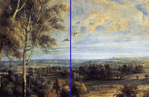
  3. The view we can see is not that from the large windows of the house. This painting and ‘The Landscape with a Rainbow’

    Peter Paul Rubens: ‘Landscape with a Rainbow’, 1636. Oil on Panel. The Wallace Collection, London

    were to be shown in a room on either side of those windows. Although the painted view is a sort of composite, I wonder which room it was painted in. Traditionally, studios are north facing to stop shadows and direct sunlight. Het Steen Manor faces south (we are looking east to the rising sun) it can’t have been made in a fancy room can it? Could Rubens keep a fancy room clean whilst oil painting? Leonardo famously said that a painter could work surrounded by beauty and listening to a fine musician. Leonardo was a careful, almost fastidious man, mostly dressed in lilac according to his inventories. Rubens was a painter of some bravura, and therefore a bit messier? Would he have painted at the back of the house, is this likely? Covered as I am in the white oil paint left behind by a student panicking about a deadline, I have strong feelings about this point.

  4. Going back to the walk idea, there are no fences behind this particular picture plane, no closed off areas. Some grown out hedges, several lines of trees suggest a slight fence hedge behind the milkmaid for example. But none of the post-enclosure English hedgerows and field boundaries, none of ‘this land is mine-ness’, that characterise the English countryside.
  5. One thinks of John Clare, the poet of the English countryside unhinged by the effects of The Enclosure Acts. That period of 18th and 19th century English history when landowners put boundaries across common land; expelling those who once used the land to work and walk. Clare was a great walker, for example in 1841 he walked 80 miles after escaping from his asylum, returning home to look for his first love, Mary Joyce (long dead); he lived on grass and air. As he wrote about her:

“And we will walk the meadow love

And we will walk the grove

And by the winding river love

We’ll walk and talk of love

And by the white thorn bushes love

Just budding into green

Where the shaded fountain rushes love

We’ll steal a kiss unseen”

(For the text of Clare’s diary from his walk see http://dawnpiper.wordpress.com/john-clares-walk-1841/, the John Clare WebLog is very good on his walking as well http://johnclare.blogspot.co.uk/)

 All this sense of rural freedom goes, as you can read in his : ‘Remembrances’

“…Inclosure like a Buonaparte let not a thing remain

It levelled every bush and tree and levelled every hill

And hung the moles for traitors – though the brook is

running still

It runs a naked brook cold and chill”

Or

“These paths are stopt – the rude philistine’s thrall

Is laid upon them and destroyed them all

Each little tyrant with his little sign

Shows where man claims earth glows no more divine

But paths to freedom and to childhood dear

A board sticks up to notice ‘no road here’”

Enclosure in a Gainsborough landscape?

I have always assumed the neat fields behind Gainsborough’s: ‘Mr and Mrs Robert Andrews’ 1750,

Thomas Gainsborough: ‘Mr and Mrs Robert Andrews’, 1750, oil on canvas, 76 x 119 cm. National Gallery, London

are a reference to the economic benefits of the ‘rude philistine’s thrall’, it is certainly set at the beginning of the Enclosure Acts, Clare’s poetry towards the end. Look at the sharp meanness of those two faces and, despite the gun and dog, both look uncomfortable in the countryside that they so clearly own; she won’t have walked far in those shoes. As Clare put it some ninety years later:

“Fence now meets fence in owners’ little bounds

Of field and meadow large as garden grounds

In little parcels little minds to please

With men and flocks imprisoned ill at ease”

To the Painting in Front of Me

So, trying to watch the world of seventeenth century Flanders, these are some of the ideas from the twenty-first century I brought with me. I think walking kept bobbing up like a dog wanting me to throw the ball, partly because I was thinking of a response made to an earlier post by Ann Marquez from Desert Muse publications and her description that “growing up in the southwest I never imagined limited access to land”.

‘The Path Stopt’

And partly because a few days ago, I tried to take a walk through local woods on a path that, though not a formal right of way, has been a customary path used by many for many, many years. It was fenced off without warning or explanation; heart-breaking.
Walking and Rubens

Rubens’ figures don’t look like they walk much, Paris in the later Judgement  perhaps,

Rubens: ‘The Judgement of Paris’, 1632; Oil on canvas, 139 x 174 cm; National Gallery, London

in the earlier version Paris is too much of a classical hero, despite his very pink bottom.

Peter Paul Rubens: ‘The Judgement of Paris’, 1597-9. Oil on Panel. The National Gallery, London

Moses and Eleazer in ‘The Brazen Serpent 1635 – 40’ look like they have covered a few miles.

 Mainly, Rubensian walkers are stock working figures, milkmaids and shepherds, many carts in his rural scenes, as in Het Steen. As Rebecca Solnitt points out in her book about the history of walking: ‘Wanderlust’, nobody walked for pleasure before the Wordsworths.  

Looking slowly at paintings is a process of clearing questions and relaxing and just looking, it takes about twenty minutes usually. Time to really start looking, or to walk away until the next time?

Het Steen, National Gallery, London, Friday Afternoon

Peter Paul Rubens: 'A View of Het Steen in the Early Morning', 1636. Oil on Oak. 131 x 229.cm. National Gallery, London

The young woman in front of the later ‘Judgement of Paris’ is haranguing a large group of fellow Chinese. She has talked for 10 – 15 minutes without drawing breath, a small boy has his hand up; he is ignored. She is wearing cream trousers and a cream jacket zipped right up the neck, she does not look relaxed.

A complete contrast to a colleague I saw this morning, taking a large group of Year Eight students through a range of paintings about rooms and interiors: Dutch and Swedish ending with Rachel Whiteread. It was all about interaction, questioning, and the students lively responses.

How Do We See Art?

Returning to the central theme of all these posts: how do we see art, what do we get from looking at it? The students in front of the slide show had been led by careful pointed questions, what can we see? What might be the relevance of? What does that make you think about? The importance of composition/ light/ context/ new ideas about interiors. But I wondered, were they just showing their skills at a particular game: answering questions (very high) or were they actually engaging with images. Was this the equivalent of twenty questions,  just running around a museum pressing buttons. Their teacher by the way was wearing dressed down art teacher clothing; checked shirt and jeans.

Pictorial Space

I think these posts have established by now, that composition of pictorial space has a great deal to do with how a painting is approached; physically and mentally. But, schooled in iconographic analysis or not, you also bring assumptions about behaviour and meaning on the far side of the picture plane. For example, I remember a small boy’s response to Picasso’s ‘Woman Weeping’

Picasso: 'Woman Weeping', 1937, 60 x 49 cm, oil on canvas. Tate Gallery

‘I know she’s really upset’

‘Why do you know that Darren, is it to do with the shapes clashing together in the painting?’

‘No, it’s because she’s eating pizza, my mum always gives me pizza when I’m upset’

So, what do we bring to Het Steen? A general assumption about the reassuring properties of paintings about nature? A deep calm, from the gently lifting ground plane, the soft, close tonal range, the warmth of colours in the foreground, the bucolic carter and companion, the wealthy but not obtrusive house? Soft shapes rising sun: optimistic; reassuring; comforting. These are the sorts of terms that come to mind. It might be autumn, i.e. towards the end of a cycle, but time moves very slowly here.

Rubens: 'The Judgement of Paris', 1632; Oil on canvas, 139 x 174 cm; National Gallery, London

Large numbers of Spaniards, smelling rather strongly of soap, not unpleasant but certainly insistent, are collapsed around the bench. It is a comfortable place to rest, they are exhausted, time this side of the picture plane is catching up with them. At the other end of the bench, a man is slowly making an extremely painstaking tonal drawing of the later Judgement; hours of evident labour. He is drawing from left to right and the proportions are gently getting away from him; the figures are beginning to elongate and lose their Rubensian plumpness as the drawing becomes widescreen.

The Spanish, distressed brown leather, sports gear and strange white tubular headgear rather like socks, do not look at the paintings. Later a middle aged English couple, beige trousers, grey anoraks, argue in a low monotone, carefully looking at an image, true; but it is a tube map. Most of the visitors, few are actually viewers, seem to regard being here as a form of labour, measured in miles walked, the occasional interesting painting is a bonus.

The ‘Art Study’ Problem

Perhaps this is behaviour learnt early. By and large students coming into an art room see making art as a subdivision of leisure activities; ‘Art’ is not real work etc. Whereas looking at art made by others is always more of a chore, any art teacher who has tackled the ‘art study’ will confirm this. I have written many books for teachers trying to overcome this reluctance, but never quite worked out why it is there; surely pictorial space is fascinating, isn’t it?

But What Shall I Wear?

Maybe it is to do with clothing, to make art in an art room you put on an overall, a paint spattered ‘cloak of creativity’ as it were. To study the art work made by others you are still in the clothes you wear for other activities, learning Maths for schoolchildren, travelling seems to be the main theme here in the National Gallery. I don’t mean that you should stand in front of Het Steen wearing seventeenth century muddy peasant linen bowing to the Lord of the Manor, but the awkward mismatch between formality and casual tourism is noticeable. At the Damien Hirst exhibition at Tate Modern, that I saw earlier (highly recommended by the way, very well put together indeed) there was none of that awkwardness; art and viewers seemed to be well matched. So perhaps it does help to dress accordingly, I’m off to order my rough smock now.

Peter Paul Rubens: 'A View of Het Steen in the Early Morning', 1636. Oil on Oak. 131 x 229.cm. National Gallery, London

Friday Afternoon, National Gallery, London

Sitting in front of this painting, can we recognise a sense of freedom, a release from working to commission? This is, or so we are told in critiques of late Rubens’ landscapes, a painting made entirely for pleasure. It is certainly not one of Rubens’ machines, no muscular quantities of flesh and evident classical narrative.

“Man, why’s there so many dogs in all these paintings?”

“I don’t know, maybe the Brits liked dogs”

“Look there’s one with that man with the gun”

“And see in that one over there, the one with all the fat women, the dog under the tree, and there’s an ostrich!”

“Man, that’s not an ostrich”

“What’s it then?”

“I don’t know, but it’s not an ostrich”

“Maybe that dog will eat it”

“Maybe, then we won’t have to know what it’s called”

The panel is made from many odd sections (twenty apparently), some of the horizontal joins are increasingly obvious. Earlier explanations believed this unorthodoxy showed Rubens adding new parts to the painting as ideas occurred; a genuine development not an allotted task. Recent research (e.g. Christopher Brown: ‘Making and Meaning/ Rubens’ Landscapes’. National Gallery Publications. 1996)  thinks this unlikely. It would be difficult if not impossible to add, prime and work in sections of oil painting, the already worked paint would be disturbed at the very least. Adding sections of panel is not like, for example, Degas sticking on extra bits of paper to his drawings as he expanded an idea.

Edgar Degas: 'Woman Drying Herself', 1880's. pastel on several pieces of paper. 104 x 98 cm. National Gallery, London

The reason for all the small sections then? Rubens was paying for it himself, the artist went for the cheapest option, something knocked up from oddments in the panel makers shop: lots of bits.

But, to be honest, after looking for so long at this large painting in such a public place, I still think it is a public painting, made for this sort of reception. You could say that the strong brown washes (the Burnt Sienna like colour, probably Cassel Earth) over white lead underpaint in the foreground have the effect of lighting the trunk and fallen branches from underneath; like footlights on a stage.

Peter Paul Rubens: 'A View of Het Steen in the Early Morning', 1636. Oil on Oak. 131 x 229.cm. National Gallery, London. Detail: The Foreground

I’m sure this has more to do with paint ageing, than a deliberate attempt to reinforce the artificiality of the painted world, far too Post-Modernist. Nonetheless, the fact that one could hold such a notion about the work, emphasises that it was an image made for public consumption.

Was there any other type in this period?  Van der Capelle (looked at in the last post), is often described as a ‘Sunday Painter’ in that, as a wealthy man (the family firm made money in the dye trade: carmine) he did not need to sell his work. Unlike for example Rubens, and like for example, Cezanne supported by his father’s money.

The Ground Plane

Van der Capelle’s paintings look very similar, but I hope my digressions on the ground plane recently showed that something else going on, some wish to follow a line of enquiry. There is none of that same sense of personal investigation about Het Steen, personal display perhaps but not personal discovery. Rubens is not finding anything that he had not known before, unlike Cezanne or possibly van der Capelle.

Look at the ground plane in Het Steen, unlike the van Der Capelle,

Jan van de Cappelle: ‘A River Scene with a Large Ferry and Numerous Dutch Vessels at Anchor’, 1665. Oil on canvas. 122 x 154.5 cm. National Gallery, London.

Rubens ground plane is entirely and deliberately solid, and for a reason. This is land that Rubens would like to us to believe generations of Rubens have traversed; there is certainly an ancient hill fort aspect to our viewpoint. It is also land, Rubens would like us to believe, generations of Rubens will traverse after him; in fact it was sold not long after his death.

“Eurgh, my feet hurt”

“We should really report in”

“What time is the meet?”

“Now”

“Moving on then?”

Timelessness and Pictorial Space

Another question: How does an artist go about creating this sense of timelessness in a scene which, through the contemporary dress of the carter and companion and hunter, is clearly set in 1636?

Answer: the deep pictorial space and elevated viewing point help a great deal. Think of a different painting, Rubens: ‘Samson and Delilah’, which you can just see from the bench in front of Het Steen.

Peter Paul Rubens: 'Samson and Delilah', about 1609, Oil on Oak, 185 x 205 cm. National Gallery, London

It is made by the way, from six very carefully jointed and prepared oak panels, with the grain running perfectly parallel in all of them. Although Samson is a timeless story and the some of the clothes are vaguely timeless, the animal skin notwithstanding, it is set in a claustrophobic now. The long past and future are suitably indicated, but not really part of the show. The contemporary armour helps, but that ‘nowness’ is set, because there are no depths for the eye to travel to, therefore no indicated depths of time for us to wander about in.

The action in Het Steen is in the immediate fore and near mid-ground, the rest of the view though, is equally clearly painted, and clear for us to potter across. It is not though,  the mere scene setting landscape you can see on the flanking Judgements of Paris.

A young man pushes an older man (father?) in a rather splendid wheelchair (all wicker back and cane edged wheels) to position him centrally in front of the painting.

“A view of Het-Stern, whatever a hetstern is”

The older man points with his stick at the horizontal crack running between cart wheel and trunk. They wonder between them what could have caused this. The younger man points out the hunter, the older points to the fallen tree and says:

“I suppose it looked like those once” waving at the oak and birches in the mid ground.

“I suppose so”

The younger man wheels the chair away, he has Rebel Rock Radio embroidered on the back of his shirt, and big head phones around his neck.

This morning I saw some drawings by Robert Bevan (The Camden Town artist better known for his small painting of horses and horse markets) made during time spent in Pont-Aven.

Robert Bevan: 'Poplars by the Road, Brittany',early 1890's, charcoal on paper, 33 x 40 cm.

Heavily influenced by Gauguin, these drawings of trees had enormous energy and strength, not dissimilar now I come to look at them, to the lively forms of the trees the old man has been indicating with his stick. The different areas of sunlight and the curving masses of the painted leaves are full of movement and, well, youth really.

Peter Paul Rubens: 'A View of Het Steen in the Early Morning', 1636. Oil on Oak. 131 x 229.cm. National Gallery, London. Detail The Trees

On the other side of the bench, a young man is drawing in his sketchbook, not the usual insipid copying, but strong lines of figures, thick and black and energetic. So different for example to the art student I saw recently, laboriously copying the biro lines made by Boetti’s assistants, and getting them wrong.

Alighiero Boetti: 'Al Mondo Il Mondo', 1972-3. Biro on Paper, 159 x 164 cm. Archivio Alighiero Boetti.

In the Boetti, the biro lines are entirely vertical, in hers they were both horizontal and vertical. Boetti’s ‘Mettare Al Mondo Il Mondo’ series are strong, thought provoking images, a record of the labour involved in making art, hers were not.

The young man behind me continues to draw, I realise that he is drawing people as they walk past, reflecting their vigour in this room (Room 29) of vigorous painted figures. The focus of his drawing is moving round the bench and will get to me soon; time to go.

On the Platform

An empty station, Friday afternoon. I am on the platform alone. A man walks purposefully down the long empty space, it is hot, the sun very bright. He stops less than one pace in front of me. He is middle aged and red faced with a shiny suitcase on wheels, resting over the handle is a vividly crimson, highly decorated Chinese silk suit. He does not acknowledge me, although I could probably breathe down his neck if I wanted to, I do not, so I don’t.

Art about Waiting

Paintings are busy spaces, and the people depicted are busier still. They are always doing something, about to do something, having something done to them.

Conversely, travelling on public transport is all about waiting, long periods not going anywhere, not having anything done to you etc. There are few works of art that fit this state.

A Large Ferry

There is a painting in the National Gallery, London that shows stasis: Jan van der Capelle’s: ‘A River Scene with a Large Ferry and Numerous Dutch Vessels at Anchor’, 1665.

Jan van de Cappelle: ‘A River Scene with a Large Ferry and Numerous Dutch Vessels at Anchor’, 1665. Oil on canvas. 122 x 154.5 cm. National Gallery, London.

It is calm, still, waiting for the tide, or a wind; the ferry by the way is the boat in front, lying diagonally. Apart from the gentle tonality, I have always been fascinated by van der Capelle’s treatment of the ground plane.

“This is the guard speaking with a message for the customer who just got on with a large plain (plane?) cross; you left half of it behind on the platform. I’ve got it here with me now. I’m in the fourth carriage from the front waiting for you”

Albertian Space

Leon Battista Alberti: ‘De Pictura and Elementa’ 1518, from 1435

Traditionally in Albertian space, the ground plane, the Renaissance pavement, is an opaque, unyielding surface, where figures can stand, buildings can be constructed with no fear of falling through that solid ground. Even in marine paintings, the sea is usually fairly solid and boats sit/ float on top of it like a ruffled carpet on a hard floor. The power of a painted storm is the obvious departure from the comforting horizontal format.

For Albertian space to be convincing, we must feel we can traverse it, usually on foot. In this van der Capelle image the ‘pavement’, the skin of the world is the thickness and transparency of a soap bubble; we would fall through. But fall through to where? The reflected world is equally real, as though, in fact, it is us that is upside down and the reflection is reality. The boundaries between one world and the next are confused. In a very calm world there is unease. To some extent this is the familiar artist game with mirrors, playing with spaces within pictorial spaces (think of The Arnolfini portrait, or Manet’s ‘Bar at the Folies Bergeres). These mirror reflections are in planes parallel to the picture plane, parallel to us looking at them. The game relates to the role of pictorial space in the first place; the function of illusion. Can we say the same with a horizontal plane?

Outside the British Car Auctions, in front of an enormous queue of waiting cars, two young men are playing football with a very white ping pong ball.

The Reflective Ground Plane

To get closer to what is happening in ‘Large Ferry’ try comparing it with another familiar image of reflections in calm water, Poussin’s ‘Landscape with a Man Killed by a Snake’,

Poussin: 'Landscape with a Man Killed by a Snake', 1648. oil on canvas. 118 x 198 cm. National Gallery, London

look at the lake in the mid ground, the reflections of the buildings do not, surprisingly perhaps, destroy the flatness of the surface, the watery ground plane still happily continues on its journey to the infinite horizon. Or, any of Turner’s reflections in calm waters:

J M W Turner: 'The Fighting Temeraire Tugged to her Last Berth to be Broken Up', 1839. oil on canvas. 91 x 122 cm. National Gallery, London

‘The Fighting Temeraire’, or

J M W Turner: 'Norham Castle Sunrise', 1845. oil on canvas, 90 x 121 cm. Tate Britain.

‘Norham Castle Sunrise’, you could traverse these flat, reflective ground planes without once thinking of falling through. Their function is to create space, to reflect the sky, to promote the narrative; but they are always an unyielding surface. Depth in these paintings goes horizontally, into the space not, as it were, down through it, as we can see in ‘Large Ferry’. Down into another world? Where does that other world lead to, do they do things differently there? This is the familiar trope from children’s fiction: the land behind the wardrobe; the rabbit hole; the looking glass. As Auden wrote in ‘As I walked out one evening’

‘The glacier knocks in the cupboard,

The desert sighs in the bed,

And the crack in the tea-cup opens

A lane to the land of the dead’


The Viewing Experience

Maybe this sense of unease is why this room of unassuming Dutch landscape paintings is always empty. Or, it might reflect my thesis that our behaviour this side of the picture plane is, to some extent, governed by the organisation of the space on the far side of the picture plane. This painting is hung in one of the quietest and calmest areas of the National Gallery, I have rarely seen anyone in this room, the few viewers rarely stay for more than a minute or two. Numberless hordes pass nearby, yet, like this painting, all in Room Twenty Two is still: waiting.

Morning Train

As we pull into a station two large herring gulls are slowly tearing apart a McDonalds bag, the train leaves and the birds walk with a proprietorial air down the platform.

In the seat across the aisle a youngish woman makes noises, reminiscent of a dog about to be sick. She (the youngish woman) has a transparent plastic cup and a can of Red Bull in front of her. From a carrier bag she opens a rectangular golden cardboard box and takes out a bottle of brandy. She tops up the cup and places a ham roll beside it. Her hair is red, as is her phone and all of her accessories – earrings, bracelets, flashes on trainers etc. It is 7.30 on a Saturday morning. As the train pulls away from the station she rushes towards the toilets.

“Of course, I won’t buy a new one, a perfectly ordinary biro, Why should I?”

“In the old days…”

“Of course, In the old days you could repair things, but now, I don’t see that I should.”

“In the old days…”

“Of course, in the old days, you would have signed it out wouldn’t you?”

“It would have lasted you for ever”

“Of course, you’d have looked after a thing like that, wouldn’t you?”

Both together: “in the old days…”

At the coffee shop

A well-dressed couple order extra-large and complex arrangements of what is really, sweetened milk with added cream, caramel, chocolate and finally coffee flavourings. They add a thick pink creamy looking drink each, and a couple of pain au raisins to their order. It takes them a while to organise carrying out this feast as they are both carrying large sporting bags.

“Ignorant of misfortune/ Living without worry”

Witnessing these searches for gratification makes me think of paintings of Silenus. There are different approaches to this god, Titian’s ‘Bacchus and Ariadne’,

Titian: 'Bacchus and Ariadne', 1520-3, oil on canvas, 177 x 191 cm. National Gallery, London

and Van Dyck/ Rubens’ Studio’s ‘Drunken Silenus Supported by Satyrs’,

Attributed to Anthony van Dyck/ Studio of Rubens: 'Drunken Silenus supported by Satyrs'. 1620. Oil on canvas. 134 x 197 cm. National Gallery, London.

(both in the National Gallery, London) show the usual iconography: the hugely fat figure; the surrounding Bachante; riding on a donkey in the Titian. This is the Falstaffian Lord of the Revels, clearly, but happily showing the effects of that indulgence. The teacher and companion of Bacchus/ Dionysius, the god of wine and good times; someone I’ve always felt close to. The Van Dyck figure, in particular, seems a joyful image, the brushstrokes, the palette, the smiling red face, the white hair, everybody’s favourite uncle, even if he is blind drunk and cannot walk.

Whereas the darker delineation around the stumbling Silenus in Rubens painting,

Peter Paul Rubens: 'The Drunken Silenus'. 1618. oil on canvas, 212 x 213 cm. Alte Pinakothek, Munich, Germany.

although delicately held up by the pair on the left, is an altogether different and lonely character. To add to this theme, the woman (the face anyway) on the lower left looks surprisingly like the young person on the train. Rubens’ driven, but falling demi god, is closer to the Greek mythology later revisited by Nietzsche (The Birth of Tragedy). The melancholic, pessimistic and wise Silenus pursued by King Midas. For example when the golden king asked what is best thing for man, Silenus replies:

‘you, seed of an evil genius and precarious offspring of hard fortune, whose life is but for a day, why do you compel me to tell you those things of which it is better you should remain ignorant? For he lives with the least worry who knows not his misfortune; but for humans, the best for them is not to be born at all, not to partake of nature’s excellence; not to be is best, for both sexes. This should our choice, if choice we have; and the next to this is, when we are born, to die as soon as we can.’

( from Aristotle: ‘Eudemus’)

 Afternoon Train.

 Man to my right eating Salt and Vinegar Monster Munch, drinking Carling Black Label, bellowing into his mobile about borrowing requirements and bank lending rates. Behind, a baby screams. In front a woman eats a very ripe banana from a yellow storage box, it is shaped like an ideal banana. Two seats down, earnest young Asian men are talking about mathematical formulae and what happens when you substitute P for X – I think. Schoolchildren are everywhere, talking about ‘Games’ and teachers and work not done, and ‘then my dad did this’ and ‘my mum did that’. And ‘she said’ and ‘I was like’ and ‘I texted her’ and on and on in a continuous stream of high-pitched jollity.

It is a relatively new train, the announcements are up as loud as they will go, the sibilance could take off the top of your head and fill it full of strong smelling, potato based, snack opportunities.

“Look, look, look what I’ve bought”

“What?”

“I got ten sets of eyelashes, all sorts”

“Like, wow”

We all partake of nature’s excellence, each of us be-ing in our own particular way.

Peter Paul Rubens: 'A View of Het Steen in the Early Morning', 1636. Oil on Oak.131 x 229.cm. National Gallery, London

Late night Friday opening at the National Gallery, on the bench in front of Het Steen.

The way pictorial space is organised, the route through the painting that the viewer walks, conceptually as it were, creates our reaction as much as the iconography and the figures. The rectangular surface of this painting appears (almost) to divide into two equal squares.

 The dimensions are 131.2 x 229.2 cm, so in fact each ‘square’ is 131.2 x 114.6. Nonetheless, there is a possible vertical axis, at the central join of the two squares. It goes up between the lines of the silver birch trunks and bisects the two birds, just touches the right hand branches of the of the silver birch on the raised circular area. Each ‘square could be a complete painting in itself, one contains pure landscape, the other contains the house etc.

It seems to be Spanish visitor night in the Gallery, lots of leather handbags and jackets, large family groups with large shopping bags labeled with large names of west ends shops. The Spanish woman behind me has, at last, finished her phone call. Mostly it consisted of ‘Si, Si, Si’ in a manner reminiscent of Sybil Falwty’s ‘Oh I know, I know, I know’

Peter Paul Rubens: 'A View of Het Steen in the Early Morning', 1636. Oil on Oak.131 x 229.cm. National Gallery, London. Detail Horizontal Axis

A horizontal line of light and shade runs across the painting, approximately half way up; although none of these putative lines are exact. This doesn’t just apply to the surface, but divides the structure of the space into quarters

Peter Paul Rubens: 'A View of Het Steen in the Early Morning', 1636. Oil on Oak.131 x 229.cm. National Gallery, London. Detail Numbered Quarters

A contains all the figures

B contains the house

C contains the sky and mid and background

D contains foreground  and the milkmaid with cows and the oversized ducks.

Not much else is organised around these axes. You might for example expect the tower on the horizon, (the Cathedral of St Rombout in Malines) to mark the point where the vertical axis touches the horizon.

Peter Paul Rubens: 'A View of Het Steen in the Early Morning', 1636. Oil on Oak.131 x 229.cm. National Gallery, London. Horizon Detail

Or that the tower would be balanced by something on the left, equidistant to the vertical axis; but it isn’t. You could say that the vague branch of the of the silver birch dropping down at about 45 degrees, just touching the horizon, is that balance but I don’t think so, do you? You could say that the orthogonal made by the right hand ditch, just below the milkmaid and cows, will join the horizon where it is bisected by the possible vertical axis.

 As, by the way, does the almost exactly symmetrical orthogonal line made by the front of the house. This again starts from the upright side of the canvas at the same point as it’s symmetrical twin. It cuts the horizon at the same point, where the vertical axis and the orthogonals meet; just about.

A young Spanish couple next to me on the bench are trying to organise English terms,

‘With you…With me…You say I go with you…You come with me…We go on this tour”.

There is much hesitant repetition. Each time they get a phrase right, they kiss. An improvement on my own French language education with Monsieur Hervé. If we declined wrongly he would hit us, rhythmically in time with the right stresses as he repeated the correct form. I can still spell ‘old’ in French as a result, and it still hurts.

In ‘The Science of Art’, Martin Kemp points out that Rubens knew his perspective systems well, although he didn’t use them in an obvious manner. With a bit of effort you could say that underneath this bucolic autumnal dishevelment are some careful pictorial structures.

Peter Paul Rubens: 'A View of Het Steen in the Early Morning', 1636. Oil on Oak.131 x 229.cm. National Gallery, London. Detail Orthogonals 2

Even more debatable, look at the equilateral triangle made by the fallen trunk, you could say that the dominant lines are parallel with the orthogonals of the ditch and house. Above, as you travel up the vertical axis, is another meeting of orthogonals made from the lower of the ditches and a line formed by the angles of the horses hooves and cart wheels. I.e. a herringbone pictorial construction, that system of depth projection that preceded linear perspective. But in this case, unlike for example the Veronese I was looking at in an earlier post, I think this interpretation would be over-reading the visual evidence.

We can say is that the underlying structure creates a calmness and a logic to the pictorial space, which could otherwise be over-ridden by the figures in the bottom left quarter.

At this point a Spanish couple stand in front of the painting, one behind the other and both exactly on the vertical axis. He is very tall, his face very close to the picture surface. The top of his bright, bald spot, haloed by dark hair just touches the horizon. She is much shorter, her head directly below his, so that where his thinning hair stops hers starts. She is wearing a large brown leather coat that obscures their bodies and she is perfectly positioned so that his legs are obscured also. All I can see is the back of two heads in exact vertical alignment. His head is shining like an extra sun, placed where a less successful painter than Rubens might have positioned a painted version, centre stage.

By now all the other Spaniards seem to have gone, to shops and bars and restaurants. Behind me, a couple have been having a quiet and intense discussion for some time. Something about it is increasingly unnerving, and I can’t work out why. Then I recognise the language, they are speaking in Danish. After two series of  The Killing, I associate that sound, those characteristic stresses and language forms with fear, anxiety and rain. All the suns in the painted world in front of me cannot dissolve that association; time to go.

Peter Paul Rubens: 'A View of Het Steen in the Early Morning', 1636. Oil on Oak. Oil on oak.131 x 229.cm. National Gallery, London

It is half term; the National Gallery is full of enthusiastic parents with reluctant children, occasionally vice versa. I have just come from the Courtauld Gallery, partly to see the Ben Nicholson/ Piet Mondrian exhibition, also to visit old favourites: Manet’s ‘Bar at the Folies Bergeres’; Rubens ‘Deposition’ etc.

In front of Rubens landscape: Het Steen, it occurs to me that you could make a strong case to say that Mondrian, even late Mondrian, is also about landscape, certainly about ‘Nature’. As Mondrian wrote:

“It took me a long time to discover that particularities of form and natural colour evoke subjective states of feeling which obscure pure reality. The appearance of natural forms changes, but reality remains. To create pure reality plastically, it is necessary to reduce natural forms to constant elements of form, and natural colour to primary colour. The aim is not to create other particular forms and colours, with all their limitations, but to work toward abolishing them in the interest of a larger unity.”

Much of De Stijl’s philosophy came from splendidly esoteric stuff, like this from Dr. Schoenmaeker:

‘The two fundamental, complete contraries which shape our earth and all that is of the earth, are: the horizontal line of power, that is the course of the earth around the sun and the vertical, profoundly spatial movement of rays that originates in the centre of the sun.’

(‘Principles of Plastic Mathematics’, 1916)

Or from Theosophy, another search for deeper realities largely inspired by the engagingly dubious Madame Blavatsky. Before discovering the lucrative forces of the mind, she is supposed to have been a trick rider in a circus, a piano teacher, and manager of an artificial flower factory. An exposed ex-Spiritualist, apparently descended from Russian nobility, she mixed Western and Eastern mysticism by claiming direct contact with the Goddess Isis. Her writings and teachings were hugely successful and influential, although largely plagiarised. Mondrian later played down the importance of such fakery, but at the time it provided a philosophical underpinning to early De Stijl.

Moving from Cezanne’s ‘Monte Sainte Victoire’ of 1887,

Paul Cezanne: 'Monte Sainte Victoire', 1887

to Mondrian’s pre-American abstractions, e.g. ‘Composition C (no.III), with Red, Yellow and Blue’, 1935

Piet Mondrian: 'Composition C (no.III), with Red, Yellow and Blue’, 1935

and then back to my bench in front of a Flemish autumn landscape, it seems logical to ask if there any obvious similarities, apart from the fundamental theme: man and nature. I would suggest that that ‘Monte Sainte Victoire’ is closer to Mondrian, or the other way round, than it is to Het Steen. The clue to that closeness, to developing Modernism as a whole I suppose, is in their relationship to the picture plane.

Rubens, like all artists before…before when? Manet and the theatrical flatness of ‘Dejeuner sur l’Herbe’, or more likely, Cezanne’s posthumous retrospective at the Salon d’Automne, Paris in 1907. This was where artists like Picasso and Braque picked up the threads that would lead to a pictorial form (Cubism) that was entirely about relationship to the picture plane.

Incidentally, after seeing the ‘Picasso and Modern British Art’ show at Tate Britain, one would have to agree with Wyndham Lewis that Picasso was entirely studio bound. I still think Lewis was little more than an illustrator, a maker of posters to illustrate the importance of Wyndham Lewis in fact, but in that observation he points his finger exactly at Picasso’s limits.

“So, what are we meant to be looking at Mum?”

I think, we need to think about what we want to see next. Right, are we ready? Shall we move on?”

Back to Cezanne and Rubens. Both paintings involve receding planes, framing trees, natural forms at specific angles under light. The earlier artist as you might expect, apparently ignores the picture plane; like all those brought up on the mathematical construction of pictorial space.

Leon Battista Alberti: ‘De Pictura and Elementa’ 1518, from 1435

This world is designed to physically position the viewer, the agency (as it were) happens on both side of the vertical non existency. Whereas Cezanne’s pictorial space is composed of horizontals and verticals that work in exact parallels with the picture plane. That parallel format means that nothing is projected beyond it, the space stops dead at the plane. We can view it from any position, but that is all we are doing: viewing.

“The new vision… …does not proceed from a fixed point. Its viewpoint is everywhere, and not limited to any one position. Nor is it bound by space or time”

Piet Mondrian.

Peter Paul Rubens: 'A View of Het Steen in the Early Morning', 1636. Oil on Oak. Oil on oak.131 x 229.cm. National Gallery, London

In Het Steen, the verticals (the trees, the house) and horizontals (lines of the ditches, shadows) operate in relation to the space and the presumed viewer enclosed within that space. They curve according to the depicted topography, the painted world, it seems, precedes our viewing of it. Whereas in ‘Monte Sainte Victoire’ the artist is imposing a method of viewing upon the subject, and that method becomes the subject.

Paul Cezanne: 'Monte Sainte Victoire', 1887. 67 x 92 cm, oil on canvas. Detail

Look at Cezanne’s famous ‘passage’, the repeated, parallel, hatched brushstrokes, strokes that refer us to process, to flatness, to the art work. In Het Steen, brushstrokes (where they are visible) are mimetic, they curve around forms; the curve varying according to what is seen, not how it is seen. Rubens does use parallel brushstrokes, for example blue transparent lines in the willows in the mid-ground, but then, that is how willows grow. Look at the sky above the mountain, Cezanne’s ‘passage’ tells us about the visual tension between two painted horizons/ edges (of the tree and the mountain) and their relationship to the top and sides of the painted canvas. We might also think that this relates to climactic conditions, heat haze for example, but after carefully looking I would suggest structure of the painting comes first.

“O que bello!

“Mamma, Andiamo?”

“Bello”

“Mamma, Andiamo!”

“Uno, Duo, Tre, Hup”

Rubens methods are of course, equally stylised, the intention of his stylisation is to make an apparently neutral world, a world in which each painted space operates to rules we can easily understand. Whereas Cezanne is measuring the distance from each part of the view to…? I used to think it was from each part of the view to the artist’s eye, but after a while in front of this particular Monte Sainte Victoire, I rather think it is from the view to the picture plane.

Next to me, a young Asian boy of impressive width is playing a game on his phone. The game appears to involve building towers, or perhaps cranes. He builds them in a series of different settings, buildings grow as he taps the screen, swiping from right to left with his little finger. Every now and then he does something to collapse the whole scene and start a new one. Sometimes it is at sea, sometimes on land, sometimes mountains.

He changes to a cyclist pouring down narrow bridges across torrential rivers and mountain chasms. The bridges run directly into the picture plane exactly in the centre of the phone screen. The bridges have breaks in them and with his little finger he must make the cyclist jump, or plunge into the abyss. It is all very exciting and he has not looked up once.

I look upward and notice that we are surrounded by small beings with names like Giles and Charlotte and Harriet. Giles is, oddly, given that is about 1 degree outside and drizzling, wearing a light straw hat, large bushes of blond hair push out beneath it, enough I think rather grumpily to spare for those of us of a slightly older vintage; time to go.

“Take all of your personal belongings with you” a phrase constantly repeated in all train announcements, spoken in the indignant tone of a teacher at the end of a long day. Like bored students, we commuters are irritated and indifferent. Apart from pedantic annoyance at the tautology: what is an impersonal belonging I wonder? This phrase prompts other thoughts: what is the nature of belonging anyway? The notion that we need to belong, to be a part of various forms of wider human association is a common one:

“All objectifying knowledge about our position in society, in a social class, in a cultural condition and in history is preceded by a relation of belonging upon which we can never entirely reflect. Before any critical distance, we belong to a history, to a class, to a nation to a culture, to one or several traditions”

Ricoeur, Paul. ‘Hermeneutics and The Human Sciences’, ed and trans by Thompson, JB. Cambridge University Press, 1981. Page 243

 Belongings, personal or otherwise, define us and how we belong. The role of belongings as a means of thinking about who we might be and how we relate to each other and our future, spiritual or physical, is common in art, from Vanitas to Van Gogh’s twin paintings of chairs, to physical beds in galleries to pots with words and pictures on them.

Paolo Veronese: ‘Christ Healing a Woman with an Issue of Blood?’, 1548, oil on canvas 117 x 163 cm National Gallery, London

This painting in the National Gallery brings some of these points together. I have been puzzled by it for a while. It is apparently by Paolo Veronese, yet it is small with a strong Mannerist style.

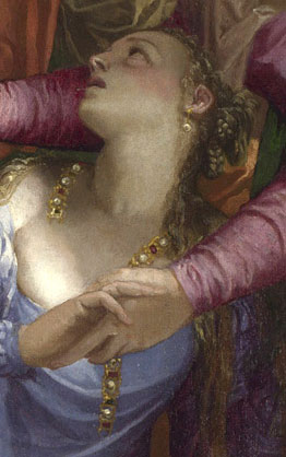
In the centre of painting a young woman in a light blue top showing a fair amount of chest and a mustard yellow, voluminous skirt, has collapsed to the ground. In her right hand is both, a broken necklace (or possibly a string of jewels wound from her hair) and the hand of the woman behind her, we can just see the other end of the necklace appearing on the right of her neck. She is being supported by that hand holding woman in red and green behind, who also manages to point at Christ at the same time. Christ is making some sort of blessing gesture, his right hand pointing downwards. Surrounding these three are large numbers of figures, most of them look towards the young woman.

Paolo Veronese: 'Christ Healing a Woman with an Issue of Blood' detail of Fallen Woman

The action seems to take place in a shallow pictorial space, a lobby with the fluting of large classical columns (Greek Doric) visible behind. There is an open portal to our left, a dog’s head and the back of a nude boy is framed in it and behind, columns (Ionic)  appear to flank a circular opening, a figure is looking down, which makes the viewer suppose we are at least one storey high, a small crescent of sky can be seen.

The Subject: Belonging, Composition and Types of Perspective

There is some debate about which Biblical story we are looking at, and that is where the notion of belonging comes in I think. The collapsed figure is tended to by the woman beside her and, presumably, by Christ. The man with the book to her left and the man in green behind him look less keen. It is the breaking of the necklace, the losing, or indeed loosing, of her personal belongings, the string of jewels, that either sparks off this whole event (whatever it may be) or symbolises it. Although small, that jewellery is centre stage, and this is a very stage-like frieze of figures. We know that Veronese intended this to be so, by simple Early Renaissance devices. She is positioned exactly on the vertical axis. Look at the pavement on which the figures stand, follow the orthogonals (parallel lines that lead to a vanishing point) created by the darker pink bands leading into the pictorial space. At first sight, they appear inconsistent, although they all point to the necklace and more specifically to the broken section below the two clasping hands of the women. If you look at the orthogonals on the image below,

Paolo Veronese: Christ Healing a Woman with an Issue of Blood?', 1548 oil on canvas. 117 x 163 cm with orthogonals

you will see that they appear to be reminiscent of a ‘herringbone’ pattern, in which the parallels meet symmetrically in mirror fashion on a descending vertical axis, rather than converging to a single vanishing point. Erwin Panoksky in the Introduction to ‘Early Netherlandish Painting’, and also in ‘Perspective as Symbolic Form’ (Section II), describes the herringbone pattern (or vanishing axis perspective) as deriving, ultimately from, classical painting (Greek vases and Roman murals, usually for things like roof beams). It is also the mediaeval precursor to the fully fledged linear perspective discovered by Brunelleschi in the early 1420’s. The obvious question is this, why does a young, very proficient artist in the middle 16thCentury use such an archaic device? The answer must lie in the way that the artist directs the eye towards the string of jewels. The series of vanishing points continue the line and form of that broken string, a line that falls, deliberately, exactly on that vertical axis. It is like a big arrow: look this way.

Before its first showing at the National  Gallery (1876) this painting was assumed to be ‘Christ and the Woman Taken in Adultery’, when Christ asks the Pharisees who are about to stone a woman to death ‘He that is without sin, let him cast the first stone’. Once on public display it was then assumed to be ‘Mary Magdalene Laying Aside her Jewels’, although there is no biblical text for such an image. A recent article (By David Rossand in The Burlington Magazine: ‘Veronese’s Magdalene and Pietro Aretino’, June 2011) has again suggested that this is indeed the Magdalene, if so where are her other attributes, the jar of ointment perhaps? Is this where the nude boy, (who must refer to Cupid) and the dog (to fidelity?) fit in to the narrative?

Analysts in the 1990’s proposed the current title, the story of the sick woman (the issue of blood) grasping hold of Christ’s clothing in a crowded place, convinced that he can heal her, convinced of her faith, he does so. This is a painting by a young man, about 20 if the dates are right, young Veronese copied Parmigianino’s drawings which would explains the Mannerist style; the elongation of the figures and their serpentinata poses.

Belonging to?

What sort of community, what sort of belonging are we being shown? What does the book, so lightly held by the white cloaked man, contain? What? Rules? Or the names of transgressors? Christ’s New Testament?

Paolo Veronese: 'Christ Healing a Woman with an Issue of Blood' String of Jewels detail

That string, look at the shape it makes, firstly that shape resembles the arrangement of key figures around the fallen girl and Christ a swirling open form, close to a spiral. Secondly, although it is probably a coincidence, the shape of the string is a question mark. Apparently the forms of punctuation didn’t really settle down until the full acceptance of printing; about the beginning of the 16th century. So we cannot assume a common usage of the question mark in 1548, but as a means of highlighting our, contemporary difficulties with the narrative, that question mark is perfect, her ‘personal belongings’ falling across her chest point exactly to the heart and the uncertainties of the story

This is a woman who is either losing her place, her ‘relation of belonging’ as Ricoeur put it, to a particular community. Or, she is being welcomed into it by the central charismatic figure, against the misgivings of others perhaps because of past transgressions. There is enough evidence to support either supposition. But, I would favour the latter, the spiral of figures around her and Christ is not dissimilar to the disordered and broken circle the fallen woman holds in her hand. That similarity surely indicates parallel ‘relations of belonging’

The Space within the Space

There is more evidence in the formal arrangements, in the composition of the work. Behind, through the opening, is a presumed architectural circle, a perfect form.

Paolo Veronese: 'Christ Healing a Woman with an Issue of Blood' Detail of Inner Space

As always a separate space within the pictorial space of a painting (often a window, in this case the brightly lit circular architectural form on the left) has a narrative and a formal function. Formally, it relieves the claustrophobia of the foreground; it allows Veronese to make a scene that is dark, crowded and intense, without making it overpowering and awkward. Put your hand over the lit inner space and the other forms become incoherent and overheated; frantically boiling melodramatic emotion. Add the calmness of pale circular forms, receding verticals and the tiny crescent sliver of blue gently echoing the curves beneath it, and you have an ordered space of reason (perfect geometric forms like the circle) and light.

Paolo Veronese: 'Christ Healing a Woman with an Issue of Blood?', 1548, oil on canvas 117 x 163 cm National Gallery, London

In narrative terms, we must assume that the lighting and simplicity of this inner architectural space relate to Christ, i.e. a temple. He is after all, the only clearly identifiable figure in the work and as such is nearest to the opening. (“In my Father’s house are many mansions: if it were not so, I would have told you. I go to prepare a place for you.” John 14.2). This fictive architecture seems a mix of Bramante and Palladio, there is something of the ambulatory of The Redentore in Venice, or the first floor of the cloisters at Santa Maria della Pace in Rome about the arrangement. Not much though, the cloisters are rectangular, Corinthian and Veronese had not been to Rome and didn’t work in Venice until 1551. Nonetheless, as Nicholas Penny points out in the National Gallery Catalogue (Sixteenth Century Italian Paintings Volume II) he came from a family of masons and had worked with Michele Sanmichele, the great Veronese architect and to whom this section might relate. Despite Penny’s point about the closeness of the intercolumniation in the lobby, Veronese was a man who therefore knew his high level architecture and putative meanings. This little painted fragment shows classically inspired architecture of order and rationality, note that it is Ionic, the next step up the Architectural Orders from the Doric of the lobby area; that inner space is a sanctum, a temple, a spiritual destination. Stick with the man in the halo and that is where you will get to. This is the destination of that clustered community around him, that group of people belonging to each other, as opposed to disapproving and disorder to the right of the painting.

Veronese knew what he was doing

I think we come to the supposition that, if Veronese had wanted to specifically and clearly identify the fallen woman, he would have done so. He knew, or would come to know, exactly how to play with notions of identity in paintings.

Paolo Veronese: 'The Family of Darius before Alexander', 1565-7. oil on canvas, 236 x 475 cm. National Gallery, London

Look at his vast painting of the ‘Introduction of the Family of Darius to Alexander’ 1565-7 with the famous misidentification by Darius’ mother, Sisigambis when she mistakes Hephaeston for Alexander. Veronese made this sort of thing one of his key themes. Had he wanted us to know who was who in this smaller, earlier painting he would have done so. I suspect though, rather than setting up complex puzzles for later art historians, it was an ambitious young artist widening his opportunities. The wider the field of identifiable characters, the greater possibilities for future commissions.

Back to the train gang

Sadly though, in my case travelling on a packed afternoon train, wedged into a narrow seat by a large man steadily eating a reeking and noisy packet of crisps, there is no possibility of rescue to a glorious inner sanctum, not even to the empty First Class seats. Opposite me, a man in a black leisure wear sporting a black baseball cap, with BENCH printed asymmetrically across it, has been trying to buy a double garage over the phone. He is having trouble explaining what he wants, no matter how many times he repeats himself (7 metres by 5 metres with double doors and a shingle roof) whoever takes his calls cannot help. Does a garage come under the heading of a temple, a place of calmness and rational order: that’s a shed isn’t it? A shed is where you put all those ‘personal; belongings’ that have no obvious place to be, but you can’t bear to part with, unless of course you have left them on the train.