Archive

Light in Art

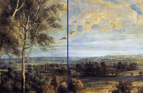
Peter Paul Rubens: 'A View of Het Steen in the Early Morning', 1636. Oil on Oak. 131 x 229.cm. National Gallery, London

Peter Paul Rubens: ‘A View of Het Steen in the Early Morning’, 1636. Oil on Oak. 131 x 229.cm. National Gallery, London

Is your mobile a Black mirror or a spittoon?

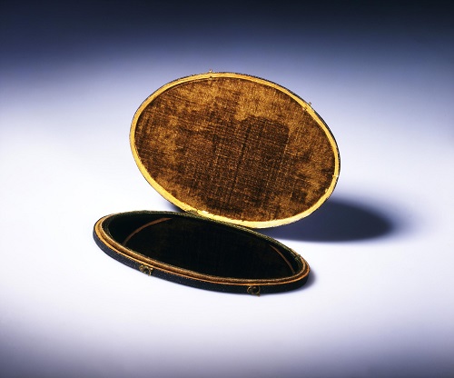
18th century Romantic visitors to landscapes, looking for the Picturesque, used to put a Claude Glass, between them and the scene. The Claude Glass was a small tinted mirror, eg this one from the Victoria and Albert Museum, London, you turned your back on the landscape and held up the mirror.

Claude Glass, from the Victoria and Albert Museum © 1775-1780

Claude Glass, from the Victoria and Albert Museum © 1775-1780

Essentially the same effect as an Instagram filter, the curving on the mirror focused the reflection slightly to key points and the reduced tones gave the impression of a painting by the 17th-century French artist, Claude Lorrain; the famous ‘Master’ of the hazy and vaguely classical Picturesque view.

Claude Lorrain: 'View of La Crescenza', 1648–50. Oil on canvas, 39 x 58 cm. Metropolitan Museum of Art

Claude Lorrain: ‘View of La Crescenza’, 1648–50. Oil on canvas, 39 x 58 cm. Metropolitan Museum of Art

Taking your Claude Glass, or Black Mirror, you either stood and appreciated the selected view over your shoulder or drew from the affected image. You used technology to remove you from direct perception to elevate you to the higher plane that was the point in choosing the view in the first place.

Taking photographs in the National Gallery is now allowed. Does taking photos with your phone, the most common method, change the way we look at art, another frame through which to look, another proscenium arch? Apart from shortening viewing or contact time with the art object, how does that process affect our perception of the thing/s we have come to look at?

Viewer at the National Gallery, London

Viewer at the National Gallery, London

Are gallery visitors with their mobiles constructing their social selves, taking images to post later? Probably not, Maybe the phone is a sort of spittoon, spitting out what you have chewed over and used up? Perhaps a slightly more active metaphor, a self sorting rubbish bin? Perhaps we are assuming the phone acts somewhat like the brain, we chuck everything in and hope that important experiences will somehow autonomously rise to the surface and claim their due significance. This process though, assumes that a painting is a signboard, like an advert designed to direct the viewer to a single message. But, paintings, like all art forms, work in layers and take time to understand.

Viewer at the National Gallery, London

Viewer at the National Gallery, London

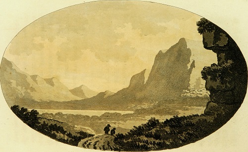
It is difficult to just stand and look, it has taken me many years to learn how to just look at Het Steen for example. We need to feel that we are doing something active, are actively involved in our looking and need to have some sort of certified authority, a guidebook as it were, to lean on. You can see this in William Gilpin’s illustrations for his guide book: “Observations, relative chiefly to picturesque beauty, made in the year 1772, on several parts of England; – particularly the mountains, and lakes of Cumberland, and Westmoreland. (1788)”, look at how the format echoes the Claude Glass he recommended and how the tones are reduced to get the Picturesque effect. Most of the photographing visitors in the National Gallery use audio guides to get them to the best works.

William Gilpin: 'Rydal Water' from 'Observations, relative chiefly to picturesque beauty, made in the year 1772, on several parts of England; - particularly the mountains, and lakes of Cumberland, and Westmoreland', printed 1788.

William Gilpin: ‘Rydal Water’ from ‘Observations, relative chiefly to picturesque beauty, made in the year 1772, on several parts of England; – particularly the mountains, and lakes of Cumberland, and Westmoreland’, printed 1788.

Surely looking at a painting via the phone is doing much the same thing as standing with your back to the view and looking into a black mirror. Our phone photo not only makes a digital record of having been there, made our own postcard so to speak, but we have also digitised our presence in front of celebrity and wealth (art). In the same way that the Romantic viewer in front of Tintern Abbey or wherever, needed the Claude Glass to validate their own looking, we use the phone image to validate us in front of a famous painting.

Mostly Chinese/ Korean and Spanish tourists in the gallery this afternoon with a sprinkling of indigenous families, the children nobly doing their Christmas ‘duty’ whilst looking at their phones. I have done my duty to Het Steen, been an hour in front of the painting, perhaps a quick photo then it’s time to go.

Het Steen with Viewer

Het Steen: viewing in progress

Early Morning Train

Hot and crowded, this is a train with five cramped seats in a row; in a two then three formation with a narrow passage between. People try to stand in this gap; standing room by the doors is full. At one end of the carriage, just beyond those doors, is a separate area with twelve first class seats, generously surrounded by space. All are empty bar one. A man sits alone, in splendour. The rest of us sweat and stand and stare at him in his isolation, in his splendid palace.

One Space Seen from Another

Looking at this carriage as a composition, a distinct space within another one, makes me think of paintings, of the smaller painted space within the larger painted space. This set up often occurs in early Northern European art, symbolising the Virgin Mary as the portal to heaven for example. It is a theme that must have been familiar enough for Van Eyck to use the mirror in the Arnolfini portrait in 1434, and the window to the left as a form of referent to that type of composition.

Jan van Eyck: ‘The Arnolfini Portrait’, 1434, oil on panel. National Gallery, London

The train passes through an empty country station, at the end of the platform are two cats, one pure black, the other black and white. The piebald cat stands looking towards London, the black one sits staring towards the coast. They are close together almost touching, yet appear to pretend the other does not exist.

Space to Space

The space within a space arrangement is a form of Golden Section. The relationship of the smaller to larger area is the same as the larger to the whole. Mathematical ratios draw attention to the sets of relationships that govern the entire process. In the same way, the relationship of one painted space to another allows the artist to consider making the whole pictorial space and presenting it to the viewer.

The Ideal City and the Flagellation

Does that sort of Northern composition travel? Can we see it for example in Italian art? Try looking at Piero della Francesca’s ‘The Flagellation’,

Piero della Francesca: ‘Flagellation of Christ’, 1458-60, Tempera on Panel, 58 x 81 cm. Galleria Nazional delle Marche, Urbino.

a painting that has been much analysed and mythologised. I recently visited ‘The Ideal City’ exhibition in Urbino. The ‘Flagellation’ was exhibited under that title. The main draw to the show was the comparison between the Ideal City image itself and others, e.g. ‘The Ideal City’ from Baltimore.

Unknown Artist: ‘Ideal City’, Last Quarter Fifteenth Century, Oil on Panel, 67 x 240 cm. Galleria Nazional delle Marche, Urbino

A fascinating exhibition, but what stood out was the range of available forms of communication; successful or otherwise. The wall texts for example had been translated into the most tortuous English possible.

Herr Professor

Standing in front of the ‘Flagellation’ an elegant, white suited, white haired German History of Art teacher spoke into the air and pushed back his hair. Behind him his young students texted, showed each other pictures on their phones, some wrote down his every word clearly not listening to any of it. This lack of interaction pointed up how one space in Piero’s painting communicates with the other, through the language of mathematics (the geometry and linear perspective) and of art (light and form). We might not know the exact intentions behind this image, but these lines of communications were stronger than those between the hair stroking Herr Professor and his charges.

The Theories

In the Flagellation (1458-60), a group of three stand in the foreground, on red tiles crossed by white.

Piero della Francesca: ‘Flagellation of Christ’, 1458-60, Tempera on Panel, 58 x 81 cm. Galleria Nazional delle Marche, Urbino. Detail: the group of three

To the left, in the midground is a loggia, (the praetorium) in which Christ is whipped.

Piero della Francesca: ‘Flagellation of Christ’, 1458-60, Tempera on Panel, 58 x 81 cm. Galleria Nazional delle Marche, Urbino. Detail: the praetorium.

The whipping pillar stands within a complex series of black and white tiles, on a circle within a square. A seated figure on a dais wearing a splendid hat watches.

Piero della Francesca: ‘Flagellation of Christ’, 1458-60, Tempera on Panel, 58 x 81 cm. Galleria Nazional delle Marche, Urbino. Detail: seated figure.

He frames a doorway, in that further space we can see a set of stairs leading upwards; it is brightly lit.

This might or might not have been painted for Federigo da Montefeltro, the condottiere (mercenary commander) who ruled the small state of Urbino from 1444-1482,

Piero della Francesca: Federico da Montefeltro.1472-4. Tempera and oil on Panel, 47 x 33 cm. Galleria degli Uffizi, Florence.

or for Ottaviano Ubaldini, Federigo’s Chief Counsellor and Treasurer, a famously well-read humanist. It is possible, just, to identify the bearded figure with portraits of Ottaviano, and the other with Ludovico, il Gonzaga Marquis of Mantua. None of the figures looks like Federigo, who was not shy of including himself where necessary.

Evidently, the Flagellation was made for a cognoscente. Northern art was familiar in Urbino, Justus of Ghent produced many paintings for it, Ottaviano owned a van Eyck painting. The games played with space here and in the Studiolo (several of the inlaid doors in the exhibition) display ease with characteristic Northern uses of pictorial space.

Piero della Francesca: ‘Flagellation of Christ’, 1458-60, Tempera on Panel, 58 x 81 cm. Galleria Nazional delle Marche, Urbino. Detail: the group of three

The Threesome

Art historians get most excited about the identity of the group of three, and their relationship to the flailed Christ. Opinion differs greatly as to who they are. Is what we can see what those three can actually see or, are they conjuring up the scene? Marilyn Lanvin suggests the specific identities above (Lanvin, Marilyn, 1972. Piero della Francesca: the Flagellation. University of Chicago Press. ISBN 0-226-46958-1) because two key figures of the period had recently lost sons (Ottaviano in 1458 and Ludovico’s adopted son between 1456-60).

A Visionary Scene

The conjuring up of visions, or visions within visions is also reasonably familiar within paintings, eg The Visions of St Jerome. According to this reading the figure in the centre is either an angel, or an image of the risen Christ, note the halo, or wreath of laurel leaves behind him (symbol of victory/ glory) and the similarity of the pose of Christ and the youth.

Or, the figures are representations of Oddantonio da Montefeltro, the Duke of Urbino and his advisors, Manfredo dei Pio and Tommaso di Guido dell’Agnello murdered just before Federigo took over. Or they are, including Oddantonio, Federigo’s predecessors. Or, the seated figure is the Byzantine emperor John VIII Palaiologos, and this is a painting about the re-unification of the two wings of the Eastern and Western Christian church, or it might be about the siege of Constantinople (1453) and the figure is Sultan Murad II, the Ottoman leader, or…

Signorelli Gets to the Bottom of the Story

By the way, we know that these figures are a crucial part of the composition by comparing them to similar compositions on the same theme. Luca Signorelli is generally thought to be Piero della Francesca’s pupil. Signorelli’s take on the subject was shown in the same room as ‘The Flagellation’.

Luca Signorelli: ‘Flagellation of Christ’, c.1480, Tempera on Panel, 84 x 60 cm. Pinacoteca di Brera, Milan.

The later work is splendidly dissolute with, as one of my companions put it, ‘lots of cheeky buttock work’. No evidence of the careful, measured relationship between the three and the whole space. Take them away and the entire meaning changes. Fill it full of sinuous curves and the muscular male behind and it changes even further. We had a long time to look at this whilst we waited for the teaching to finish.

So, You are a German Historian of Art

You have a linen suit creased just so, your horn rimmed spectacles sit, academically you think, on your aquiline nose, your hair is lovingly placed over your head, so. You have the words of your illustrious predecessors: Wolfflin; Wittkower; Panofsky running through your veins like blood, yet still your students do not listen. You are surrounded by communication, of one sort or another, so you say, let us think about the communication of one painted space to another or, how does one space talk to the other; who is texting whom? Actually he didn’t say anything of the sort, just kept chuntering on to a point some two feet above the painting, for a very, very long time.

Piero della Francesca: ‘Flagellation of Christ’, 1458-60, Tempera on Panel, 58 x 81 cm. Galleria Nazional delle Marche, Urbino.

The three figures stand on a straightforward red and white tiled floor receding into the distance. In the praetorium the tiling is more complex, As Martin Kemp points out in ‘The Science of Art’, that tile pattern is based on Pythaogorus and the length of the diagonal in his famous triangle; an irrational number, in this case deriving from the external proportions of the panel. The tile pattern outside the praetorium is made from simple divisions into eight, no square roots here. This is the language of mathematics, Piero della Francesca was one of the most successful mathematicians of his period, a copy of his ‘De Prospectiva Pingendi’ was on display in the next room. In the relationship between these two spaces we have the ratio of the mundane, the everyday to the glorious and the geometric; the secular to the sacred.

The Viewer Within

In the performative role of the Internal Spectator, often the painted figures closest to the viewer, we see the painted world through their eyes. The closest of the three figures to us is in profile; the man in the glorious robe. Lanvin identifies him as Ludovico Gonzaga. If anyone is conjuring up this scene it is him, looking into this world from the edges, not perhaps the putative Ottaviano who looks out of the space

Back with the Train Gang

In my train carriage, there is no aural communication between us second class folk and the lone first class passenger. He can be in no doubt how the rest of us feel through other means: body language; disposition of space; the visibility of his floor as opposed to the rows of dark suited legs and shiny black shoes and walking trainers that obscure ours. Perhaps that is why he stares so intently at his I-pad. Is there an internal viewer in this composition? Next to the door surrounds, a short round woman with short blond hair is asleep. Her red T shirt matches her complexion as she snores. Her laptop computer, open on the table ledge by the window, bleeps. On her wrist is a very large gold watch. Her congested breathing gets louder. No other passenger pays any attention, perhaps they are used to it. Is she our guide to the true meaning of this composition?

Light in My Darkness

The spirituality of light is well known in art, particularly in Northern Renaissance paintings. Often the light indicates the presence of God, or the holiness of the Virgin Mary.

van Eyck: ‘The Ghent Altarpiece (closed)’ tempera and oil on panel, 3.5 x 4.6 m (closed panels), Cathedral of Saint Bavo, Ghent, Belgium,

In the piazza, outside the praetorium the light is from the upper left; a traditional placing. As Lanvin and Kemp show, the light in the praetorium has a different source. One of those analyses that Art Historians come out with after hours of reading not looking, I thought.

Piero della Francesca: ‘Flagellation of Christ’, 1458-60, Tempera on Panel, 58 x 81 cm. Galleria Nazional delle Marche, Urbino. Detail: the praetorium.

But, actually in front of the work, yes that light is very obvious, especially the shadow cast by the roof beam. That central coffered area above Christ is lit up as though rows of fluorescent tubes sit around the cornice. It is light that only Christ can see, coming from somewhere just above his eye level between the second and third column.

There’s a Sign on the Wall, But She Wants to be Sure

But, what about the furthest space, the space within the space within the space? The one with the stairs.

Piero della Francesca: ‘Flagellation of Christ’, 1458-60, Tempera on Panel, 58 x 81 cm. Galleria Nazional delle Marche, Urbino. Detail: seated figure.

There are eight stairs, octagons occur throughout the construction of the praetorium tiled floor and the tile pattern in the piazza is divided into eight parts. Didn’t Christ rise from the tomb eight days after entering Jerusalem? What about that other key factor for the major inner space, light? Where is the light in that furthest stair filled space coming from? From the right, possibly the same source of light that Christ looks toward, the different source of light within the loggia, to that, from the left, that lights up the three standing figures. There is no other way to put this; this is the stairway to heaven. No doubt Rolf will be at the top to serenade the three figures when they climb it, “Convenerunt in Unum” (“They came together”) as it originally said on the frame.

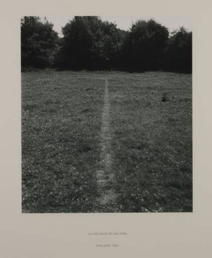
In common with the theme of this post, the form of this writing follows a meandering path. I have just returned from walking in the Scottish Highlands. The walk is a familiar theme in contemporary art[i], Long and Fulton are probably where one usually begins,

Richard Long: 'A Line Made by Walking', 1967

Long’s ‘A Line Made by Walking’ is the most straightforward and refers us, perhaps, backwards to the rural walk. For the urban walk there is the ‘dérive’ starting, arguably, with Guy Debord, looking backwards to the ‘flaneur’.

Edouard Manet: 'Music in the Tuileries Gardens', 1862. Oil on Canvas. 76 x 118 cm. National Gallery, London

(Manet’s self-portrait in the left corner of ‘Music in the Tuileries Gardens’, his monocle referring to Baudelaire’s original description of the term flaneur, Baudelaire is also amongst the painted throng), and forward, via Ron Herron’s ‘Walking City’ maybe, to pyscho-geography and Ian Sinclair[ii].

The Romantic Experience

I practise both, but standing on the top of Beinn Resipol,

 the Romantic associations were uppermost, the line which runs from Keats: ‘On First Looking into Chapman’s Homer’, 1816

“Then felt I like some watcher of the skies

When a new planet swims into his ken;

Or like stout Cortez when with eagle eyes

He star’d at the Pacific—and all his men

Look’d at each other with a wild surmise—

Silent, upon a peak in Darien.”

The Wanderer (I roam around, around, around)

Or Caspar David Friedrich’s painting from a year or so later: ‘Wanderer above a Sea of Fog’, 1817 [iii].

Caspar David Friedrich: 'Wanderer Above the Sea Fog', oil on canvas, 98 x 74 cm, Kunstahalle, Hamburg.

Look at the ‘Wanderer’ carefully; the spatial construction makes the figure static and solid. It is directly on the central vertical axis

Caspar David Friedrich: 'Wanderer Above the Sea Fog', oil on canvas, 98 x 74 cm, Kunstahalle, Hamburg. Detail 1

and the waist on the horizontal,

 the crag and head form a strong pyramidal structure.

Caspar David Friedrich: 'Wanderer Above the Sea Fog', oil on canvas, 98 x 74 cm, Kunstahalle, Hamburg. Detail 3

This pictorial strength, as it were, makes the wanderer a form of god in the way that he dominates the rest of the space, his Romantic imagination, and by extension, our own, creates the view. ‘The Wanderer’ is one of the first paintings in which we look with the figure from inside the painting, not at a painted figure looking at it. Friedrich takes the notion of the internal spectator and makes it the central focus of the painting, and makes that act of internal viewing the paradigm for all acts of viewing this side of the picture plane.

A Literary Device?

Powerful stuff, but to be honest it is a device and a literary one at that. We can see the apotheosis of experience on a mountain top. We can understand the analogous nature of viewer and internal viewers experience. But, there is very little particularity about what we are actually experiencing; it is a generic scene. It has none of the genuine nature of what it was really like to walk up there and stand above the clouds; cold and wet in my own experience.

‘Wanderlust’

As Rebecca Solnitt points out in ‘Wanderlust’, to walk is to be embodied. But is the figure in the Wanderer embodied, in the sense that it is corporeal and fully sensate? I think the precision of the co-ordinates that place it in pictorial space, militate against that reading. This is an intellectual body, a minds eye body, not someone who has toiled up through bog and slippery footholds, out of breath with the wind in their face, wondering which path to take. Can art ever present the embodied walker?

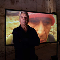
A better work on this theme was John Cale’s ‘Dreaming in Vertigo’ section of ‘Dark Days’,

John Cale in front of 'Dreaming in Vertigo'

shown at the Welsh Pavilion of the Venice Bienalle in 2009. If memory serves, he strapped a video camera to his chest and walked up endless steps on a Welsh hill. The soundtrack is of heavy panting as he struggles up a steep slope, the view is of a man working hard to keep walking.

Our Forbidden Land

The book of photographs by Fay Godwin: ‘Our Forbidden Land’, describes the real experience of a walk. The journey as a political tool is extended by showing the journey denied.

Fay Godwin: 'Meall Mor Glencoe', from 'Our Forbidden Land'.

Our Forbidden Land’ is a series of polemical photographs taken around Britain, Godwin’s photographs of natural beauty show how ordinary walkers are denied access to that beauty. Over 87% of this country is privately owned, and another 13% is made up of roads and railways etc. A walker has only a one in three chance of being able to complete a 2 mile country walk along public rights of way. Her photograph of Glencoe in Scotland shows a dark tarmac road leading to the white mountains, the road is almost central, the diminishing single viewpoint perspective almost perfect, the snow on the mountains white and exciting, the sky clear, beauty in the wild. But the pressure of tourism in the area, the demand for new roads and the amount of rubbish thrown from passing cars speeding through Glencoe is horrible; this will destroy that beauty within the next few years.

So then, most images about walking tend to be making some other point, Christ striding about with a cross, fresh from the tomb off to have a few words with dad (‘Noli Me Tangere’). ‘Bonjour Monsieur Courbet’, the artist as The Wandering Jew, as the true seer of society. The group of walkers (the Bacchante) that meet the single walker (Ariadne) as she tries to call her lover Theseus as he sails away.

‘The Morning Walk’

Gainsborough’s ‘The Morning Walk’ might sum all this up.

Thomas Gainsborough: 'The Morning Walk', 1862, oil on canvas, 76 x 118 cm, National Gallery, London

Like ‘Mr and Mrs Robert Andrews’, it’s about ownership, walking the bounds of your property in your best shoes. Like the painting technique, this is a far more subtle painting than it’s predecessor, and infinitely grander. Compare the two dogs to get the sense of this change. The elegant white dog (a Spitz) versus the working gun dog; the dogs tell us who owns whom and what.

Dogs in Art

By the way, thinking of dogs in art have a look at ‘The Pont de l’Europe’ by Caillebotte,

Gustave Caillebotte: 'Le Pont de l'Europe', 1876, 125 x 181 cm, Petit Palais, Geneva.

the elegant hands behind the back, the swaying self-importance of the strolling flaneur. Notice the bustling dog though, which I have always thought stands as the internal urban viewer in this Realist/ Impressionist work.

The ownership theme is the same in both Gainsborough works, although the visual relationship between the white dog and the white dressed Mrs Hallet, makes her marital relationship to Mr H none too subtle.

The brushstrokes are the key to ‘The Morning Walk’; light, feathery, and gentle. The clothing was fashionable, not clothes worn for getting muddy on a long hike through real countryside. The delicacy of the paint matches the lightness of the walk through the grounds, they are on a well made path, the title is ‘The Morning Walk’, i.e. before the real business of the day. From the branches at the top left the eye is drawn to the pale background, then to the dog and back to the figures, the silks of the Mrs Hallet in particular. These light brushstrokes, made with a six foot brush, create serpentine movement, i.e. the type of movement expected for a gentle walk in one’s grounds, definitely not the earthy energetic rush of the hunter in Het Steen.

The view up to Beinn Resipol, Ardnamurchan, West Scotland.

Our return from Beinn Resipol was neither gentle, nor light, it was definitely earthbound and very soggy; like all proper walks,


[i]  I recommend this website on the theme as well: ‘Walking and Art a blog about the uses of walking in art


[ii] Might I mention here the existence of ‘The Suburban Hiking Association’ formed first in Leeds in the late 1970’s and then resuscitated with Adam Curtis and Mary Harron in Brixton in the middle Eighties. Us Suburban Hikers met in the centre of town and then travelled to the ends of tube lines to collect stories and characteristic objects to display to each other at the subsequent party.


[iii]I have fond memories of this painting, it was the cover of the second Mekons Album (from 1980 I think, memories of that period are a little vague).

The Cover of The Second Mekons Album

Originally there was to be a speech bubble coming up from the fog below with “It’s De Mekonns Bas” written in it. We thought this would sum up the ironic contradictions between attacking Capitalism, yet using it’s mechanisms to create profit. Virgin Records, and then Rough Trade, hated the content, we really were outside the system now. Somewhere along the line the name changed to cultish references to pop fiction.


Peter Paul Rubens: 'A View of Het Steen in the Early Morning', 1636. Oil on Oak.131 x 229.cm. National Gallery, London

Late night Friday opening at the National Gallery, on the bench in front of Het Steen.

The way pictorial space is organised, the route through the painting that the viewer walks, conceptually as it were, creates our reaction as much as the iconography and the figures. The rectangular surface of this painting appears (almost) to divide into two equal squares.

 The dimensions are 131.2 x 229.2 cm, so in fact each ‘square’ is 131.2 x 114.6. Nonetheless, there is a possible vertical axis, at the central join of the two squares. It goes up between the lines of the silver birch trunks and bisects the two birds, just touches the right hand branches of the of the silver birch on the raised circular area. Each ‘square could be a complete painting in itself, one contains pure landscape, the other contains the house etc.

It seems to be Spanish visitor night in the Gallery, lots of leather handbags and jackets, large family groups with large shopping bags labeled with large names of west ends shops. The Spanish woman behind me has, at last, finished her phone call. Mostly it consisted of ‘Si, Si, Si’ in a manner reminiscent of Sybil Falwty’s ‘Oh I know, I know, I know’

Peter Paul Rubens: 'A View of Het Steen in the Early Morning', 1636. Oil on Oak.131 x 229.cm. National Gallery, London. Detail Horizontal Axis

A horizontal line of light and shade runs across the painting, approximately half way up; although none of these putative lines are exact. This doesn’t just apply to the surface, but divides the structure of the space into quarters

Peter Paul Rubens: 'A View of Het Steen in the Early Morning', 1636. Oil on Oak.131 x 229.cm. National Gallery, London. Detail Numbered Quarters

A contains all the figures

B contains the house

C contains the sky and mid and background

D contains foreground  and the milkmaid with cows and the oversized ducks.

Not much else is organised around these axes. You might for example expect the tower on the horizon, (the Cathedral of St Rombout in Malines) to mark the point where the vertical axis touches the horizon.

Peter Paul Rubens: 'A View of Het Steen in the Early Morning', 1636. Oil on Oak.131 x 229.cm. National Gallery, London. Horizon Detail

Or that the tower would be balanced by something on the left, equidistant to the vertical axis; but it isn’t. You could say that the vague branch of the of the silver birch dropping down at about 45 degrees, just touching the horizon, is that balance but I don’t think so, do you? You could say that the orthogonal made by the right hand ditch, just below the milkmaid and cows, will join the horizon where it is bisected by the possible vertical axis.

 As, by the way, does the almost exactly symmetrical orthogonal line made by the front of the house. This again starts from the upright side of the canvas at the same point as it’s symmetrical twin. It cuts the horizon at the same point, where the vertical axis and the orthogonals meet; just about.

A young Spanish couple next to me on the bench are trying to organise English terms,

‘With you…With me…You say I go with you…You come with me…We go on this tour”.

There is much hesitant repetition. Each time they get a phrase right, they kiss. An improvement on my own French language education with Monsieur Hervé. If we declined wrongly he would hit us, rhythmically in time with the right stresses as he repeated the correct form. I can still spell ‘old’ in French as a result, and it still hurts.

In ‘The Science of Art’, Martin Kemp points out that Rubens knew his perspective systems well, although he didn’t use them in an obvious manner. With a bit of effort you could say that underneath this bucolic autumnal dishevelment are some careful pictorial structures.

Peter Paul Rubens: 'A View of Het Steen in the Early Morning', 1636. Oil on Oak.131 x 229.cm. National Gallery, London. Detail Orthogonals 2

Even more debatable, look at the equilateral triangle made by the fallen trunk, you could say that the dominant lines are parallel with the orthogonals of the ditch and house. Above, as you travel up the vertical axis, is another meeting of orthogonals made from the lower of the ditches and a line formed by the angles of the horses hooves and cart wheels. I.e. a herringbone pictorial construction, that system of depth projection that preceded linear perspective. But in this case, unlike for example the Veronese I was looking at in an earlier post, I think this interpretation would be over-reading the visual evidence.

We can say is that the underlying structure creates a calmness and a logic to the pictorial space, which could otherwise be over-ridden by the figures in the bottom left quarter.

At this point a Spanish couple stand in front of the painting, one behind the other and both exactly on the vertical axis. He is very tall, his face very close to the picture surface. The top of his bright, bald spot, haloed by dark hair just touches the horizon. She is much shorter, her head directly below his, so that where his thinning hair stops hers starts. She is wearing a large brown leather coat that obscures their bodies and she is perfectly positioned so that his legs are obscured also. All I can see is the back of two heads in exact vertical alignment. His head is shining like an extra sun, placed where a less successful painter than Rubens might have positioned a painted version, centre stage.

By now all the other Spaniards seem to have gone, to shops and bars and restaurants. Behind me, a couple have been having a quiet and intense discussion for some time. Something about it is increasingly unnerving, and I can’t work out why. Then I recognise the language, they are speaking in Danish. After two series of  The Killing, I associate that sound, those characteristic stresses and language forms with fear, anxiety and rain. All the suns in the painted world in front of me cannot dissolve that association; time to go.

A young man is unhappy, as he speaks into his phone I gather that he has left his tent on the train; he is carrying two large rucksacks. He was expecting to sleep in the tent which must, by now, be half way to Ramsgate. It is late Friday afternoon on a small, rural station, the ticket office is closed. He had not obeyed the constant instruction:

“TAKE ALL OF YOUR PERSONAL BELONGINGS WITH YOU WHEN YOU ALIGHT AT YOUR NEXT STATION STOP”

Sympathy for the poor man without his weekend shelter prompts thoughts about our minimum requirements; what are the key elements of ‘home’? Do we always carry ‘home’ with us?

National Schools?

I have just come from a talk by the President of the Royal Academy to a group of schoolchildren. I had been about a National School of Art, a founding function of the Royal Academy. Afterwards a GCSE student asked the Pres about Tracey Emin, he was very appreciative of her time and commitment. He did not discuss whether she was, in fact, part of the new National School he was supposed to promote. Is such a collection possible or desirable in a complex, multicultural world? ‘National’ presumes a homogenous culture, a shared view of the land we share. We all share the same sky as the old posters used to say, appreciation of soft, British light might characterise those who struggle to represent its landscape.

National Characteristics: Light

It is grey and cold and drizzling on the platform, the light levels are low. Two girls are standing, half way along, towards the front. They face each other and bob slowly up and down in exact time, knees not quite touching. Just before the train arrives, the sun briefly appears on the horizon, it silhouettes the two gently rising and falling figures

What else might allow us to think of home as a set of shared national characteristics?

National Characteristics: Channelling your inner minor official

Time on public transport brings to mind that national inability to operate or cope with minor authority. Give any British man or woman a cap, a radio, a low level position of importance and we become instantly unbearable, we suppress individuality and joy in ourselves and others. That overwhelming British urge to stop someone enjoying themselves. Is that a recognisable icon on our national desktop?

This morning, on the bus, the new driver did not know the way. The driver made it as clear as he could that it was the passengers fault, we in turn did not help, did not show him where to go. He was lost and grumpy in charge of a double decker bus on winding country lanes; we were on a rudderless ship.

National Characteristics: Making it Big

As I watch the tent-less man, I can see another familiar theme on the pull down menu; sat on a bench is a young man on his mobile. He wears a vivid red and white shiny tracksuit and a crisp, purple New York Yankees baseball cap, the price ticket in dollars proudly displayed. His accent though is clearly local as he continues a monologue about his sexual successes. Could such a fidgety, awkward youth, blessed with such poor, pale skin expect his listeners to believe his spectacular history?

St Jerome

A small painting in the National Gallery shows a different conceptual desktop,

Antonello da Messina: 'St Jerome in his Study', 1475. oil on panel. 46 x 36 cm. National Gallery, London

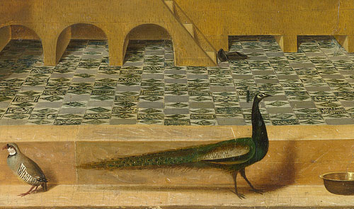
it is ‘St Jerome in his Study’ by Antonello da Messina painted, probably about 1475. The saint is symmetrically framed by a stone portal, a frame within a frame. A peacock, a finch and a perfectly elliptical water bowl stand outside the illusory stone frame. The saint sits reading inside a Gothic nave, in profile, in a wooden carrel; a rather complicated piece of furniture centred on a desk. Shelves surround him with carefully placed significant objects (including a cat. Notice by the way, the saint’s attribute, the lion in the arcade on the right). We can see landscape through the clear windows (no stained glass) to his left and right and sky with birds in the windows above.

Georges Perec

As Georges Perec points out in ‘Species of Spaces and Other Pieces’ (Penguin Classics 2008, page 87)

“The whole space is organised around the piece of furniture (and the whole of the furniture is organised around the book). The glacial architecture of the church (the bareness of the tiling, the hostility of the piers) has been cancelled out. Its perspectives and its vertical lines have ceased to delimit the site simply of an ineffable faith; they are there solely to lend scale to the piece of furniture, to enable it to be inscribed. Surrounded by the uninhabitable, the study defines a domestic space inhabited with serenity by cats, books and men.”

Space within Space

Antonello da Messina: 'St Jerome in his Study', 1475. (Centre Detail) oil on panel. 46 x 36 cm. National Gallery, London

This painting features spaces within spaces within spaces, from the stone doorway, to the rectangular box shelves, the carrel itself with the stone box of the church, the tunnel of the arcading on the right and the different heights of the horizon through the two lower windows. An idealised landscape, the familiar notion of paradise in the types of Northern European art that had so clearly influenced this Southern European painter. Look for example at the view in Van Eyck’s ‘Madonna with Chancellor Rollin’.

Jan Van Eyck: 'The Madonna and Chancellor Rollin', 1437. 66 x 62 cm. Oil on Panel. Louvre, Paris.

 Antonello’s left hand landscape view does, coincidentally I presume, bear strong similarity to the methods that Poussin would later use to represent small towns, eg in ‘Landscape with a Snake’.

In his writing, Perec has organised the species of spaces so that each section works outwards starting from ‘The Page’ and ending with ‘Space’. Reminiscent of that schoolboy address that starts “If this book should dare to roam/ box it’s ears and send it home” and each further line moves from continent to hemisphere to planet to near space and ends with: The Universe. I’m not sure that I entirely agree with Perec that the ineffable faith is delimited. Look at the painting starting from the picture plane, the stone portal emphasises the world of the viewer on this side of that plane.  Go through the doorway and you enter the world of the spiritual mind (a series of interlocking themes and spaces within the overall temporal space of ‘The Church’); ineffable faith inscribed throughout each piece of iconography and the very way that the spaces are organised. Finally look through the windows; a release, a timeless space.

Note that the light from the windows has a different source to that (ordinary human space) which for example casts the shadow of the peacock.

Antonello da Messina: 'St Jerome in his Study', 1475. (Detail) oil on panel. 46 x 36 cm. National Gallery, London

Iconography

Penny Jolly has pointed out (Antonello da Messina’s ‘St Jerome in his Study’ : An Iconographic Analysis The Art Bulletin, Vol 65 No 2 (Jun 1983 pp 238-253) that each of the painted objects fit into a complex ‘iconographical program’ as characteristic of Flemish art as his use of painting media (traditionally Antonello was the first Italian artist to introduce oil paint to the South, although this is now disputed).  The iconographic references tend towards associations with the Virgin Mary, as Jolly points out the composition and arrangement of St Jerome owes something to paintings of the annunciation. The towel (although used), the bowl of water, the trees referring to walled gardens and so on; all these are, or could be, disguised Mariological symbolism.

Jolly assets that the right hand landscape is the uninhabited wilderness Jerome lived in as a hermit, and the left hand view, with it’s proximity to the cat, (sexual temptation/ erotic associations etc) shows a view of the city associated by Jerome with wordliness.

Antonello da Messina: 'St Jerome in his Study', 1475. (Centre Detail) oil on panel. 46 x 36 cm. National Gallery, London

Close examination doesn’t quite prove this, the city could of course be Jerusalem: “Do you keep your windows open on the side where light may enter and you may see the City of God” as Jerome said in Epistle 22. 

And, the right hand side looks closer to the sort of organised agrarian landscape you can see in the right side of for example, the effects of Good and Bad Government in the Town Hall in Sienna.

Ambrogio Lorenzetti: 'The Legend of Good and Bad Government (Good Government in the Country)1337-9, Fresco, Sienna.

Painted Space

Like most art historians, Jolly concentrates on de-coding iconography and says little about the composition of pictorial space, usually a figurative artist’s overriding concern.    A carefully placed series of spaces, containing other spaces, the pictorial logic holds throughout; it is convincing, rational, planimetric. The Carrel and its contents, including the saint are parallel to the picture plane. It has for example, none of the oddities of later Florentine Mannerism,

Jacopo Pontormo: 'Joseph with Jacob in Egypt', 1518, oil on panel, 96 x 109 cm. National Gallery, London

try looking at ‘Joseph with Jacob in Egypt’ by Pontormo (expressing perhaps something of the nature of dreams fundamental to the story, certainly of the mysteries of death fundamental to the parts of the story shown here and the style.,

Lorenzo Monaco: 'Coronation of the Virgin', 1414, egg tempera on panel. national Gallery, London

Or the absolute rigidity, pictorial and ideological, of early Renaissance images such as Lorenzo Monaco’s ‘Coronation of the Virgin’. The way each painted area interacts with another is as much part of the meaning as the precise signification of the peacock (“symbol of celestial immortality and incorruptibility” Jolly p 240).

Perec as, I suppose, a Twentieth Century Modernist sees Jerome driving his desk into infinite space, as it were. Doesn’t the composition, with its sequence of steps and arrangement of layers, work the other way?

Antonello da Messina: 'St Jerome in his Study', 1475. oil on panel. 46 x 36 cm. National Gallery, London

Like Jerome, we have to start at the door outside the box, a box we might call home. Note that he has come from outside, he has taken off his hat, his own cap of office, minor officialdom plays no part here. And , we know that he is now on holy ground because, in common with so many other Flemish paintings, he has taken off his shoes. Grasp hold of the significance of these wordly goods, and there are many of them around him, to arrive at the calm centre. We have to examine the objects that make up our ‘home’, study their relationships guided by a key text, before we can look out of the window to paradise.

I try to do this on the train home, but the image of the poor young man, still trying to track down his tent as the batteries fade on his phone, and the monotonous insistence of the red suited would-be sexual athlete who boards the train with me, make looking out of the window in a contemplative mood, difficult.

Peter Paul Rubens: 'A View of Het Steen in the Early Morning', 1636. Oil on Oak. Oil on oak.131 x 229.cm. National Gallery, London

It is half term; the National Gallery is full of enthusiastic parents with reluctant children, occasionally vice versa. I have just come from the Courtauld Gallery, partly to see the Ben Nicholson/ Piet Mondrian exhibition, also to visit old favourites: Manet’s ‘Bar at the Folies Bergeres’; Rubens ‘Deposition’ etc.

In front of Rubens landscape: Het Steen, it occurs to me that you could make a strong case to say that Mondrian, even late Mondrian, is also about landscape, certainly about ‘Nature’. As Mondrian wrote:

“It took me a long time to discover that particularities of form and natural colour evoke subjective states of feeling which obscure pure reality. The appearance of natural forms changes, but reality remains. To create pure reality plastically, it is necessary to reduce natural forms to constant elements of form, and natural colour to primary colour. The aim is not to create other particular forms and colours, with all their limitations, but to work toward abolishing them in the interest of a larger unity.”

Much of De Stijl’s philosophy came from splendidly esoteric stuff, like this from Dr. Schoenmaeker:

‘The two fundamental, complete contraries which shape our earth and all that is of the earth, are: the horizontal line of power, that is the course of the earth around the sun and the vertical, profoundly spatial movement of rays that originates in the centre of the sun.’

(‘Principles of Plastic Mathematics’, 1916)

Or from Theosophy, another search for deeper realities largely inspired by the engagingly dubious Madame Blavatsky. Before discovering the lucrative forces of the mind, she is supposed to have been a trick rider in a circus, a piano teacher, and manager of an artificial flower factory. An exposed ex-Spiritualist, apparently descended from Russian nobility, she mixed Western and Eastern mysticism by claiming direct contact with the Goddess Isis. Her writings and teachings were hugely successful and influential, although largely plagiarised. Mondrian later played down the importance of such fakery, but at the time it provided a philosophical underpinning to early De Stijl.

Moving from Cezanne’s ‘Monte Sainte Victoire’ of 1887,

Paul Cezanne: 'Monte Sainte Victoire', 1887

to Mondrian’s pre-American abstractions, e.g. ‘Composition C (no.III), with Red, Yellow and Blue’, 1935

Piet Mondrian: 'Composition C (no.III), with Red, Yellow and Blue’, 1935

and then back to my bench in front of a Flemish autumn landscape, it seems logical to ask if there any obvious similarities, apart from the fundamental theme: man and nature. I would suggest that that ‘Monte Sainte Victoire’ is closer to Mondrian, or the other way round, than it is to Het Steen. The clue to that closeness, to developing Modernism as a whole I suppose, is in their relationship to the picture plane.

Rubens, like all artists before…before when? Manet and the theatrical flatness of ‘Dejeuner sur l’Herbe’, or more likely, Cezanne’s posthumous retrospective at the Salon d’Automne, Paris in 1907. This was where artists like Picasso and Braque picked up the threads that would lead to a pictorial form (Cubism) that was entirely about relationship to the picture plane.

Incidentally, after seeing the ‘Picasso and Modern British Art’ show at Tate Britain, one would have to agree with Wyndham Lewis that Picasso was entirely studio bound. I still think Lewis was little more than an illustrator, a maker of posters to illustrate the importance of Wyndham Lewis in fact, but in that observation he points his finger exactly at Picasso’s limits.

“So, what are we meant to be looking at Mum?”

I think, we need to think about what we want to see next. Right, are we ready? Shall we move on?”

Back to Cezanne and Rubens. Both paintings involve receding planes, framing trees, natural forms at specific angles under light. The earlier artist as you might expect, apparently ignores the picture plane; like all those brought up on the mathematical construction of pictorial space.

Leon Battista Alberti: ‘De Pictura and Elementa’ 1518, from 1435

This world is designed to physically position the viewer, the agency (as it were) happens on both side of the vertical non existency. Whereas Cezanne’s pictorial space is composed of horizontals and verticals that work in exact parallels with the picture plane. That parallel format means that nothing is projected beyond it, the space stops dead at the plane. We can view it from any position, but that is all we are doing: viewing.

“The new vision… …does not proceed from a fixed point. Its viewpoint is everywhere, and not limited to any one position. Nor is it bound by space or time”

Piet Mondrian.

Peter Paul Rubens: 'A View of Het Steen in the Early Morning', 1636. Oil on Oak. Oil on oak.131 x 229.cm. National Gallery, London

In Het Steen, the verticals (the trees, the house) and horizontals (lines of the ditches, shadows) operate in relation to the space and the presumed viewer enclosed within that space. They curve according to the depicted topography, the painted world, it seems, precedes our viewing of it. Whereas in ‘Monte Sainte Victoire’ the artist is imposing a method of viewing upon the subject, and that method becomes the subject.

Paul Cezanne: 'Monte Sainte Victoire', 1887. 67 x 92 cm, oil on canvas. Detail

Look at Cezanne’s famous ‘passage’, the repeated, parallel, hatched brushstrokes, strokes that refer us to process, to flatness, to the art work. In Het Steen, brushstrokes (where they are visible) are mimetic, they curve around forms; the curve varying according to what is seen, not how it is seen. Rubens does use parallel brushstrokes, for example blue transparent lines in the willows in the mid-ground, but then, that is how willows grow. Look at the sky above the mountain, Cezanne’s ‘passage’ tells us about the visual tension between two painted horizons/ edges (of the tree and the mountain) and their relationship to the top and sides of the painted canvas. We might also think that this relates to climactic conditions, heat haze for example, but after carefully looking I would suggest structure of the painting comes first.

“O que bello!

“Mamma, Andiamo?”

“Bello”

“Mamma, Andiamo!”

“Uno, Duo, Tre, Hup”

Rubens methods are of course, equally stylised, the intention of his stylisation is to make an apparently neutral world, a world in which each painted space operates to rules we can easily understand. Whereas Cezanne is measuring the distance from each part of the view to…? I used to think it was from each part of the view to the artist’s eye, but after a while in front of this particular Monte Sainte Victoire, I rather think it is from the view to the picture plane.

Next to me, a young Asian boy of impressive width is playing a game on his phone. The game appears to involve building towers, or perhaps cranes. He builds them in a series of different settings, buildings grow as he taps the screen, swiping from right to left with his little finger. Every now and then he does something to collapse the whole scene and start a new one. Sometimes it is at sea, sometimes on land, sometimes mountains.

He changes to a cyclist pouring down narrow bridges across torrential rivers and mountain chasms. The bridges run directly into the picture plane exactly in the centre of the phone screen. The bridges have breaks in them and with his little finger he must make the cyclist jump, or plunge into the abyss. It is all very exciting and he has not looked up once.

I look upward and notice that we are surrounded by small beings with names like Giles and Charlotte and Harriet. Giles is, oddly, given that is about 1 degree outside and drizzling, wearing a light straw hat, large bushes of blond hair push out beneath it, enough I think rather grumpily to spare for those of us of a slightly older vintage; time to go.

After visiting ‘The Tomb of the Unknown Craftsman’ (see previous post) I notice that Alain de Botton

http://www.guardian.co.uk/commentisfree/2012/jan/20/art-museums-churches

has come out with some thoughts on this theme, in the characteristically lazy thought patterns of the right wing philosopher. It is all here: the thunderous definition of the norms of his peers as ‘common sense’, as axiomatic truths. Truths that are the unsubstantiated opinions of a particular subset of self-regarding British society. The traditionalist demands for a paternalistic set of beliefs given, like Moses’ tablets, down to the undeserving heathen. One tires of the Oxbridge educated using their highly trained ability to construct arguments with little meaningful research, so confident in their command of process that they ignore the content bit. De Botton turns a feeble search for contemporary spirituality into a tired, and embarrassingly ill-informed attack on ‘Modern Art’

“The problem is that modern museums of art fail to tell people directly why art matters, because modernist aesthetics (in which curators are trained) is so deeply suspicious of any hint of an instrumental approach to culture.”

This is such piffle it is difficult to know where to start, Let us put to one side for the moment one underlying theme here; the impossible idea that art is ‘autonomous’, that contemporary art has no relationship, intentional or inferred, to the world that it reflects and tries to represent; hermeneutics anyone? The vagueness of the pejorative terms ‘modern museums’ and ‘modernist aesthetics’ is equally ludicrous and impossible to define, do we assume Modernism begins when? 1850/ 1863/ 1907?

Has he been to either tate recently, noticed the thematic hang, and seen the numberless hordes of students and schoolchildren being put through their paces?

“And what is the mood of this grid?” as I saw a group of primary school children being asked in front of a Whiteread drawing.They were busy doing Key Stage Three National Curriculum Art and Design I expect:

“They learn to appreciate and value images and artefacts across times and cultures, and to understand the contexts in which they were made. In art, craft and design, pupils reflect critically on their own and other people’s work, judging quality, value and meaning.”

What can de Botton mean by ‘instrumental approach to culture’

“To have an answer anyone could grasp as to the question of why art matters is too quickly viewed as “reductive”. We have too easily swallowed the modernist idea that art that aims to change or help or console its audience must by definition be “bad art” – Soviet art is routinely trotted out here as an example – and that only art that wants nothing of us can be good. Hence the all-too-frequent question with which we leave the modern museum of art: what did that mean?”

Think of the big shows on in London in the last year or so:

Gerhard Richter or Pipilotti Rist. Just walk round Mike Nelson’s installation: ‘The Coral Reef’, Alain and tell me that this is not art with an informing imperative, with points to make about our approaches to art, society and emotional response. Has he been to Grayson’s installation at the British Museum?

What none of this art does though, is didactic, single issue tub thumping, neither does the presentation follow such banalities. Each of the shows above, laid out a clear range of possible ways for the viewer to understand them, from the purely canonical and chronological via contemporary thought, right through to the overtly emotional response. After seeing these shows we had a fair idea what the artist was about, what the curators thought the artist was about and what we, the viewers, thought it was all about (not always the same thing)

“Christianity, by contrast, never leaves us in any doubt about what art is for: it is a medium to teach us how to live, what to love and what to be afraid of. Such art is extremely simple at the level of its purpose, however complex and subtle it is at the level of its execution. Christian art amounts to a range of geniuses saying such incredibly basic but extremely vital things as: “Look at that picture of Mary if you want to remember what tenderness is like”; “Look at that painting of the cross if you want a lesson in courage”; “Look at that Last Supper to train yourself not to be a coward and a liar”. The crucial point is that the simplicity of the message implies nothing whatsoever about the quality of the work itself. Instead of challenging instrumentalism by citing the case of Soviet art, we could more convincingly defend it with reference to Mantegna and Bellini.”

Does De Botton genuinely believe that Christian art is consistently “simple at the level of its’ purpose.” Has he ever looked at it?

Parmigianino: 'Madonna and Child with St John The Baptist and St Jerome', 1527. oil on canvas

At the Mannerist art in, say, the National Gallery, at the very curious knowing figure of the young Christ striding away from his mother in Parmigianino’s Madonna and Child with St Jerome? Or, think of the curiosities involved in Leonardo’s iconographically radical composition for ‘The Virgin of the Rocks’, including for the first time, the figure of the very young John the Baptist.

Leonardo da Vinci: 'The Virgin of the Rocks', 1491--9/ 1506-8. oil on canvas

Or what about the relationships depicted in Leonardo’s ‘Madonna and Child with St Anne,

Leonardo da Vinci: 'The Virgin and Child with Saint Anne and John the Baptist', 1499-1500, charcoal and chalk on paper

complex and oddly frightening, a great deal more than maternal tenderness going on here, and certainly not an image that anyone would recommend for a mother and baby workshop.

Very few of the thousands of other Madonna and Childs that litter Western art contain tenderness by the way, the premonition of pain and sorrow perhaps, the weight of the future, the glory of redemption occasionally; very little about tenderness. Equally, the iconographic intention of most Last Suppers is to reinforce the lessons of the Eucharist and the Semitic qualities of Judas, usually by painting a lot of slightly bored looking young men (one with darker skin and a hooked nose), a large amount of tablecloth and an awful lot of legs.

It might be worth pointing out again the role of context here; context at the time of making and now, and to consider how we appreciate that change in context. Look at for example, the art produced in direct response to the Council of Trent (the Catholic Church’s attempt to visually upstage insurgent Protestantism in the late 16th Century) if you want art that was designed to be consistently simple in message.

Santa di Tito: 'The Vision of St Thomas Aquinas', 1593, oil on canvas

Apart from being dull, it is still incomprehensible, visual language and iconography changes over time: in how it is depicted and how it is understood. De Botton seems to want an art that is utterly static; autocratic icons.

I have taught the History of Western Art for many years, it is rare for the Christian message to be obvious to contemporary viewers. ‘Who was Judas?” I get asked that sort of question quite often and in nominally Christian educational establishments. Yet somehow or another, we live in a world of considerable emotional literacy, think of the nuances of our responses to reality TV, to soaps and to 24 hour news. A world which has lost the basic Christian narrative, has also also lost the multilayered complexity of Christian imagery. My point is that the complexity of art is still apparent to students, although the didactic Christian message does not come across unless it is explained, didacticism it is not necessarily inherent in an image.

To give another example. I have shown Caravaggio’s ‘Supper at Emmaus’ (the earlier one in the National Gallery) to most age ranges.

Caravaggio: 'The Supper at Emmaus', 1601, oil on canvas

Very few identify the central figure, even fewer know the story. It is by the way, the sudden re-discovery of Christ alive after the crucifixion and disappearance of the body. We see the instant realisation of the risen Christ/ mankind’s redemption in the gestures and faces of the two disciples, possibly Cleopas and Peter. They recognise Christ from his gesture, first seen of course at the Last Supper, or rather seen in paintings of the Last Supper by artists and viewers of art. Art is a language, it uses particular forms in particular groupings that comment simultaneously on the portrayed narrative and the process of portrayal. Ie art has always been about art,

Look at the role of light in this work, the brightly lit fruit still life in the foreground is also a vanitas piece

Caravaggio: 'The Supper at Emmaus' 1601, oil on canvas detail

(see the rot in the grapes and apple) think of what that might be about in such a story, and why the dark shadow underneath as the bowl appears to fall through the picture plane into our laps. Or, notice the cast shadow of the innkeeper that makes a halo over Christ, but why a black halo? All this without mentioning the role of the artist himself. Many, many layers of meaning going on here. Show this image to people under 30 or so, they usually assume that the central figure is female. But armed with a few other images of Caravaggio’s self portraiture and you can guarantee some fascinating insights into the public portrayal of the self, and some very skilful unpicking of the vast range of themes on offer. Even to the extent that one small boy explained that this was a painting about fishing, and therefore, boasting.

“See that man on the right, with his arms stretched out, he’s telling the others that he caught a fish and it was thiiiis big!”

In fact, I find that students find more complexity and relevance in contemporary art than they do in paintings ”about men in dresses waving their arms about”. Tracey Emin’s ‘Bed’, although ‘Everyone I Have Ever Slept With’ usually strikes a closer chord.

Hirst: 'Mother and Child Divided' 1993, multi media

Or, more obviously Hirst’s ‘Mother and Child Divided’ (a new Madonna and Child perhaps), parent and offspring forever divided from each other and themselves

The simplicity that de Botton is after is a chimera; it has never been there, it only exists in propaganda, advertising posters and the lazy minds of paternalistic ‘philosophers’. We live in an ambiguous world and have done since the collapse of feudalism, the rise of capitalism and the art that reflected it. Art is ambiguity; that is why it is interesting.

I think I have to go and lie down in a darkened room now, perhaps I’ll re-read Lucy Lippard’s ‘Six Years: The Dematerialisation of the Art Object’ to calm me down; it’s awfully good you know.

Lucy Lippard 'Six Years: The Dematerialization of the Art Object. 1966-72'

Peter Paul Rubens: 'A View of Het Steen in the Early Morning', 1636. Oil on Oak. Oil on oak.131 x 229.cm. National Gallery, London

Alberti defined seeing a painting as looking through a window but, you can look out of or into a window. Looking at pictorial space is a reciprocal process. Norman Bryson (‘Vision and Painting’, page 96) points out that the viewer’s space, on this side of the picture plane, has differed over time. The dramatic liturgical theatre of Byzantine Christendom; you approached the image in a full architectural setting with aural context. You moved from devotional icon to icon in a set pattern, at a particular time of the year, according to prescribed physical ritual accompanied by prescribed sounds and of course smells, incense etc. The contested piazza of the Renaissance self; always measuring, always calculating proportion, always negotiating a better deal with God. The pure white cube of the fiercely convinced, Protestant communicant. The contingent world of the modern being, a fluid range of virtual selves, constantly subject to a vast choice of undifferentiated stimuli.

Perhaps I was aware of this as I took my usual place in the National Gallery, on the bench before Het Steen on a Friday evening. Perhaps it was because, on leaving the Leonardo exhibition, I had seen Professor Martin Kemp (the international authority on da Vinci) in the Gents, prepping himself for his evening talk. He was dressed in a blinding white, collarless linen frock coat, buttoned to the neck. The neckline was giving him problems and took time to adjust – much fiddling and staring into the mirror. I last saw him, in the flesh, at a talk some 8-10 years ago. He seems curiously ageless, although his hair, then a dazzling black, now has shades of deeper red; we know he’s worth it. Outside, he is greeted by attendant young women in flowing dark tailoring, they whisk him away to bathe his brow in perfumed oils; aah the life of the eminent art historian.

Perhaps it was because the Leonardo show was so crowded (only a three hour queue to buy a day ticket, time quickly lost in explaining the processes of Christianity to a puzzled Malaysian Economics student struggling with terminology in the exhibition hand-out). An exhibition crowded with a certain class of person, fragrant is the term I think, modulated voices and modulated décolletage on show as well; parties to go to I suppose.

Perhaps this was why I was more than usually aware of others as I sat in front of Rubens’ joyful autumn.

A Study of Hand Gestures in Front Of Het Steen

Older hands are often clasped behind the back, male tending to one hand holding the clenched other. Female hands seem to be relatively open. Younger hands tend to hold digital devices in front or to the side, or carry bags, handbags or labelled shopping bags.

A couple walk past, constantly changing their hand grasp with each other, sometimes fully entwined fingers, sometimes laid palm in palm, sometimes holding little fingers as though they are about to pull a wishbone. They read the label, ignore the painting.


“It’s very nice, this landscape, quite a size, but just a bit big for our lounge”

Two women, middle aged, one in a pale pink cardigan, the other all in black. They are clearly absorbed by the painting and keep making paired movements, each pushes her hands together from a height about nose level and moves them down to about the waist, mostly whilst pointing to the carter and the house.

Three very small Japanese women/ girls (difficult to tell) make small dabbing movements as they point upwards to the painted sky; dab, then circular movement, dab, then circular movement. They stop, hold up their phones, standing like the three graces (two facing the work, one away from it) they each consult their mobiles, this uplights their faces with a delicate blue glow. Whatever they find, it returns them to the painted sky, more very careful anti clockwise gestures, this time with thumb and forefinger; precise and in a single plane.

The digital light from the three graces glowed briefly across the silver birches in the paintings foreground. The painted highlight on those top branches is frontally lit, as though a film crew had rigged up towers and put full spots –no coloured gels – onto the upper parts, prior to some swooping camera shots across the plain. But the sun, pale straw yellow, but yellow nonetheless, comes from the right hand horizon behind the trees. That the sun is low is clear from the sight and intensity of the shadows cast by trees in the midground; surely the trees should be in silhouette and dark at the top?

Young couple in matching anoraks stand with an arm around each other’s back. With her other hand, she takes out her chewing gum, examines it, rolls it between her fingers and pops it back in her mouth.

White haired, large middle aged man to equivalent companion, pointing with fleece clad arm whilst sat on the bench.

“Frank, what’s that building”

Frank gets up, looks at the label, waves his arm slowly in front of the painting in a horizontal manner

“It’s Birmingham”

A very large class of students appears, to draw the right hand Judgement of Paris, all hats and boots and tights. They carry A3 black sketchbooks, Seawhite’s finest held in front of them like protective shields, or perhaps devices to declare their allegiance. Time to go.


Rembrandt: ‘A Woman at her Toilet’, 1633, oil on canvas. The National Gallery of Canada.


 (http://www.gallery.ca/en/see/collections/artwork.php?mkey=3570)


The Caravaggio I had come to see has been replaced with this little Rembrandt from The National Gallery of Canada. Layer on layer of finely textured light pooled into the centre of a gloomy space, a room we presume.

A large woman holds her even larger stomach; pregnant and musing on the future? Or fat and remembering how she got that way? In the darkness another woman is combing her hair, the comb is just visible. The room could be huge, but is probably small, behind them on what is probably a bed, jewels glint, echoing the fineness of her clothing, the red cloak and the jewelled slipper.

Layers of soft, reticent Northern light in a private room, no male presence. The two women are in a space that dust must lie, layered in generations, thin sediments of human skin, strata of stories of the people that made up that dust.

The Rembrandt, in a an inspired piece of curatorship, was paired with another


Caravaggio: 'Saint John the Baptist ', 1602. Oil on Canvas. Capitoline Museums, Rome.

http://upload.wikimedia.org/wikipedia/en/e/e6/Caravaggio_Baptist_Musei_Capitolini%2C_Rome.jpg

A bronzed boy, who has played in the sun, jumped into rivers in the Italian August sun, holds a horned ram. He has turned back, half smiling at the viewer. He is sitting on a ledge covered, not with the ratty animals skins of the desert, but a fine fur, white and red cloth match that quality and set of the boys own naked skin.

The body is (slightly) oddly articulated which makes it resemble a central trunk of muscle. There is little doubt what this boy is prepared to do for the man who could pay for it. The bright light, clear and strong, and the naked form it shows are not evidence of the light of god, nor is the nudity evidence of the divinity of man in it’s ideal form.  The composition strips away the sacerdotal form that covers Michelangelo’s Ignudi, although the arrangement of the boy is similar.

This is Southern sensuality and corrupt pleasure, strong, immediate, male and thrust right up to the picture plane. None of Rembrandt’s delicacy, women absorbed in domestic activity and the aching slowness of cobwebbed light layered down over what might seem like a geological time scale.