Archive

Art Seen

On the Platform

Waiting at the station, I talked to a man about cataract operations for Labradors, £3000 per eye apparently. It would be cheaper to send the dog to India he thought, but wasn’t sure about quarantine.

The bus to the station had to drive through thick fog, bright but visually impenetrable. Trees are just changes of tone in a wall of grey/ white, like the steam on glasses in a hot bathroom as you clean your teeth before departure.

Art about not seeing

It is rare to find art work that presents a restricted vision. Or, restricted vision as a deliberate theme. You could say that the late work of Monet and Degas, as they struggled with eyesight problems, are the results of restricted vision itself, but I’m not sure Claude or Edgar would thank you for it; not really what they were intending to do. Duchamp’s last work (Étants Donnés) perhaps, where we can only see through the holes in an old door. In most art your eye is directed around pictorial space, yet you are simultaneously aware of the whole work. Think of artist play with mirrors:

Velasquez: 'The Rokeby Venus',1647, oil on canvas, 122 x 177 cm. National Gallery, London

Velasquez’ ‘Rokeby Venus’, what we see in the mirror, (her face), is not what we (the male viewer) want to see, her naked front, although we know that the mirror is in fact pointed at that very form.

“Charlie ruined his IPad yesterday, he rebooted from a PC and it like, wiped all the applications, there is nothing to see, just the empty screen.”

“Why’d he do that then?”

“Don’t know, because he’s a boy? It was great”

What about ‘The Day of the Triffids’, those unable to see on the night of a meteor shower are saved from blindness. They survive deadly killer plants, ending up in the Isle of Wight of all places; is this a metaphor for enhanced perception? Perhaps not. Or the standard ‘blind so that he might really see’ trope (Homer, Gloucester in Lear, Milton etc.) I suppose it’s not surprising that an art work, an object to be seen, is made with visual clarity, and doesn’t concern itself with not being able to see. But art about how we perceive the world and how we see ourselves, there’s lots of that.

“Look, he sent me a text, says he wants a picture of me, not a dirty picture or nothing, just a nice one he can put it in bed at night and see me when he gets up in the morning”

“Nice”

“Yeah, right”

The schoolchildren are opposite, two women in front are discussing their day, they have documents on the table, ‘Rebranding  HLC/ALCs: a New Look’, quiet speech in determined tones, lots more jargon.

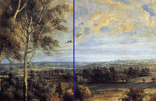
Peter Paul Rubens: 'A View of Het Steen in the Early Morning', 1636. Oil on Oak. 131 x 229.cm. National Gallery, London

In front of Het Steen

Behind me a large French youth is lying full length on the bench, earphones on and singing. Next to him, two equally disengaged young men, equally French; all are wearing sportsgear for the non sportif. They comment loudly on the girls that pass. They have yet to turn round and see the Judgements of Paris. I suspect their reaction would be similar to the primary school boys who have just passed, their hands over their mouths, pointing and giggling.

Peter Paul Rubens: 'A View of Het Steen in the Early Morning', 1636. Oil on Oak. 131 x 229.cm. National Gallery, London. Detail The Trees

The Trees

The small group of six trees in the foreground island, are reminiscent of a group of people, standing tall. The oak on the left proud and straight, the birches in the centre: lounging, and the birch on the right swaying gently.

I am surrounded by people standing – to look at the art – apart from the lolling French behind. Many viewers take the attitudes of the outer left and right trees. It is only the young in groups who lounge and lean. Do we take the attitude of that we look at? More noticeable when looking at standing figures perhaps, adopting the pose of the Arnolfinis; that sort of thing.

Peter Paul Rubens: 'Landscape with St George and the Dragon', 1630, oil on canvas. The Royal Collection

Pathetic Fallacy

The blasted tree in the ‘Landscape with St George’ now in Tate Britain reflects this sort of ‘pathetic fallacy’ approach, as incidentally do the trees in the later ‘Judgement of Paris’.

Rubens: 'The Judgement of Paris', 1632; Oil on canvas, 139 x 174 cm; National Gallery, London

Those to the left, with the clouds generated by the Goddess of Discord are dark and distorted and forked, echoing the shapes of the Goddess. The tree around which Hermes and Paris and their bovine dog are wrapped, is clean limbed and brightly lit.

Peter Paul Rubens: 'A View of Het Steen in the Early Morning', 1636. Oil on Oak. 131 x 229.cm. National Gallery, London

The scale of the trees in Het Steen really does not fit the figures. Judging from their foliage and form these are mature trees. Yet, stood beside them, the carter or his passenger would reach about half way up the trunk; implausible.

The Tree Question

Is it possible to be a self-conscious painted tree, a form that draws attention to itself?  A question that is not quite as footling as it sounds. Such a question assumes that painted forms in their painted world have mass and agency within that illusory space. A world in which the usual laws of physics, those from our side of the picture plane, still operate.

Perhaps other human traits also apply, the jeunesse dorée behind me clearly believe they are objects of interest. They have positioned themselves and behave to draw attention; admiring attention they assume. I do not share their opinion, but I am in the minority. Their belief, to watch the huge numbers of European and British young moving through the gallery, is shared.

 I wonder if the similarity I see between the composition of the trees and their anthropomorphic nature, comes from proximity. Apart from upright humans standing in front of them, they are flanked by triads of painted standing, naked women. Three goddesses confident in their nudity, conscious of being seen by Paris and Hermes, but not perhaps by us the viewers, or by aggressive young Frenchmen or giggling London primary schoolchildren. Is it possible to ask the question: are the trees in Het Steen aware that they are being watched, without putting my hand over my mouth and giggling?

The Tree Question: Context

The tree question presumes that we read a single standing form as part of a history of single standing forms. Rubens was a classicist, he would have known both something about Greek and Roman statuary and Vitruvius’ descriptions of the classical column as different forms of human figure.

The Classical Orders: Greek and Roman

Here, in these trees we have everything from Doric (the sturdy ‘male’ Oak) through Ionic (the curving birch as a young slender and female) through to Corinthian (The swaying birch on the right as the fuller female figure). John Summerson’s ‘The Classical Language of Architecture’, (Thames and Hudson) is very useful on all this by the way. Rubens would also have been aware of the general belief that Classical stone architecture was derived from wooden building techniques; we are looking at the painting of a building after all.

The Tree Question: Nonsense

But, of course this is all fanciful. The building is Flemish vernacular, look at the stepped gables,
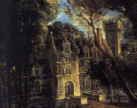
Peter Paul Rubens: 'A View of Het Steen in the Early Morning', 1636. Oil on Oak. 131 x 229.cm. National Gallery, London. Detail Het Steen itself

the only classical references are textual; to Virgil and Horace. The trees are, as I have established earlier, just stock trees from the painters studio repertoire, no reference to anthropomorphism here at all.

More French youth have appeared, an army of them, enough to stock a re-enactment of Delacroix’s ‘Liberty Storming the Barricades’ though without the bare breasted Liberty, much to the disappointment of those on the bench behind. Like Delacroix’s painting the young folk around me are also stock characters, gum chewing, unshaven, louche and aggressive, time to go.

Peter Paul Rubens: 'A View of Het Steen in the Early Morning', 1636. Oil on Oak.131 x 229.cm. National Gallery, London

Late night Friday opening at the National Gallery, on the bench in front of Het Steen.

The way pictorial space is organised, the route through the painting that the viewer walks, conceptually as it were, creates our reaction as much as the iconography and the figures. The rectangular surface of this painting appears (almost) to divide into two equal squares.

 The dimensions are 131.2 x 229.2 cm, so in fact each ‘square’ is 131.2 x 114.6. Nonetheless, there is a possible vertical axis, at the central join of the two squares. It goes up between the lines of the silver birch trunks and bisects the two birds, just touches the right hand branches of the of the silver birch on the raised circular area. Each ‘square could be a complete painting in itself, one contains pure landscape, the other contains the house etc.

It seems to be Spanish visitor night in the Gallery, lots of leather handbags and jackets, large family groups with large shopping bags labeled with large names of west ends shops. The Spanish woman behind me has, at last, finished her phone call. Mostly it consisted of ‘Si, Si, Si’ in a manner reminiscent of Sybil Falwty’s ‘Oh I know, I know, I know’

Peter Paul Rubens: 'A View of Het Steen in the Early Morning', 1636. Oil on Oak.131 x 229.cm. National Gallery, London. Detail Horizontal Axis

A horizontal line of light and shade runs across the painting, approximately half way up; although none of these putative lines are exact. This doesn’t just apply to the surface, but divides the structure of the space into quarters

Peter Paul Rubens: 'A View of Het Steen in the Early Morning', 1636. Oil on Oak.131 x 229.cm. National Gallery, London. Detail Numbered Quarters

A contains all the figures

B contains the house

C contains the sky and mid and background

D contains foreground  and the milkmaid with cows and the oversized ducks.

Not much else is organised around these axes. You might for example expect the tower on the horizon, (the Cathedral of St Rombout in Malines) to mark the point where the vertical axis touches the horizon.

Peter Paul Rubens: 'A View of Het Steen in the Early Morning', 1636. Oil on Oak.131 x 229.cm. National Gallery, London. Horizon Detail

Or that the tower would be balanced by something on the left, equidistant to the vertical axis; but it isn’t. You could say that the vague branch of the of the silver birch dropping down at about 45 degrees, just touching the horizon, is that balance but I don’t think so, do you? You could say that the orthogonal made by the right hand ditch, just below the milkmaid and cows, will join the horizon where it is bisected by the possible vertical axis.

 As, by the way, does the almost exactly symmetrical orthogonal line made by the front of the house. This again starts from the upright side of the canvas at the same point as it’s symmetrical twin. It cuts the horizon at the same point, where the vertical axis and the orthogonals meet; just about.

A young Spanish couple next to me on the bench are trying to organise English terms,

‘With you…With me…You say I go with you…You come with me…We go on this tour”.

There is much hesitant repetition. Each time they get a phrase right, they kiss. An improvement on my own French language education with Monsieur Hervé. If we declined wrongly he would hit us, rhythmically in time with the right stresses as he repeated the correct form. I can still spell ‘old’ in French as a result, and it still hurts.

In ‘The Science of Art’, Martin Kemp points out that Rubens knew his perspective systems well, although he didn’t use them in an obvious manner. With a bit of effort you could say that underneath this bucolic autumnal dishevelment are some careful pictorial structures.

Peter Paul Rubens: 'A View of Het Steen in the Early Morning', 1636. Oil on Oak.131 x 229.cm. National Gallery, London. Detail Orthogonals 2

Even more debatable, look at the equilateral triangle made by the fallen trunk, you could say that the dominant lines are parallel with the orthogonals of the ditch and house. Above, as you travel up the vertical axis, is another meeting of orthogonals made from the lower of the ditches and a line formed by the angles of the horses hooves and cart wheels. I.e. a herringbone pictorial construction, that system of depth projection that preceded linear perspective. But in this case, unlike for example the Veronese I was looking at in an earlier post, I think this interpretation would be over-reading the visual evidence.

We can say is that the underlying structure creates a calmness and a logic to the pictorial space, which could otherwise be over-ridden by the figures in the bottom left quarter.

At this point a Spanish couple stand in front of the painting, one behind the other and both exactly on the vertical axis. He is very tall, his face very close to the picture surface. The top of his bright, bald spot, haloed by dark hair just touches the horizon. She is much shorter, her head directly below his, so that where his thinning hair stops hers starts. She is wearing a large brown leather coat that obscures their bodies and she is perfectly positioned so that his legs are obscured also. All I can see is the back of two heads in exact vertical alignment. His head is shining like an extra sun, placed where a less successful painter than Rubens might have positioned a painted version, centre stage.

By now all the other Spaniards seem to have gone, to shops and bars and restaurants. Behind me, a couple have been having a quiet and intense discussion for some time. Something about it is increasingly unnerving, and I can’t work out why. Then I recognise the language, they are speaking in Danish. After two series of  The Killing, I associate that sound, those characteristic stresses and language forms with fear, anxiety and rain. All the suns in the painted world in front of me cannot dissolve that association; time to go.
A young man is unhappy, as he speaks into his phone I gather that he has left his tent on the train; he is carrying two large rucksacks. He was expecting to sleep in the tent which must, by now, be half way to Ramsgate. It is late Friday afternoon on a small, rural station, the ticket office is closed. He had not obeyed the constant instruction:

“TAKE ALL OF YOUR PERSONAL BELONGINGS WITH YOU WHEN YOU ALIGHT AT YOUR NEXT STATION STOP”

Sympathy for the poor man without his weekend shelter prompts thoughts about our minimum requirements; what are the key elements of ‘home’? Do we always carry ‘home’ with us?

National Schools?

I have just come from a talk by the President of the Royal Academy to a group of schoolchildren. I had been about a National School of Art, a founding function of the Royal Academy. Afterwards a GCSE student asked the Pres about Tracey Emin, he was very appreciative of her time and commitment. He did not discuss whether she was, in fact, part of the new National School he was supposed to promote. Is such a collection possible or desirable in a complex, multicultural world? ‘National’ presumes a homogenous culture, a shared view of the land we share. We all share the same sky as the old posters used to say, appreciation of soft, British light might characterise those who struggle to represent its landscape.

National Characteristics: Light

It is grey and cold and drizzling on the platform, the light levels are low. Two girls are standing, half way along, towards the front. They face each other and bob slowly up and down in exact time, knees not quite touching. Just before the train arrives, the sun briefly appears on the horizon, it silhouettes the two gently rising and falling figures

What else might allow us to think of home as a set of shared national characteristics?

National Characteristics: Channelling your inner minor official

Time on public transport brings to mind that national inability to operate or cope with minor authority. Give any British man or woman a cap, a radio, a low level position of importance and we become instantly unbearable, we suppress individuality and joy in ourselves and others. That overwhelming British urge to stop someone enjoying themselves. Is that a recognisable icon on our national desktop?

This morning, on the bus, the new driver did not know the way. The driver made it as clear as he could that it was the passengers fault, we in turn did not help, did not show him where to go. He was lost and grumpy in charge of a double decker bus on winding country lanes; we were on a rudderless ship.

National Characteristics: Making it Big

As I watch the tent-less man, I can see another familiar theme on the pull down menu; sat on a bench is a young man on his mobile. He wears a vivid red and white shiny tracksuit and a crisp, purple New York Yankees baseball cap, the price ticket in dollars proudly displayed. His accent though is clearly local as he continues a monologue about his sexual successes. Could such a fidgety, awkward youth, blessed with such poor, pale skin expect his listeners to believe his spectacular history?

St Jerome

A small painting in the National Gallery shows a different conceptual desktop,

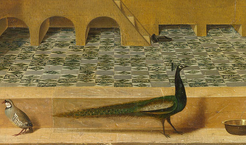
Antonello da Messina: 'St Jerome in his Study', 1475. oil on panel. 46 x 36 cm. National Gallery, London

it is ‘St Jerome in his Study’ by Antonello da Messina painted, probably about 1475. The saint is symmetrically framed by a stone portal, a frame within a frame. A peacock, a finch and a perfectly elliptical water bowl stand outside the illusory stone frame. The saint sits reading inside a Gothic nave, in profile, in a wooden carrel; a rather complicated piece of furniture centred on a desk. Shelves surround him with carefully placed significant objects (including a cat. Notice by the way, the saint’s attribute, the lion in the arcade on the right). We can see landscape through the clear windows (no stained glass) to his left and right and sky with birds in the windows above.

Georges Perec

As Georges Perec points out in ‘Species of Spaces and Other Pieces’ (Penguin Classics 2008, page 87)

“The whole space is organised around the piece of furniture (and the whole of the furniture is organised around the book). The glacial architecture of the church (the bareness of the tiling, the hostility of the piers) has been cancelled out. Its perspectives and its vertical lines have ceased to delimit the site simply of an ineffable faith; they are there solely to lend scale to the piece of furniture, to enable it to be inscribed. Surrounded by the uninhabitable, the study defines a domestic space inhabited with serenity by cats, books and men.”

Space within Space

Antonello da Messina: 'St Jerome in his Study', 1475. (Centre Detail) oil on panel. 46 x 36 cm. National Gallery, London

This painting features spaces within spaces within spaces, from the stone doorway, to the rectangular box shelves, the carrel itself with the stone box of the church, the tunnel of the arcading on the right and the different heights of the horizon through the two lower windows. An idealised landscape, the familiar notion of paradise in the types of Northern European art that had so clearly influenced this Southern European painter. Look for example at the view in Van Eyck’s ‘Madonna with Chancellor Rollin’.

Jan Van Eyck: 'The Madonna and Chancellor Rollin', 1437. 66 x 62 cm. Oil on Panel. Louvre, Paris.

 Antonello’s left hand landscape view does, coincidentally I presume, bear strong similarity to the methods that Poussin would later use to represent small towns, eg in ‘Landscape with a Snake’.

In his writing, Perec has organised the species of spaces so that each section works outwards starting from ‘The Page’ and ending with ‘Space’. Reminiscent of that schoolboy address that starts “If this book should dare to roam/ box it’s ears and send it home” and each further line moves from continent to hemisphere to planet to near space and ends with: The Universe. I’m not sure that I entirely agree with Perec that the ineffable faith is delimited. Look at the painting starting from the picture plane, the stone portal emphasises the world of the viewer on this side of that plane.  Go through the doorway and you enter the world of the spiritual mind (a series of interlocking themes and spaces within the overall temporal space of ‘The Church’); ineffable faith inscribed throughout each piece of iconography and the very way that the spaces are organised. Finally look through the windows; a release, a timeless space.

Note that the light from the windows has a different source to that (ordinary human space) which for example casts the shadow of the peacock.

Antonello da Messina: 'St Jerome in his Study', 1475. (Detail) oil on panel. 46 x 36 cm. National Gallery, London

Iconography

Penny Jolly has pointed out (Antonello da Messina’s ‘St Jerome in his Study’ : An Iconographic Analysis The Art Bulletin, Vol 65 No 2 (Jun 1983 pp 238-253) that each of the painted objects fit into a complex ‘iconographical program’ as characteristic of Flemish art as his use of painting media (traditionally Antonello was the first Italian artist to introduce oil paint to the South, although this is now disputed).  The iconographic references tend towards associations with the Virgin Mary, as Jolly points out the composition and arrangement of St Jerome owes something to paintings of the annunciation. The towel (although used), the bowl of water, the trees referring to walled gardens and so on; all these are, or could be, disguised Mariological symbolism.

Jolly assets that the right hand landscape is the uninhabited wilderness Jerome lived in as a hermit, and the left hand view, with it’s proximity to the cat, (sexual temptation/ erotic associations etc) shows a view of the city associated by Jerome with wordliness.

Antonello da Messina: 'St Jerome in his Study', 1475. (Centre Detail) oil on panel. 46 x 36 cm. National Gallery, London

Close examination doesn’t quite prove this, the city could of course be Jerusalem: “Do you keep your windows open on the side where light may enter and you may see the City of God” as Jerome said in Epistle 22. 

And, the right hand side looks closer to the sort of organised agrarian landscape you can see in the right side of for example, the effects of Good and Bad Government in the Town Hall in Sienna.

Ambrogio Lorenzetti: 'The Legend of Good and Bad Government (Good Government in the Country)1337-9, Fresco, Sienna.

Painted Space

Like most art historians, Jolly concentrates on de-coding iconography and says little about the composition of pictorial space, usually a figurative artist’s overriding concern.    A carefully placed series of spaces, containing other spaces, the pictorial logic holds throughout; it is convincing, rational, planimetric. The Carrel and its contents, including the saint are parallel to the picture plane. It has for example, none of the oddities of later Florentine Mannerism,

Jacopo Pontormo: 'Joseph with Jacob in Egypt', 1518, oil on panel, 96 x 109 cm. National Gallery, London

try looking at ‘Joseph with Jacob in Egypt’ by Pontormo (expressing perhaps something of the nature of dreams fundamental to the story, certainly of the mysteries of death fundamental to the parts of the story shown here and the style.,

Lorenzo Monaco: 'Coronation of the Virgin', 1414, egg tempera on panel. national Gallery, London

Or the absolute rigidity, pictorial and ideological, of early Renaissance images such as Lorenzo Monaco’s ‘Coronation of the Virgin’. The way each painted area interacts with another is as much part of the meaning as the precise signification of the peacock (“symbol of celestial immortality and incorruptibility” Jolly p 240).

Perec as, I suppose, a Twentieth Century Modernist sees Jerome driving his desk into infinite space, as it were. Doesn’t the composition, with its sequence of steps and arrangement of layers, work the other way?

Antonello da Messina: 'St Jerome in his Study', 1475. oil on panel. 46 x 36 cm. National Gallery, London

Like Jerome, we have to start at the door outside the box, a box we might call home. Note that he has come from outside, he has taken off his hat, his own cap of office, minor officialdom plays no part here. And , we know that he is now on holy ground because, in common with so many other Flemish paintings, he has taken off his shoes. Grasp hold of the significance of these wordly goods, and there are many of them around him, to arrive at the calm centre. We have to examine the objects that make up our ‘home’, study their relationships guided by a key text, before we can look out of the window to paradise.

I try to do this on the train home, but the image of the poor young man, still trying to track down his tent as the batteries fade on his phone, and the monotonous insistence of the red suited would-be sexual athlete who boards the train with me, make looking out of the window in a contemplative mood, difficult.

Peter Paul Rubens: 'A View of Het Steen in the Early Morning', 1636. Oil on Oak. Oil on oak.131 x 229.cm. National Gallery, London

It is half term; the National Gallery is full of enthusiastic parents with reluctant children, occasionally vice versa. I have just come from the Courtauld Gallery, partly to see the Ben Nicholson/ Piet Mondrian exhibition, also to visit old favourites: Manet’s ‘Bar at the Folies Bergeres’; Rubens ‘Deposition’ etc.

In front of Rubens landscape: Het Steen, it occurs to me that you could make a strong case to say that Mondrian, even late Mondrian, is also about landscape, certainly about ‘Nature’. As Mondrian wrote:

“It took me a long time to discover that particularities of form and natural colour evoke subjective states of feeling which obscure pure reality. The appearance of natural forms changes, but reality remains. To create pure reality plastically, it is necessary to reduce natural forms to constant elements of form, and natural colour to primary colour. The aim is not to create other particular forms and colours, with all their limitations, but to work toward abolishing them in the interest of a larger unity.”

Much of De Stijl’s philosophy came from splendidly esoteric stuff, like this from Dr. Schoenmaeker:

‘The two fundamental, complete contraries which shape our earth and all that is of the earth, are: the horizontal line of power, that is the course of the earth around the sun and the vertical, profoundly spatial movement of rays that originates in the centre of the sun.’

(‘Principles of Plastic Mathematics’, 1916)

Or from Theosophy, another search for deeper realities largely inspired by the engagingly dubious Madame Blavatsky. Before discovering the lucrative forces of the mind, she is supposed to have been a trick rider in a circus, a piano teacher, and manager of an artificial flower factory. An exposed ex-Spiritualist, apparently descended from Russian nobility, she mixed Western and Eastern mysticism by claiming direct contact with the Goddess Isis. Her writings and teachings were hugely successful and influential, although largely plagiarised. Mondrian later played down the importance of such fakery, but at the time it provided a philosophical underpinning to early De Stijl.

Moving from Cezanne’s ‘Monte Sainte Victoire’ of 1887,

Paul Cezanne: 'Monte Sainte Victoire', 1887

to Mondrian’s pre-American abstractions, e.g. ‘Composition C (no.III), with Red, Yellow and Blue’, 1935

Piet Mondrian: 'Composition C (no.III), with Red, Yellow and Blue’, 1935

and then back to my bench in front of a Flemish autumn landscape, it seems logical to ask if there any obvious similarities, apart from the fundamental theme: man and nature. I would suggest that that ‘Monte Sainte Victoire’ is closer to Mondrian, or the other way round, than it is to Het Steen. The clue to that closeness, to developing Modernism as a whole I suppose, is in their relationship to the picture plane.

Rubens, like all artists before…before when? Manet and the theatrical flatness of ‘Dejeuner sur l’Herbe’, or more likely, Cezanne’s posthumous retrospective at the Salon d’Automne, Paris in 1907. This was where artists like Picasso and Braque picked up the threads that would lead to a pictorial form (Cubism) that was entirely about relationship to the picture plane.

Incidentally, after seeing the ‘Picasso and Modern British Art’ show at Tate Britain, one would have to agree with Wyndham Lewis that Picasso was entirely studio bound. I still think Lewis was little more than an illustrator, a maker of posters to illustrate the importance of Wyndham Lewis in fact, but in that observation he points his finger exactly at Picasso’s limits.

“So, what are we meant to be looking at Mum?”

I think, we need to think about what we want to see next. Right, are we ready? Shall we move on?”

Back to Cezanne and Rubens. Both paintings involve receding planes, framing trees, natural forms at specific angles under light. The earlier artist as you might expect, apparently ignores the picture plane; like all those brought up on the mathematical construction of pictorial space.

Leon Battista Alberti: ‘De Pictura and Elementa’ 1518, from 1435

This world is designed to physically position the viewer, the agency (as it were) happens on both side of the vertical non existency. Whereas Cezanne’s pictorial space is composed of horizontals and verticals that work in exact parallels with the picture plane. That parallel format means that nothing is projected beyond it, the space stops dead at the plane. We can view it from any position, but that is all we are doing: viewing.

“The new vision… …does not proceed from a fixed point. Its viewpoint is everywhere, and not limited to any one position. Nor is it bound by space or time”

Piet Mondrian.

Peter Paul Rubens: 'A View of Het Steen in the Early Morning', 1636. Oil on Oak. Oil on oak.131 x 229.cm. National Gallery, London

In Het Steen, the verticals (the trees, the house) and horizontals (lines of the ditches, shadows) operate in relation to the space and the presumed viewer enclosed within that space. They curve according to the depicted topography, the painted world, it seems, precedes our viewing of it. Whereas in ‘Monte Sainte Victoire’ the artist is imposing a method of viewing upon the subject, and that method becomes the subject.

Paul Cezanne: 'Monte Sainte Victoire', 1887. 67 x 92 cm, oil on canvas. Detail

Look at Cezanne’s famous ‘passage’, the repeated, parallel, hatched brushstrokes, strokes that refer us to process, to flatness, to the art work. In Het Steen, brushstrokes (where they are visible) are mimetic, they curve around forms; the curve varying according to what is seen, not how it is seen. Rubens does use parallel brushstrokes, for example blue transparent lines in the willows in the mid-ground, but then, that is how willows grow. Look at the sky above the mountain, Cezanne’s ‘passage’ tells us about the visual tension between two painted horizons/ edges (of the tree and the mountain) and their relationship to the top and sides of the painted canvas. We might also think that this relates to climactic conditions, heat haze for example, but after carefully looking I would suggest structure of the painting comes first.

“O que bello!

“Mamma, Andiamo?”

“Bello”

“Mamma, Andiamo!”

“Uno, Duo, Tre, Hup”

Rubens methods are of course, equally stylised, the intention of his stylisation is to make an apparently neutral world, a world in which each painted space operates to rules we can easily understand. Whereas Cezanne is measuring the distance from each part of the view to…? I used to think it was from each part of the view to the artist’s eye, but after a while in front of this particular Monte Sainte Victoire, I rather think it is from the view to the picture plane.

Next to me, a young Asian boy of impressive width is playing a game on his phone. The game appears to involve building towers, or perhaps cranes. He builds them in a series of different settings, buildings grow as he taps the screen, swiping from right to left with his little finger. Every now and then he does something to collapse the whole scene and start a new one. Sometimes it is at sea, sometimes on land, sometimes mountains.

He changes to a cyclist pouring down narrow bridges across torrential rivers and mountain chasms. The bridges run directly into the picture plane exactly in the centre of the phone screen. The bridges have breaks in them and with his little finger he must make the cyclist jump, or plunge into the abyss. It is all very exciting and he has not looked up once.

I look upward and notice that we are surrounded by small beings with names like Giles and Charlotte and Harriet. Giles is, oddly, given that is about 1 degree outside and drizzling, wearing a light straw hat, large bushes of blond hair push out beneath it, enough I think rather grumpily to spare for those of us of a slightly older vintage; time to go.
“Take all of your personal belongings with you” a phrase constantly repeated in all train announcements, spoken in the indignant tone of a teacher at the end of a long day. Like bored students, we commuters are irritated and indifferent. Apart from pedantic annoyance at the tautology: what is an impersonal belonging I wonder? This phrase prompts other thoughts: what is the nature of belonging anyway? The notion that we need to belong, to be a part of various forms of wider human association is a common one:

“All objectifying knowledge about our position in society, in a social class, in a cultural condition and in history is preceded by a relation of belonging upon which we can never entirely reflect. Before any critical distance, we belong to a history, to a class, to a nation to a culture, to one or several traditions”

Ricoeur, Paul. ‘Hermeneutics and The Human Sciences’, ed and trans by Thompson, JB. Cambridge University Press, 1981. Page 243

 Belongings, personal or otherwise, define us and how we belong. The role of belongings as a means of thinking about who we might be and how we relate to each other and our future, spiritual or physical, is common in art, from Vanitas to Van Gogh’s twin paintings of chairs, to physical beds in galleries to pots with words and pictures on them.

Paolo Veronese: ‘Christ Healing a Woman with an Issue of Blood?’, 1548, oil on canvas 117 x 163 cm National Gallery, London

This painting in the National Gallery brings some of these points together. I have been puzzled by it for a while. It is apparently by Paolo Veronese, yet it is small with a strong Mannerist style.

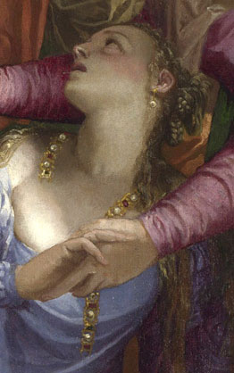
In the centre of painting a young woman in a light blue top showing a fair amount of chest and a mustard yellow, voluminous skirt, has collapsed to the ground. In her right hand is both, a broken necklace (or possibly a string of jewels wound from her hair) and the hand of the woman behind her, we can just see the other end of the necklace appearing on the right of her neck. She is being supported by that hand holding woman in red and green behind, who also manages to point at Christ at the same time. Christ is making some sort of blessing gesture, his right hand pointing downwards. Surrounding these three are large numbers of figures, most of them look towards the young woman.

Paolo Veronese: 'Christ Healing a Woman with an Issue of Blood' detail of Fallen Woman

The action seems to take place in a shallow pictorial space, a lobby with the fluting of large classical columns (Greek Doric) visible behind. There is an open portal to our left, a dog’s head and the back of a nude boy is framed in it and behind, columns (Ionic)  appear to flank a circular opening, a figure is looking down, which makes the viewer suppose we are at least one storey high, a small crescent of sky can be seen.

The Subject: Belonging, Composition and Types of Perspective

There is some debate about which Biblical story we are looking at, and that is where the notion of belonging comes in I think. The collapsed figure is tended to by the woman beside her and, presumably, by Christ. The man with the book to her left and the man in green behind him look less keen. It is the breaking of the necklace, the losing, or indeed loosing, of her personal belongings, the string of jewels, that either sparks off this whole event (whatever it may be) or symbolises it. Although small, that jewellery is centre stage, and this is a very stage-like frieze of figures. We know that Veronese intended this to be so, by simple Early Renaissance devices. She is positioned exactly on the vertical axis. Look at the pavement on which the figures stand, follow the orthogonals (parallel lines that lead to a vanishing point) created by the darker pink bands leading into the pictorial space. At first sight, they appear inconsistent, although they all point to the necklace and more specifically to the broken section below the two clasping hands of the women. If you look at the orthogonals on the image below,

Paolo Veronese: Christ Healing a Woman with an Issue of Blood?', 1548 oil on canvas. 117 x 163 cm with orthogonals

you will see that they appear to be reminiscent of a ‘herringbone’ pattern, in which the parallels meet symmetrically in mirror fashion on a descending vertical axis, rather than converging to a single vanishing point. Erwin Panoksky in the Introduction to ‘Early Netherlandish Painting’, and also in ‘Perspective as Symbolic Form’ (Section II), describes the herringbone pattern (or vanishing axis perspective) as deriving, ultimately from, classical painting (Greek vases and Roman murals, usually for things like roof beams). It is also the mediaeval precursor to the fully fledged linear perspective discovered by Brunelleschi in the early 1420’s. The obvious question is this, why does a young, very proficient artist in the middle 16thCentury use such an archaic device? The answer must lie in the way that the artist directs the eye towards the string of jewels. The series of vanishing points continue the line and form of that broken string, a line that falls, deliberately, exactly on that vertical axis. It is like a big arrow: look this way.

Before its first showing at the National  Gallery (1876) this painting was assumed to be ‘Christ and the Woman Taken in Adultery’, when Christ asks the Pharisees who are about to stone a woman to death ‘He that is without sin, let him cast the first stone’. Once on public display it was then assumed to be ‘Mary Magdalene Laying Aside her Jewels’, although there is no biblical text for such an image. A recent article (By David Rossand in The Burlington Magazine: ‘Veronese’s Magdalene and Pietro Aretino’, June 2011) has again suggested that this is indeed the Magdalene, if so where are her other attributes, the jar of ointment perhaps? Is this where the nude boy, (who must refer to Cupid) and the dog (to fidelity?) fit in to the narrative?

Analysts in the 1990’s proposed the current title, the story of the sick woman (the issue of blood) grasping hold of Christ’s clothing in a crowded place, convinced that he can heal her, convinced of her faith, he does so. This is a painting by a young man, about 20 if the dates are right, young Veronese copied Parmigianino’s drawings which would explains the Mannerist style; the elongation of the figures and their serpentinata poses.

Belonging to?

What sort of community, what sort of belonging are we being shown? What does the book, so lightly held by the white cloaked man, contain? What? Rules? Or the names of transgressors? Christ’s New Testament?

Paolo Veronese: 'Christ Healing a Woman with an Issue of Blood' String of Jewels detail

That string, look at the shape it makes, firstly that shape resembles the arrangement of key figures around the fallen girl and Christ a swirling open form, close to a spiral. Secondly, although it is probably a coincidence, the shape of the string is a question mark. Apparently the forms of punctuation didn’t really settle down until the full acceptance of printing; about the beginning of the 16th century. So we cannot assume a common usage of the question mark in 1548, but as a means of highlighting our, contemporary difficulties with the narrative, that question mark is perfect, her ‘personal belongings’ falling across her chest point exactly to the heart and the uncertainties of the story

This is a woman who is either losing her place, her ‘relation of belonging’ as Ricoeur put it, to a particular community. Or, she is being welcomed into it by the central charismatic figure, against the misgivings of others perhaps because of past transgressions. There is enough evidence to support either supposition. But, I would favour the latter, the spiral of figures around her and Christ is not dissimilar to the disordered and broken circle the fallen woman holds in her hand. That similarity surely indicates parallel ‘relations of belonging’

The Space within the Space

There is more evidence in the formal arrangements, in the composition of the work. Behind, through the opening, is a presumed architectural circle, a perfect form.

Paolo Veronese: 'Christ Healing a Woman with an Issue of Blood' Detail of Inner Space

As always a separate space within the pictorial space of a painting (often a window, in this case the brightly lit circular architectural form on the left) has a narrative and a formal function. Formally, it relieves the claustrophobia of the foreground; it allows Veronese to make a scene that is dark, crowded and intense, without making it overpowering and awkward. Put your hand over the lit inner space and the other forms become incoherent and overheated; frantically boiling melodramatic emotion. Add the calmness of pale circular forms, receding verticals and the tiny crescent sliver of blue gently echoing the curves beneath it, and you have an ordered space of reason (perfect geometric forms like the circle) and light.

Paolo Veronese: 'Christ Healing a Woman with an Issue of Blood?', 1548, oil on canvas 117 x 163 cm National Gallery, London

In narrative terms, we must assume that the lighting and simplicity of this inner architectural space relate to Christ, i.e. a temple. He is after all, the only clearly identifiable figure in the work and as such is nearest to the opening. (“In my Father’s house are many mansions: if it were not so, I would have told you. I go to prepare a place for you.” John 14.2). This fictive architecture seems a mix of Bramante and Palladio, there is something of the ambulatory of The Redentore in Venice, or the first floor of the cloisters at Santa Maria della Pace in Rome about the arrangement. Not much though, the cloisters are rectangular, Corinthian and Veronese had not been to Rome and didn’t work in Venice until 1551. Nonetheless, as Nicholas Penny points out in the National Gallery Catalogue (Sixteenth Century Italian Paintings Volume II) he came from a family of masons and had worked with Michele Sanmichele, the great Veronese architect and to whom this section might relate. Despite Penny’s point about the closeness of the intercolumniation in the lobby, Veronese was a man who therefore knew his high level architecture and putative meanings. This little painted fragment shows classically inspired architecture of order and rationality, note that it is Ionic, the next step up the Architectural Orders from the Doric of the lobby area; that inner space is a sanctum, a temple, a spiritual destination. Stick with the man in the halo and that is where you will get to. This is the destination of that clustered community around him, that group of people belonging to each other, as opposed to disapproving and disorder to the right of the painting.

Veronese knew what he was doing

I think we come to the supposition that, if Veronese had wanted to specifically and clearly identify the fallen woman, he would have done so. He knew, or would come to know, exactly how to play with notions of identity in paintings.

Paolo Veronese: 'The Family of Darius before Alexander', 1565-7. oil on canvas, 236 x 475 cm. National Gallery, London

Look at his vast painting of the ‘Introduction of the Family of Darius to Alexander’ 1565-7 with the famous misidentification by Darius’ mother, Sisigambis when she mistakes Hephaeston for Alexander. Veronese made this sort of thing one of his key themes. Had he wanted us to know who was who in this smaller, earlier painting he would have done so. I suspect though, rather than setting up complex puzzles for later art historians, it was an ambitious young artist widening his opportunities. The wider the field of identifiable characters, the greater possibilities for future commissions.

Back to the train gang

Sadly though, in my case travelling on a packed afternoon train, wedged into a narrow seat by a large man steadily eating a reeking and noisy packet of crisps, there is no possibility of rescue to a glorious inner sanctum, not even to the empty First Class seats. Opposite me, a man in a black leisure wear sporting a black baseball cap, with BENCH printed asymmetrically across it, has been trying to buy a double garage over the phone. He is having trouble explaining what he wants, no matter how many times he repeats himself (7 metres by 5 metres with double doors and a shingle roof) whoever takes his calls cannot help. Does a garage come under the heading of a temple, a place of calmness and rational order: that’s a shed isn’t it? A shed is where you put all those ‘personal; belongings’ that have no obvious place to be, but you can’t bear to part with, unless of course you have left them on the train.

Peter Paul Rubens: 'A View of Het Steen in the Early Morning', 1636. Oil on Oak. Oil on oak.131 x 229.cm. National Gallery, London

“Shrines to me embody the essence of what I do. I put significant artefacts in a special place for us to contemplate upon…As humans I think how we look at art has developed from the way we look upon gods, altars and relics in shrines and sacred spaces”

Grayson Perry wall text from ‘The Tomb of the Unknown Craftsman’ British Museum.

 My memory of Catholic worshippers in front of shrines, is that they (usually women) either make a quick bob, cross themselves and move on or, they kneel for a long time in silent contemplation, sometimes accompanied by quiet recitation. The characteristics of Room 29 of the National Gallery, London, in front of the Rubens ensemble (the two Judgements of Paris and Het Steen) are movement and discussion. Everyone is transit, pairs and groups stop, point and discuss key features. I suppose it depends on what our relationship with the gods might be – amused tolerance, or wariness perhaps

Cavafy wrote about that relationship:

One of Their Gods

When one of them moved through the marketplace of Selefkia 

 just as it was getting dark— 

moved like a young man, tall, extremely handsome, 

with the joy of being immortal in his eyes, 

with his black and perfumed hair— 

the people going by would gaze at him, 

 and one would ask the other if he knew him, 

 if he was a Greek from Syria, or a stranger. 

But some who looked more carefully 

 would understand and step aside; 

and as he disappeared under the arcades, 

 among the shadows and the evening lights, 

going toward the quarter that lives 

only at night, with orgies and debauchery, 

with every kind of intoxication and desire, 

they would wonder which of Them it could be, 

and for what suspicious pleasure 

he had come down into the streets of Selefkia 

from the August Celestial Mansions.

C.P. Cavafy, Collected Poems. Translated by Edmund Keeley and Philip Sherrard. Edited by George Savidis. Revised Edition. Princeton University Press 1992)

 Or, do we in the North still feel Judaeo Christian awe, respect and fear? Is perhaps this constant movement a form of penance, moving between the Stations of the Cross?

The Gallery is unusually quiet this afternoon, the visitors mostly elderly. Sometimes when I am here in front of this Rubens collection, it is the landscape that draws attention, today it is the two sets of nudes.

 “I’ve got to have a sit down; it tires you out all this lot”

I suppose that, as an individual devotee in front of an icon, it’s visual representation is not important. St Cecilia is St Cecilia or St Luke is St Luke is St Luke. You need to check that you are standing in front of the right one, you make your obeisance and the job is done. Equivalently, you walk the rooms of the National Gallery, glance at the labels to check, genuflect and walk on.

 The elderly couple on the bench next to me have been here for some time. He is asleep and she has been reading the index of a large London A to Z, with apparent interest, since she sat down. Every now and then, she will turn to a different section of the maps as though to check what she has read. She is wearing a bright red fleece with ‘Nike, Just Do It’ written on it. The winged, wreathed, youthful Greek goddess of victory spurs on this tired figure, draped in contemporary leisure wear, to greater feats of cartographic research as her companion, firmly in the drowsy hall of Somnus (from Ovid), slips further under the influence of Morpheus .

 Cavafy wrote ‘One of Their Gods’ in 1917, thinking about that and the Greek Pantheon around me, leads to other responses to classicism. In ‘Quattro Centro’ way back in the 1930’s, Adrian Stokes (the art critic and painter) inspired by travels through Italy, made a distinction between carving and modelling. Art that has been ‘carved’ appears to work into the medium, (any medium, not just stone) to find new forms and imagery. As opposed to art that has been ‘modelled’, ie adding and moulding together that which is already known. Het Steen is clearly ‘modelled’; you can see how Rubens has worked his vast knowledge of pictorial space, of the hairy roundness of large vegetal forms, of the role, direction and intensity of light sources across a grand plane. A modelled space, his shaping hands have smoothed plastic forms with great sophistication and vigour.

 Two identically tall, enormously rounded, wonderfully crumpled viewers appear in front of the later ‘Judgement’. The lighting is such, that the painting and wall are lit up like a theatre set, these two are in silhouette and seem to outdo Rubens’ nudes with the plump pear shapes of their lower halves. But, it is the exact line across the top of these viewers heads and the almost exactly similar shapes of those heads that is most striking.

Hypnos has released his hold on my companion, he wakes up

“Come along then dear, we can’t sit here all day enjoying ourselves”

 People stand for a regulation amount of time in front of each painting, then briskly move on to the next. It reminds me of that early Twentieth Century diet fad called Fletcherism, (after Horace Fletcher, splendidly nicknamed ‘The Great Masticator’) when eaters had to chew each mouthful of food 32 times before swallowing; looking at paintings and 32 chews seem to share the same level of enjoyment.

 Or, perhaps we should view Perrys’ description of significant artefacts from a more utilitarian, economic, even traditionally Marxist standpoint. I suspect that Perry, like me, believes that the primary significance of these objects should come from their manufacture by artists. Their value comes from the shaping eye and hand (carving or modelling) of the maker and a complex relationship with context. I suspect that for the majority of viewers in museum, the significance of these works, their value, is primarily monetary. In essence when visiting a museum we are worshipping objects that matter because they are worth something, quite a lot of financial something. We are genuflecting in front of capital, validated by culture no doubt, but ultimately this constant foot traffic moves between the Stations of Croesus, genuflecting in front of shrines to celebrity cults and the goddess Verisimilitude.

 Two young boys with padded jackets shrugged down over their shoulders have started to recreate the dance from Thriller, worshipping a different sort of cultural icon, one of Them from the August Celestial Mansions; time to go.
Jan van Eyck: 'The Arnolfini Portrait', 1434, oil on panel. National Gallery, London

I’m stood in front of Van Eyck’s Arnolfini Portrait in the National Gallery, London, wondering why viewers queue so quietly to look at this image, and make such small gestures with their fingers, rather than run, talk loudly and wave as they do in front of others.

We, the viewers, seem to be caught in the doorway, or so the mirror tells us, although the composition might lead one to think that we are slightly closer to the couple. Are we, the internal spectators in our reflected complementaries, are we actually participating? Is there anything about the behaviour of the Arnolfini’s that makes any connection with us, apparently there in the room with them? They seem completely self-sufficient. We are anonymous witnesses, of the right social standing perhaps, but not active participants. Timeless witnesses perhaps with “a distinctive access to the content of the picture” as Richard Wollheim put it. Our access though is not to all areas. This is an, apparently, formal painting, as internal spectators we are not allowed through the velvet rope to the VIP area. The Arnolfini’s might defer to the court of Phillip the Good that is socially above them, but it doesn’t look as though they are going to let the future get away with too much familiarity. As far as they are concerned, they own the future, we will never be allowed beyond the door.

Our role in looking at this painting now, is not a passive one, (as Linda Siddel reminds us in, ‘Jan Van Eyck’s Arnolfini Portrait: Stories of an Icon’, Cambridge University Press, 1993) nor was it when it was made. Ultimately, this is a painting about relationships, between people of different ranks, of different genders, between people and things. It is a painting that stands at the beginning of capitalism, I’m sure that van Eyck was no more aware of social/ cultural/ political or economic change than any other literate and aware participant in the upper ranks of Northern European society. But, the relationship between these people tells us, at the end of capitalism, where we have come from. It doesn’t tell us through some complex arcane code known only to initiates, it tells us through the ways in which people and things interact. We understand these interactions by looking at them; something artists are good at doing.

Jan van Eyck: 'The Arnolfini Portrait' (detail), 1434, oil on panel. National Gallery, London

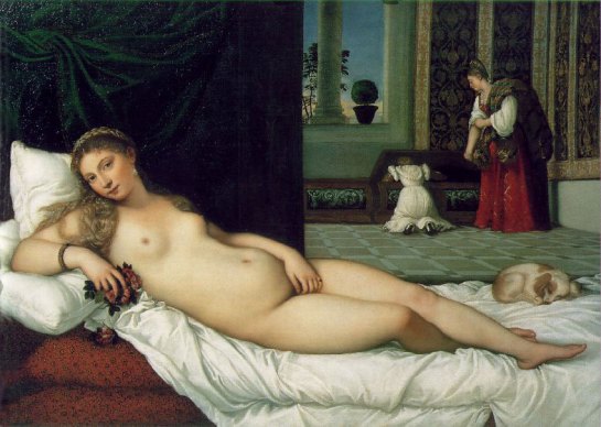
The figures in the doorway are clearly not a threat and they are known to the dog at least; it is not in guard dog mode. In the same way, the curled sleeping acceptance by the dog in Titian’s ‘Venus of Urbino’, tells us of the probable status of that viewer.

Titian: 'The Venus of Urbino', 1538, oil on canvas. The Uffizi. Florence.

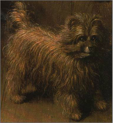
The Brussels Griffon in the Arnofini painting, a small expensive breed, indicates the notions of defence and power that a larger dog might display without the actuality

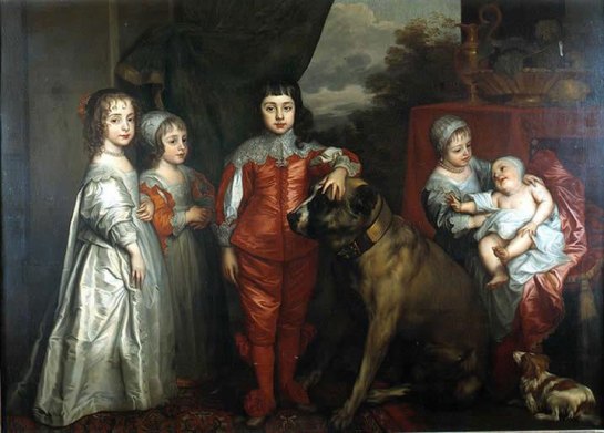
Anthony Van Dyck: 'The Children of Charles 1', 1637, oil on canvas. The Royal Collection

(Van Dyck’s portrait of the young Charles the Second with his hand on an enormous mastiff springs to mind) . It is a contemporary and ironic reworking of theme of guard dog; it is quite literally a toy.

Look at the Arnolfini dog’s mouth, it has the semblance of a smile (Jack Thomas in ‘Arnolfini: Reflections in a Mirror’, one of the many fictionalisations of the painting, devotes chapter 27 to the dog, calling it Hendrik). That turning up of the left hand side of the dog’s mouth, makes the viewer aware of the other mouths on show.

Along with strong verticals, the other dominant compositional arrangement in this painting is the upward curve of their joined hands. In his analysis of pictorial composition at the Bauhaus, Paul Klee made much of this type of arrangement. Lines or forms moving upward in an image move from ‘very bad’ to ‘very good’, in an arc points ideally related in tension create equilibrium, therefore harmony. A general shape we could call, simply, a smile.

Look at her mouth, on her left, the side closest to us, there is a highlight where the cheek meets the lips. They are a very cute, pursed pair of lips, idealised like much of her face; the eyebrows in particular. But look further at that mouth, the highlight can also be read as a smirk, her eyes might be solemn, fixed on a blank middle distance, but that is not a solemn mouth, she is thinking about something less elevated. Look again at his expression, look at his mouth, surprisingly full and sensual when you really examine it closely. Look at his eyes, they are, like hers, staring blankly. But, there is a turn to his left, towards her, in the position of those eyes. He is trying unsuccessfully, not to look at her. If you look carefully, he is not as old as that pallor might make one think at first, a pallor emphasised by all that ultra-fashionable black clothing. They are both pale, presumably underlining that, although they make money through trade, they are not artisans. His face is clear and relatively youthful, no lines, or fat or jowls,

Jan van Eyck: 'Portrait of a Man' 1433, oil on panel. National Gallery, London

compare with the man in the red turban to your left to see evidence that van Eyck can paint older male faces with great accuracy. Despite the need for formality and solemnity the eyes, of the Arnolfinis his in particular, appear to be sliding towards each other. This is a couple who can’t wait for everyone to leave the room.

Craig Harbison champions such an approach (in Chapter 4 of the ‘The Play of Realism’), like most other academics he over-determines the exactitude of the iconography, although I think his basic point stands: that there is a keen personal as well as a legal and financial relationship here. Ffor confirmation, look at the red cloth on the edge of the bed, see how it echoes the diagonal folds of her green dress and makes the parallel vertical folds of the hanging, potent, thrusting red bolster that much more emphatic.

A visual image, these are not literary, textual mysteries. This painting is far more straightforward than the professionals give it credit for. The details you are looking for, are those you would expect to look for when seeing a painting of two people entering some sort of relationship. These representations have the mass, and presence of figures, this is after all one of the earliest, full figure, standing double portraits of ‘ordinary’ people, therefore they relate to each other in the ways we might expect.

We respond then to the content, two people, but to come back to my original point, why do we respond in this particular manner?

“The entirely eccentric position of the central vanishing point reinforces the impression of a representation determined not by the objective lawfulness of the architecture, but rather by the subjective standpoint of a beholder who has just now appeared; a representation that owes its especially “intimate” effect in large part to this very perspectival disposition” (Erwin Panoksky: Perspective as Symbolic Form’, page 69)

If you are still not sure, watch how viewers behave in front of it. They stand, usually in couples, their poses unconsciously mirror those represented, like people falling into step as they walk together, or more likely people starting to adopt the accent of those to whom they are talking, and this painting does talk to us.

Peter Paul Rubens: 'A View of Het Steen in the Early Morning', 1636. Oil on Oak. Oil on oak.131 x 229.cm. National Gallery, London

Whereas, watch viewers in front of that other personal favourite: Het Steen, a grand painting about land and reward. Viewers walk about in front of Het Steen, they make gestures they speak loudly, I can always hear what they say in front of Het Steen, never the quiet confidences, the whispered exchanges about what they are witnessing in front of the Arnolfini portrait.

Peter Paul Rubens: 'Landscape with St George and the Dragon', 1630, oil on canvas. The Royal Collection

On first sight, I thought that the two blasted oaks in the newly exhibited Rubens: ‘Landscape with St George’ at Tate Britain were closely related to the foreground clump in Het Steen. On sitting in front of the latter, I think probably not.

Peter Paul Rubens: 'A View of Het Steen in the Early Morning', 1636. Oil on Oak. Oil on oak.131 x 229.cm. National Gallery, London

From a generic stock of trees perhaps, but not the same. In Het Steen the trees are sturdy/ healthy, whereas, deliberately/ iconographically in the St George they are all peeling bark and thinness. That Flemish bent silver birch – with a bend to the right – seems surprisingly unconvincing today, particularly when compared to the carefully painted fruiting tree with the weeping tendency in the centre.

Stock Figures

Unlike St George and the Princess, these stock figures (the carter and passenger and the hunter) look suitably lumpen and graceless. Even more so in comparison to the apotheosis of St James 1st, in Rubens’ Banqueting House ceiling in Whitehall. Gestures and poses derived from Michelangelo and others would clearly have no place in such a personal landscape.

Peter Paul Rubens: 'The Apotheosis of James 1st'. The Banqueting Hall, Whitehall

Thinking further about stock figures: in Trafalgar Square in a parallel line to the front of the National Gallery, as I came in there was, counting from the left:

An amplified violinist playing either ‘If You Were the Only Girl in the World’ or possibly ‘Don’t Fence Me in’, not easy to tell

An entirely silver man

A Charlie Chaplin

A man dressed in Union Jacks held on by rubber bands and sellotape, his thematic purpose was unclear

An entirely gold man

A Shrek, or rather a fat man in ordinary clothes with a beer can in one hand wearing a green rubber Shrek mask

Two young men playing noodling jazz on a double bass and a saxophone, no tune was obvious here.

All the dressed figures stood on wheeled tool boxes. These metallic men seem to have their iconography relatively fixed: the all over spray; a non-descript hat; the plain slightly industrial clothing; often with mock rubber bare feet; always a very large nose. They seem to have no relation to, for example, the Tin Man from the Wizard of Oz, what is their ultimate derivation I wonder? When I first saw them, many years ago in front of the Pompidou centre, these figures where completely static, living statues. Now, they make sweeping arms movements to beckon in children to stand next to them and be photographed. They have moved, as it were, from skills based activity to a form of celebrity; proximity rather than admiration is the current role of the viewer, although no one wants to stand next to the increasingly belligerent Shrek.

Het Steen

In front of the painting I keep coming back to a different version of that question: there must be more to our interest/ enjoyment in the painted representation of depth than admiration of skill, of a magic trick. It is always enjoyable to find a specific skill, but once you have seen it a few times the trick becomes less entrancing; not so here, painted depth always seems to excite. It must be more than just the daydreaming of an internal spectator, walking the illusory fields that holds the eye? More than the urban enjoyment of a lost rural scene? More than the joy of looking at something celebrated by others?

An animal or bird is always aware of what is above its horizon, that’s why dogs can react so strongly to hot air balloons, and a few dirigibles floating in this Flemish dawn would not look out of place. Something floating just on your skyline is threatening, think of small birds looking out for birds of prey. Do we delight in representations of a clear horizon because of some sort of atavistic pleasure: our way is clear, we dominate the land in the same way that we dominate the pictorial space?

“Daddy, can I do some drawing and draw the Mona Lisa?

When you get home you can

I don’t want to go home”

Or am I just overcomplicating something very simple? The reactions of my fellow viewers seem straightforward: the colours harmonise in a pleasant manner, the view looks nice and we like a view for the same reason we like the painting of a view: ‘it takes us out of ourselves’.

Two very young Spanish boys are running around the bench and choosing which section to jump on, chasing each other round a safe landscape I suppose; time to go.


Peter Paul Rubens: ‘A View of Het Steen in the Early Morning’, 1636. Oil on Oak. Oil on oak.131 x 229.cm. National Gallery, London

Four girls are sitting on the bench in front of Het Steen (part of a school group, Year 11 at a guess). One is sketching in an A6 book with a big red ribbon on it. They debate whether it is really annoying, or not, that different galleries have different policies for taking photographs. They fall to looking at Google Maps on their phones.

“No, look, we are here right”

“No but like, what’s that bit there?”

In ‘The Art of Describing’, Svetlana Alpers describes Northern landscape paintings as a mapping of terrain rather than the (Italian) representation of an idealised scene. She usually holds Rubens up as an example of Italianate influence and in Het Steen the foreground, with its stock figures and grand, illuminated house fits this description well. In the mid/ background though, the raised mound on the horizon acts more as destination than vanishing point. In that sense, you feel you could walk or ride in your cart along one of a series of well-established routes to the central church tower that just pierces the sky (the Cathedral of St Rombout in the town of Malines). Like the Google Map directions, you half expect a hovering blue arrow to point to an area of trees and then, disconcertingly, relocate the whole image through 90 degrees when you tilt the phone too much.

“I actually like the curves in it; I could really imagine rolling down that hill”

“It reminds me of that time we had to go on a cross country run and we got lost and had to ring up your mum”

“Shall we go now?”

“I can’t, my legs are stuck to the seat”

Alpers further characterises the fundamental differences between ‘Italian’ and ‘Northern’ pictorial space. As we know, Italian art after Alberti/ Brunelleschi  works with a mathematically defined, illusory box existing behind a transparent picture plane. It is the relationship of forms to the vanishing point and to the static, monocular viewer whose visual cone that plane bisects, which brings all this art into play. The fundamental intention is to create a unified, harmonious space between the viewer’s eye and the centrally defined infinity.

Whereas, she says, in Northern art forms are arranged in aggregation, the eye rests in a series of discrete movements around the pictorial space, movement defined by each composition, not by mathematical convention. We see each aggregation sequentially, not in one whole look. Italian represents something already known, usually known in words, Northern art is the act of describing existing objects and places through making images.

The Turner Prize at the Baltic

I have recently been to Newcastle to see the Turner Prize exhibition at the Baltic. Karla Black was the outstanding artist for me, although it was clear that the insider, with his modish re-working of early Modernism would win. This theme was all over The Venice Biennale this year; a clever bit of positioning by Martin Boyce. I had been looking forward to seeing George Shaw’s work, to seeing his paintings as real objects, rather than digital images or print.  I was surprised to find them disappointing, perhaps a comparison with Het Steen will begin to describe why.

Shaw does not, strictly speaking, make landscape paintings of a Coventry housing estate. He makes paintings of his photographs of a Coventry housing estate. That distinction is important. Look at his images and you see a visually sophisticated eye at work; an eye that is clearly well trained in photographic technique: framing; cropping balancing, depth of field; viewpoint. So that when he comes to make; ‘Resurface’ for example, a lot of the decisions have already been made. There is a formal cohesion to them, a unity that denies the tentative snapshot nature of the subject.

George Shaw: ‘The Resurface’, 2010, enamel on board

If we take one key image to stand in for the whole of his display: ‘Resurface’. Like all the others, it tends to symmetricality, look at the orthogonal created by the ‘On/ No’ device on the tarmac. This is not the sudden, deliberately non picturesque, glance of Pissarro for example. It is not, despite the advance publicity, the aggregated contents of a described landscape. If you base your pictorial space so firmly on Albertian principles, your audience will make certain assumptions; we are all familiar with these traditions, there are no real surprises anymore.

The Bin Enclosure and Art

Arranging bin sheds/ garages in this way cannot be called transgressive; we are not being challenged by the composition, rather, we are being reassured. ‘Resurface’ is a great topic, what should the housing association that owns this area of Tile Hill North do with these old sheds? Knock them down and build something useful? Wicker bin enclosures seem very a la mode these days, and the bin enclosure is a real problem for contemporary social housing design. George Shaw shows an institution not getting to grips with issues; slap on new coat of paint, put new tarmac down and ignore it.

Shaw’s paintings speak to something very appealing to the large crowds visiting the Baltic. These images seem to place themselves on a continuum that runs from the Haywain at one end, to ‘All Things Bright and Beautiful’ at the other. We can recognise ourselves and our lives in these small familiar scenes, as far as this audience is concerned there is a substantial, and affirmative process at work. The Lords of High Culture have recognised us and thought us worthy; “God has seen everything that he had made and behold, it was very good”. But note that the hymn (Words: Cecil Alexander: ‘Hymns for Little Children’ 1848. Melody: 17th Century English folk tune arranged by Martin Shaw, 1915)  continues:

‘The rich man in his castle, 

The poor man at his gate, 

 He made them, high or lowly, 

And ordered their estate.’

Look at ‘Resurface’ and the receding planes, directly parallel to the picture plane: the sheds/ a fence at the left on a scrubby grass verge/ leafless trees/ a house and in the far background more trees. These trees indicate Tile Hill Wood, one of the last remnants of the Forest of Arden, a nature reserve since the 1930’s, now rather overgrown with holly. The setting for Shakespeare’s ‘As You Like It’, pastoral romance and courtly love, all ending happily amongst the rich and powerful: Orlando carves poems to Rosalind on trees, Coventry youth paint their names on brick walls. Apart from the neatness of the interconnections that you would expect from a successful contemporary fine artist, there is an underlying nostalgia: warm and softening. We feel comforted, we accept our lot and go home thinking of British sitcoms.

The Raleigh Chopper Mk 1

In this cosy glow, we wonder whether the internal spectator for this work could perhaps be the proverbial man out walking his dog, a man who had once who been a 1970’s youth on a Raleigh Chopper bike (first released in the UK in Christmas 1969, made in Nottingham) when these sheds were in their prime. Tile Hill North was a post war estate, a new utopian future, open plan with views and walks to the surrounding woods. Employment from the new Massey Ferguson factory turning out tractors: new forms of housing and new forms of agriculture and new ways of treating nature for new futures. What we see now is entropy and ennui, decay has been unsuccessfully resurfaced, the structures themselves have not been re-worked, just given new double yellow lines to keep them in their place.

Peter Paul Rubens: ‘A View of Het Steen in the Early Morning’, 1636. Oil on Oak. Oil on oak.131 x 229.cm. National Gallery, London

Back to Het Steen

By and large Het Steen is descriptive, a specific place at a specific time of day and year: although it is redolent of ownership. We can see that through viewpoint, a raised position familiar from Patinir and earlier Flemish landscape painting. In this later work we are either an all-seeing God, or possibly a presumed absolute Stuart monarch, or perhaps we are seeing the landscape from the square crenelated tower you can just see to the right of the house: a reworking of the exact topography to emphasise the notion of ownership. Such a reworking displays the extent, the scale of the land that comes with the manor of Het Steen.

Shaw also re-presents and describes a particular landscape with a strong underlying narrative, why was seeing Shaw’s actual paintings unfulfilling? After all, in reproduction his works look very fine indeed. But the real things seem diminished, they were either too small, lacking the power that scale should bring in this context. Or, they were too large and could perhaps been bright jewels; elegant and perfect. Each approach in direct and telling visual contrast to the actuality. In fact the paintings lie very flat to the wall, dull of surface and demanding very little for the eye.

‘Resurface’ and the painted surface

It is the painting as object that matters in this context, and the surface quality in particular. In Het Steen we see a grand statement, as an object it is a glorious thing, of a piece with what it represents. The paint surface is layered and, despite the best efforts of the National Gallery lighting scheme, lively, vital, light catching on the foreground trees and the vertical fold of the hunters sleeve for example.

In common with the lack of clarity between their pictorial space and their subject, Shaw’s paintings have a muddy, unclear set of tonal values, based in ‘Resurface’ on a sharp Viridian green. Every single mention of George Shaw must, by legal decree I assume, talk at length about the medium he uses. Again a brilliant USP: Humbrol enamel. The reader immediately thinks of craft practice; obsessive hobbyists in adolescent bedrooms; that soft nostalgia again. Enamel lacks the apparent depth of oil paint, there are no evident layers of varnish in Resurface and the shine sits on top of the surface. Oil paint appears to contain tangible highlights as well as reflect light through different textures; those layers of glaze/ varnish and consistency present forms of depth to the viewer. Enamel can’t really contain texture, it just provides a uniform shine, again thematically suitable, but as interesting as looking for a long time at the surface of an Airfix model or perhaps the gleam on a slightly muddy Mark 2 Raleigh Chopper. It is interesting how much the digital version provides the depth that is missing in the object.

The four GCSE artists have gone, I now realise that during the twenty minutes, at least, I heard them on the bench, not one of the girls said ‘Oh My God’, or it’s diminutive ‘OMG’. These things ought to be noted.

Beside me in bulky tweed called, I think, a covert coat, and balancing a rather fine Brown Derby hat on his knee, a man keeps consulting first one mobile phone from the left pocket, then the right. After a while he calls from one of them.

“Hello, Hello, I’m trying to get hold of Gerrard…I came in just after one to meet him…it’s now after 3…it’s all very interesting, but I don’t know what happened to our rendezvous”

I leave him surrounded by huge numbers of French children with clipboards. Our tweed clad gent is talking about ordering a meal from M and S, he places his hat on his head to protect him from youthful Gallic indifference.

Peter Paul Rubens: 'A View of Het Steen in the Early Morning', 1636. Oil on Oak. Oil on oak.131 x 229.cm. National Gallery, London

Alberti defined seeing a painting as looking through a window but, you can look out of or into a window. Looking at pictorial space is a reciprocal process. Norman Bryson (‘Vision and Painting’, page 96) points out that the viewer’s space, on this side of the picture plane, has differed over time. The dramatic liturgical theatre of Byzantine Christendom; you approached the image in a full architectural setting with aural context. You moved from devotional icon to icon in a set pattern, at a particular time of the year, according to prescribed physical ritual accompanied by prescribed sounds and of course smells, incense etc. The contested piazza of the Renaissance self; always measuring, always calculating proportion, always negotiating a better deal with God. The pure white cube of the fiercely convinced, Protestant communicant. The contingent world of the modern being, a fluid range of virtual selves, constantly subject to a vast choice of undifferentiated stimuli.

Perhaps I was aware of this as I took my usual place in the National Gallery, on the bench before Het Steen on a Friday evening. Perhaps it was because, on leaving the Leonardo exhibition, I had seen Professor Martin Kemp (the international authority on da Vinci) in the Gents, prepping himself for his evening talk. He was dressed in a blinding white, collarless linen frock coat, buttoned to the neck. The neckline was giving him problems and took time to adjust – much fiddling and staring into the mirror. I last saw him, in the flesh, at a talk some 8-10 years ago. He seems curiously ageless, although his hair, then a dazzling black, now has shades of deeper red; we know he’s worth it. Outside, he is greeted by attendant young women in flowing dark tailoring, they whisk him away to bathe his brow in perfumed oils; aah the life of the eminent art historian.

Perhaps it was because the Leonardo show was so crowded (only a three hour queue to buy a day ticket, time quickly lost in explaining the processes of Christianity to a puzzled Malaysian Economics student struggling with terminology in the exhibition hand-out). An exhibition crowded with a certain class of person, fragrant is the term I think, modulated voices and modulated décolletage on show as well; parties to go to I suppose.

Perhaps this was why I was more than usually aware of others as I sat in front of Rubens’ joyful autumn.

A Study of Hand Gestures in Front Of Het Steen

Older hands are often clasped behind the back, male tending to one hand holding the clenched other. Female hands seem to be relatively open. Younger hands tend to hold digital devices in front or to the side, or carry bags, handbags or labelled shopping bags.

A couple walk past, constantly changing their hand grasp with each other, sometimes fully entwined fingers, sometimes laid palm in palm, sometimes holding little fingers as though they are about to pull a wishbone. They read the label, ignore the painting.


“It’s very nice, this landscape, quite a size, but just a bit big for our lounge”

Two women, middle aged, one in a pale pink cardigan, the other all in black. They are clearly absorbed by the painting and keep making paired movements, each pushes her hands together from a height about nose level and moves them down to about the waist, mostly whilst pointing to the carter and the house.

Three very small Japanese women/ girls (difficult to tell) make small dabbing movements as they point upwards to the painted sky; dab, then circular movement, dab, then circular movement. They stop, hold up their phones, standing like the three graces (two facing the work, one away from it) they each consult their mobiles, this uplights their faces with a delicate blue glow. Whatever they find, it returns them to the painted sky, more very careful anti clockwise gestures, this time with thumb and forefinger; precise and in a single plane.

The digital light from the three graces glowed briefly across the silver birches in the paintings foreground. The painted highlight on those top branches is frontally lit, as though a film crew had rigged up towers and put full spots –no coloured gels – onto the upper parts, prior to some swooping camera shots across the plain. But the sun, pale straw yellow, but yellow nonetheless, comes from the right hand horizon behind the trees. That the sun is low is clear from the sight and intensity of the shadows cast by trees in the midground; surely the trees should be in silhouette and dark at the top?

Young couple in matching anoraks stand with an arm around each other’s back. With her other hand, she takes out her chewing gum, examines it, rolls it between her fingers and pops it back in her mouth.

White haired, large middle aged man to equivalent companion, pointing with fleece clad arm whilst sat on the bench.

“Frank, what’s that building”

Frank gets up, looks at the label, waves his arm slowly in front of the painting in a horizontal manner

“It’s Birmingham”

A very large class of students appears, to draw the right hand Judgement of Paris, all hats and boots and tights. They carry A3 black sketchbooks, Seawhite’s finest held in front of them like protective shields, or perhaps devices to declare their allegiance. Time to go.