Archive

Pictorial Space

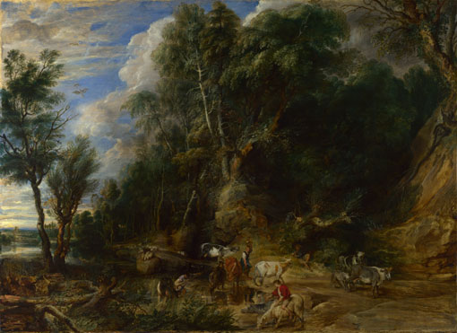
Peter Paul Rubens: 'A View of Het Steen in the Early Morning', 1636. Oil on Oak. Oil on oak.131 x 229.cm. National Gallery, London

Alberti defined seeing a painting as looking through a window but, you can look out of or into a window. Looking at pictorial space is a reciprocal process. Norman Bryson (‘Vision and Painting’, page 96) points out that the viewer’s space, on this side of the picture plane, has differed over time. The dramatic liturgical theatre of Byzantine Christendom; you approached the image in a full architectural setting with aural context. You moved from devotional icon to icon in a set pattern, at a particular time of the year, according to prescribed physical ritual accompanied by prescribed sounds and of course smells, incense etc. The contested piazza of the Renaissance self; always measuring, always calculating proportion, always negotiating a better deal with God. The pure white cube of the fiercely convinced, Protestant communicant. The contingent world of the modern being, a fluid range of virtual selves, constantly subject to a vast choice of undifferentiated stimuli.

Perhaps I was aware of this as I took my usual place in the National Gallery, on the bench before Het Steen on a Friday evening. Perhaps it was because, on leaving the Leonardo exhibition, I had seen Professor Martin Kemp (the international authority on da Vinci) in the Gents, prepping himself for his evening talk. He was dressed in a blinding white, collarless linen frock coat, buttoned to the neck. The neckline was giving him problems and took time to adjust – much fiddling and staring into the mirror. I last saw him, in the flesh, at a talk some 8-10 years ago. He seems curiously ageless, although his hair, then a dazzling black, now has shades of deeper red; we know he’s worth it. Outside, he is greeted by attendant young women in flowing dark tailoring, they whisk him away to bathe his brow in perfumed oils; aah the life of the eminent art historian.

Perhaps it was because the Leonardo show was so crowded (only a three hour queue to buy a day ticket, time quickly lost in explaining the processes of Christianity to a puzzled Malaysian Economics student struggling with terminology in the exhibition hand-out). An exhibition crowded with a certain class of person, fragrant is the term I think, modulated voices and modulated décolletage on show as well; parties to go to I suppose.

Perhaps this was why I was more than usually aware of others as I sat in front of Rubens’ joyful autumn.

A Study of Hand Gestures in Front Of Het Steen

Older hands are often clasped behind the back, male tending to one hand holding the clenched other. Female hands seem to be relatively open. Younger hands tend to hold digital devices in front or to the side, or carry bags, handbags or labelled shopping bags.

A couple walk past, constantly changing their hand grasp with each other, sometimes fully entwined fingers, sometimes laid palm in palm, sometimes holding little fingers as though they are about to pull a wishbone. They read the label, ignore the painting.


“It’s very nice, this landscape, quite a size, but just a bit big for our lounge”

Two women, middle aged, one in a pale pink cardigan, the other all in black. They are clearly absorbed by the painting and keep making paired movements, each pushes her hands together from a height about nose level and moves them down to about the waist, mostly whilst pointing to the carter and the house.

Three very small Japanese women/ girls (difficult to tell) make small dabbing movements as they point upwards to the painted sky; dab, then circular movement, dab, then circular movement. They stop, hold up their phones, standing like the three graces (two facing the work, one away from it) they each consult their mobiles, this uplights their faces with a delicate blue glow. Whatever they find, it returns them to the painted sky, more very careful anti clockwise gestures, this time with thumb and forefinger; precise and in a single plane.

The digital light from the three graces glowed briefly across the silver birches in the paintings foreground. The painted highlight on those top branches is frontally lit, as though a film crew had rigged up towers and put full spots –no coloured gels – onto the upper parts, prior to some swooping camera shots across the plain. But the sun, pale straw yellow, but yellow nonetheless, comes from the right hand horizon behind the trees. That the sun is low is clear from the sight and intensity of the shadows cast by trees in the midground; surely the trees should be in silhouette and dark at the top?

Young couple in matching anoraks stand with an arm around each other’s back. With her other hand, she takes out her chewing gum, examines it, rolls it between her fingers and pops it back in her mouth.

White haired, large middle aged man to equivalent companion, pointing with fleece clad arm whilst sat on the bench.

“Frank, what’s that building”

Frank gets up, looks at the label, waves his arm slowly in front of the painting in a horizontal manner

“It’s Birmingham”

A very large class of students appears, to draw the right hand Judgement of Paris, all hats and boots and tights. They carry A3 black sketchbooks, Seawhite’s finest held in front of them like protective shields, or perhaps devices to declare their allegiance. Time to go.
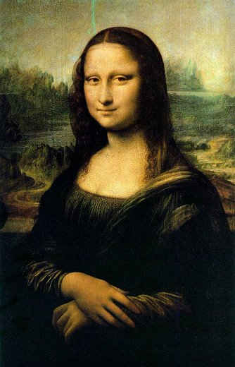
Leonardo da Vinci: ‘Mona Lisa’, 1503 -19

I once heard Martin Kemp, the great Leonardo specialist, talk about the geology in background of the Mona Lisa. Apart from surprise at the blackness of the distinguished professors hair, I remember him saying that the artist had been hired to survey the land between Florence and Pisa, to give Florentines a navigable waterway to the sea bypassing their rivals. That survey work, and Leonardo’s analysis of the role of water in changing topography, allowed him to think of time in different ways, to move away from the prescriptive Christian chronology; geological time for example. His proposed route was to go through Prato and Pistoia, although the land behind Leonardo’s portrait of Lisa Gherardini is not an exact portrait of the lakes above the great valley of the Arno, it bears similarities. It allows Leonardo to use the landscape to meditate on the role of time, as well as present the site for a pre combustion engine form of transport, that is now incidentally the route for the A11 from Florence to Pisa.

What transport routes are we looking at in Het Steen?

Peter Paul Rubens: 'A View of Het Steen in the Early Morning', 1636. Oil on Oak. Oil on oak.131 x 229.cm. National Gallery, London

What geology? What time span? Apart from the obvious track leading the horses and cart out to our left, what other forms are here and what do they tell us about Rubens’ thinking? There are tracks in the centre midground, serpentine, leading toward the horizon, lighter in colour than the green and possibly slightly frosted grass that surrounds them. Several tracks seem to come together here, to lead in to the space towards Malines (the town on the horizon). They are not large roads, nor direct.

This is presumably an alluvial plain, laid down over millennia by slow moving rivers, they are not the fast moving lakes of built up water, about to burst their banks and cause tumultuous change as represented by Leonardo. Het Steen is placed in a land where not much changes, not of course true, this was a sector of Europe that had been constantly fought over, the Northern Netherlands were at war with Spain right up until 1648, and we are in the middle of the Thirty Years War. Land reclamation to the north and west was at its peak, new canals being dug constantly, agricultural practices were changing fast to keep pace with growing urbanisation.

Viewing it now, this great flat plain stretching to a low horizon, looks just made for a 21st century motorway system: 6 lanes; gantries; illuminated signs throughout the night; those huge, double European lorries. In fact it has the A1/E19 running from Brussels to Antwerp, which apparently has one of the widest central reservations in Europe (40 metres wide over 31 km since you ask)

The hunter in the foreground, the stock figure, he is trying to move to his right, to go around the tree trunk, through the thickest part of the brambles to shoot the oversized ducks behind. Surely, his quickest path would be to his left? Or so our elevated viewpoint would seem to indicate. It would be easier to shoot the ducks from the left hand side of the trunk, he could just hit them with his great long barrel in fact.

“It must be fairly late”

“In the day?”

“No, in the History of Art, you look at that Renaissance painting over there and the trees aren’t half as green”

“True”

“What’s the best way to get to our hotel anyway?”

The brown foreground of the painting ends at a very strong horizontal line, tilted down slightly to the left. One’s eye first notices it at the right where it is marked by a drainage ditch, the field boundary for the cow field with the milkmaid, although there are more cows in the field beyond as well. The pure sunshine continues across the midground, a line of sunlight ends just in front of the house. This lets Rubens spotlight the house, placing it on a boundary edge, the left corner of sunlight exactly touches the left hand end of the mansion.

The later Judgement of Paris to my right is a constant draw for Chinese visitors, in huge numbers. They stand today in Burberry scarves, usually their leader has one of those microphone affairs, they never stay long, they have an itinerary to follow.

I’m intrigued to know where the rustic wooden bridge would lead anyone to. If it is for the milkmaid approaching the cows in the next field but one, then two questions occur:

  1. Would the bridge bear her weight and that of the milk she will carry? Presumably in another of the brass jugs like that on the cart, and the same balanced on the head of the girl in Landscape with a Rainbow, the companion piece to this (see previous post). If you look closely at the smudges of paint, the milmaid would appear to have something on her back with a highlight, a jug strapped there? The bridge is flimsy with only one handrail, in a list of ‘Bridges in Art’ (Hiroshige, copied by van Gogh; Monet; Sisley; Constable; Turner; Stella; there is of course a bridge in Mona Lisa, on the right, just where her clothing swirls across her bare shoulder; that poem by McGonagall, the Tay Bridge Disaster etc. Any more? I refuse to sing Bridge over Troubled Water in the National Gallery) in that list, this little wooden span is not the most convincing.
  2. The milkmaid would have to cross another bridgeless ditch to get from her cows to this one, is that right? Then she would have a long walk round the wrong way to the house. That route would take her to the front and the drawbridge as well. Would servants go in that way? Was the drawbridge the only way over the moat around Het Steen? Perhaps there was a loading place for milk and the cart, by the tall foreground trees? Evidence of growing rural industry?

The last time I was here, someone was drawing the earlier Judgement of Paris in pencil. Today, an elderly man, quite scruffy in a grubby brown jacket, trainers, battered grey rucksack old jeans is drawing Minerva from the same painting. She is the figure with her back to us, with armour at her feet. It is a copy with a high degree of accuracy, and he is making it on an Ipad. Minerva, in the digital drawing, is completely isolated on a pale blue grey background. The digital drawing has a definite sense of texture from the ‘tooth’ of a virtual surface, Ingres paper is the name of the physical paper with equivalent qualities.

I see all this as I leave, finding my own path past the Turners and Constables, all that power and paint as thick as the painted skeins of cloth on Lisa Gheradini; seized moments of meteorological time.


To the Wallace Collection to see Rubens’ Landscape with a Rainbow’ , 1636.

Peter Paul Rubens: 'Landscape with a Rainbow', 1636. Oil on Panel. The Wallace Collection, London

the companion to Het Steen. It is much less finished, look at the way the yellow blocking between the legs of the cart horses on the left has entirely covered the second horse, it has not been corrected; Rubens never got round to it. Underpainting and drawing clearly showing through.

Strong diagonal from middle right across the ground plane towards the centre. A surprisingly incoherent composition, not quite clear where the central pond begins or ends. It is in the centre of the painting, but is just a vague hole.

Very little accuracy in the trees, oak like, but without the precision of the birches and the oak in the Steen foreground. In the left mid-ground of Rainbow there is a vaguely birch like copse, some clarity in the background recession.

Carefully painted cattle and ducks, brown foreground, green mid, blue background seen from a slightly elevated viewpoint but not as high as Steen. Without the house we have less of the arrogance,, or showing off, that characterises Steen. Rainbow is far more of a genre painting about countryside activities i.e. Haymaking, bringing in the cattle, no doubt killing the ducks; activities in the Brabant. The ground plane rises relatively steeply from below our feet to a midpoint at the grown out hedgerow.

Is the rainbow a sign of the covenant, God will not break his promise? A sign of peace (relevant of course to Rubens own position), look at the way our eye is drawn from the dark right towards the brighter left. Is the rainbow a symbolic form in common with the genre figures?

In the National Gallery in front of Het Steen

Peter Paul Rubens: 'A View of Het Steen in the Early Morning', 1636. Oil on Oak. Oil on oak.131 x 229.cm. National Gallery, London

There is perhaps a compositional similarity between Steen and Rainbow, in that both have a dark diagonally composed foreground element in roughly the same place; a standard Flemish landscape component after all. The Rainbow haystack corresponds approximately with the position of the house, but only just; positions of plenty?

Looking again at the Steen foreground clump of trees, might that dominant tree on the left be a pine rather than an oak? Native pine has lower branches that come out at a 45 degree angle, in oaks they tend to be higher up and at 90 degrees to the trunk. But, it can’t be, the leaves are bulging groups of flora, not short dark needles at all.

The Rainbow figures owe more to The Watering Place, 1622

Peter Paul Rubens: 'The Watering Place', 1622. Oil on Panel, The National Gallery, London

than they do to Het Steen. The Watering Place is on the opposite wall to het Steen, it is a far more finished painting than either of the two later works. Specimen pollarded willows, edged with dark glazes and trembling waves of Italianate leaves on Northern European tree trunks. Bruegel like rocks and tree formations, elevated viewpoint and the usual colour division to the composition. Genre figures including peasant with brass pitcher on head and shepherd playing flute under the tree (lots of references to Virgil: Tityrus lying under a spreading beech wooing the muse on a slender reed etc) None of that obviousness in Steen, which is an ostensibly contemporary scene in which the season is established as much through light and colour as through content. Autumn, ie harvest time, is established by content and activity rather than through depiction and observation.

It is toward the end of the day in the National Gallery. Sino-Italian day by the look of it: elegant; elderly; attenuated Italian couples and younger, plumper Chinese family groups. The elderly Italian man next to me on the bench, in light brown wool jacket, grey trousers, slip on brown leather shoes, light smell of woody eau de toilette, has been asleep on the corner seat of the bench the whole time I have been here. The colour of his jacket almost exactly matches the bottom right glazing over the underpainting of Het Steen. A woman, in folds of fine grey wool, with tumbling hair full of gold highlights and gold necklaces, re-appears to wake him up; lots of whispered Italian. Is gold an autumnal colour?

 I have spent some time on commuter trains in Southern England recently. Apart from hearing one side of many phone conversations

“Have you still got all your biscuits left?…I haven’t coughed for two weeks, I eat an onion every night that’s whats done it…Friday tomorrow, how good is that?’

it has prompted further thought about our physical relationship to the picture plane. There is a fine image by Ravillious of a carriage that illustrates what I mean.

Eric Ravilious: ‘Train Landscape’, 1939. Watercolour on Paper

 A watercolour view from the corner of a railway carriage; the very old type without corridors, with slam shut doors and a flat, vertical sliding window. A landscape is joined up behind the three frames of the train windows, in the left hand pane, the Westbury Horse, a chalk figure carved into the Sussex downs. In the other two windows the shapes made by the hedges echo the patterns of the seat upholstery. There are possibly 4 zones here, the three windows and the empty carriage itself. The central leather strap is the key to this painting, in these old trains this belt holds down and closes the window. Above each window pane, are blind pulls that can be pulled down to entirely block out the scene. These closed windows make a distance between the artist and the view, he is secluded in this carriage and can see ancient Britain in the left hand pane; from a mechanical form of transport he observes the old method, the horse. The other two windows show Britain then but the locked window keeps it out. What it also locks out is how much Britain was changing in the first half of the twentieth century; urbanisation for example. The heavy wooden surrounds of the train windows stress privacy and the past.

We live in a different world; the young woman opposite me is half way through a long story about how her duvet caught light when she was seven. “I didn’t smoke then, still don’t now” and how her mum didn’t believe she could smell smoke. The recipient of her call clearly doesn’t believe it either, the story takes much repetition to get the details right. I leave as she is going through the look on the neighbours face when her and mother pushed the burning bed clothes out of the bedroom window.

Eric R’s painting, made just after the start of the Second World War, apart from the combination of the past (the White Horse) and a slightly romantic view of the present (the fields and the Sussex Downs) doesn’t include the war. Should art always show what is happening at the time? if yes, how should this be done, if no what are the various functions of art that we can see happening in this painting?

“Hello…Yes…On the train…Did you say Queen Mary?…No, no, no, no… If it was the Queen Mary I would have done it…no, goodbye”

Ravilous was a wood engraver and made designs for Wedgewood Pottery, engraving and pottery designs demand a hard line and sharp edged shapes. You can see this in his approach to this image, for instance on the cross hatching on the door, an engraving method to indicate tone. But there is more to it, if you look into Eric R’s life a bit you will find that he married one of his students from Eastbourne college, where he taught wood engraving. Eileen Lucy Garwood, called Tirzah, Eric taught her wood engraving and she was exhibiting her work in London galleries within a year or two; they are interesting, witty images. Sadly, she seems to have stopped completely when they got married in 1930, meaningful in itself, but there is more. One of her engravings, is called, ‘The Train Journey’ it has some strong similarities to her husband’s later image, and differences, the occupants is the most obvious comparison. Tirzah’s engraving is detailed, about human relationships and their relationship to us. The girl turning to us is thought by Olive Cook to be Tirzah.

Tirzah Garwood: ‘The Train Journey’, Wood Engraving, 1929-30

See Olive Cook

http://www.weepingash.co.uk/index.php?option=com_content&view=article&id=208%3Athe-art-of-tirzah-garwood&catid=35%3Aes&Itemid=5&limitstart=2

And also Adventures in the Print Trade

http://adventuresintheprinttrade.blogspot.com/2010/02/whats-in-name.html


Eric Ravilious: 'Train Landscape', 1939. Watercolour on Paper

The seating now, cramps the viewer/ passenger into a right angle view, it is restricted by upright seats and reflections, the glass is angled and catches the light in ways that make seeing the landscape difficult.  The windows must lean in at about 3 or 4 degrees, double glazed, they could be designed to catch everything inside, the overhead lights, reflections of self; staring blankly. Which means that I can concentrate on making the grey plastic table really squeak and listen carefully to the woman opposite detailing her night out, up to the point where ‘we drunk another go of them drinks’.


J.M.W.Turner: 'Rain, Steam and Speed, The Great Western Railway', 1844

Turner’s: ‘Rain, Steam, and Speed – The Great Western Railway’ might claim a place here, but the impulse is fundamentally different. In Turners world we are in and of the landscape, we are outside the carriage, we are a pure experiencing being. This was one of the first works of art about the artist’s direct experience of landscape. A strand that will come to dominate art about land from Turner onwards, modernity or not. Turner is supposed to have leant out of the carriage window with his sketchbook to draw the storm…

“As for the manner in which “The Speed” is done, of that the less said the better, only it is a positive fact there is a steam coach going at fifty miles an hour. The world has never seen anything like this picture”

From a Lady Simon:

“In the coach seated opposite her, was an elderly gentleman, short and stout, with a red face and a curious prominent nose. The weather was very wild, and by and by a violent storm swept over the country, blotting out the sunshine and the blue sky, and hanging like a pall over the landscape. The old gentleman seemed strangely excited at this, jumping up to open the window, craning his neck out and calling to her to come and observe a curious effect of light”

Notice the hare: speed. Notice the plough: from the old country dance “speed the plough”

It would be impossible to stick my head out of the window I am looking at.  Above is a narrow band of glass that can be tilted inwards for ventilation, thick and heavy square section better suited to a tank. Below is a broad glazed band, I’m intrigued to know why the bottom un-opening part of the window has a stick on shaded element surrounding it. Smaller black dots successively giving way to larger, then a black border. It has no obvious function as device for keeping out sunlight. Squashed into a two seat berth, parallel to the window, knees jammed against the seat in front. Turning the head through 90 degrees to look through the window squarely is uncomfortable. So, one looks at a 45 degree angle just where the upright reflection of the window seat in front bisects the view. I can just catch the reflection of the man opposite, working on his computer, balanced on the little table sticking into the six seat bay. His phone is balanced on the machine and his coffee is between his knees; a worrying placement.

Ravilious constructs his pictorial space so that we appear to be just off a central axis of symmetry, sitting on the near seat on the right. The window on the door shows a slight area of the jamb indicating the position of the viewer. But, the landscape looks, to me anyway as though we are exactly perpendicular to it, It is certainly planimetric, the downs on the horizon and the plough lines in the foreground, running parallel to the horizontal elements of the framing window.

On my morning train, a short man got on to our crowded carriage, wanting to sit in the middle seat of the six bay arrangement. He was carrying his neat black computer bag, a full length suit bag, a newspaper and a cup of coffee. His movements, as the train swayed through points and curves, were elegant, but he missed his intended seat, almost landing in the lap of several of the suited seated men. They neither looked at him, nor moved. It took some time; at last he sat and grinned happily. Throughout this choreography no one spoke or acknowledged his feat.

Eric Ravilious: 'Train Landscape', 1939. Watercolour on Paper

The painted landscape is entirely static, yet seen from a moving vehicle. Ravilious never learnt to drive, he bought a return ticket and shuttled between two stations to keep drawing the view. This would have been a steam train, note the lack of steam or suggestion of movement.

On my train this morning, the actual landscape behind my current picture plane is a combination of horizontal blur, darker towards the ground, yellow highlight at about eye level, sky above, and then clearer focus in the middle distance. The blur is not that unclear, this is a South Eastern train, they don’t go that quickly. Inside, the constant announcements are always preceded by the two tones, more reminiscent of 1970’s children’s programmes than, for example, Italian railway stations of that period: ‘binario uno’ and all.

‘Train Landscape’ was made at the start of 1940, the first year of the Second World War. Not long after Eric Ravillious made this painting, the chalk figures were covered up to prevent them being used to help enemy navigation. Ravilious became a war artist with the Royal Air Force and died during an air sea rescue in Iceland in 1942.

He painted several images of chalk figures besides the White Horse, The Long Man of Wilmington and the Cerne Abbas giant for example. The internal picture plane of Train Landscape shows simultaneous images from different time periods in the different areas of pictorial space. Ravilious divides time up like a cartoon strip, the theme of representing time past, time present and time future, featuring heavily in a heavily contested present.

Symbols of Englishness and defiance, or an evocation of the man-made in a natural setting? Almost on the railway line I use, but not quite, is another white horse. Mark Wallinger’s art commission to mark the Ebbsfleet International station in north Kent.

A giant sculpture of a white horse standing 50 metres high, but it’s not the rearing horse of Kent, this is a static figure.  According to Wallinger, Ebbsfleet marks the end of the horse-rearing downland country; this was where the Anglo Saxon heroes Hengist (Stallion) and Horsa (Horse) arrived to fight the Picts around 455 AD.

Wallinger: “I think at the back of my mind I had that Eric Ravilious painting Train Landscape (1940) looking out from a third-class railway carriage at a white horse on a distant hill.”

http://www.telegraph.co.uk/culture/art/4613060/Mark-Wallinger-the-inspiration-behind-my-horse.html

 The man behind has his head against the upright of my seat, he is breathing heavily, rustlings are coming from his paper bag. The woman next to me is busy on her laptop:

“Computer Purchases: QAAS Portsmouth: 1 x Labroud Refrigerator (DMG to quote on mapping for comparison with Labroud on commissioning) etc, etc. “

Sun low in the sky, shadows emphasising the flatness of the ground plane as it marches away from the train. The major commuter train from London on a Friday evening. It is, unusually, almost completely silent. A cough, a sniff, the turn of a page of the Metro or the Standard, but that is all; apart from the constant announcements and the rustling man.

Eric Ravilious: 'Train Landscape', 1939. Watercolour on Paper

Does sitting in the carriage now, have the same evocation, either of Englishness, or future collapse? Perhaps the increasing disintegration of capitalism and the re-introduction of feudalism, or so it feels reading the morning paper? Listening to the suited and booted man in front discussing his meeting schedule with someone, clearly his junior, merely makes me glad we are not in the old two bench dog carriage. The clue to the difference between painted image and life on the 7.16 am is in the relationship to the exterior. In the Ravillious we are parallel to the internal picture plane, in a semi private world. In the modern train we are not. Ravillious’ world perhaps owes a debt to earlier imagery.  In John Tenniel’s: ‘Alice on the Train’, From ‘Alice Through the Looking Glass’

John Tenniel: 'Alice on the Train' wood engraving, 1872

or Leopold Egg: ‘The Travelling Companions’, 1862 both of which use the same frontal format, parallel to the picture plane, symetricality etc.

Augustus Leopold Egg: 'The Travelling Companions',1862 Birmingham City Museums


The carriage is now a public space, focussing down a tubular formthat enforces the single viewpoint perspective aspect, reinforces the notion that we meaningfully speed towards our destination. Unlike the steam era images that often stress the privacy of the first class carriage. Compare this with, for example, Daumier’s Third Class carriage, a density of rumpled lines and close tones, raw humanity.

Honore Daumier: 'The Third Class Carriage', 1863-65. Oil On canvas. Metropolitan, New York


Train Landscape is a third class carriage, you can tell this by the letter three on the door. But the number seems very big, it stands out. Earlier Cubists had used text to stress modernity, although this doesn’t look quite like that.

Eric Ravilious: 'Train Landscape', 1939. Watercolour on Paper

“That idea you came up with was a meerkat holding a table, but I can’t draw meerkats, so I thought about a pig wearing a hat…or, maybe a turkey”

An earlier train than usual. I am greeted as I board, by a beaming businessman, in a very fine suit with two quarter bottles of white wine on the table in front of him. He has drunk one and is starting on the other; the world looks good.

Trapped in my narrow 2 seat bay, I realise that everything this side of the picture plane is shiny, the seat backs, from this position all seat coverings are more or less hidden the ceiling, the window glazing, light fittings etc. Apart from my fellow passengers in their dark suiting and white shirts, the interior is reflective and reflected in the picture plane/ window. Texture and colour is banished behind the glass, we are in a world of restricted palette, greys, off whites, usually a purple upholstery (depending on the rolling stock), a cold fluorescent lighting and dark clothing, these commuters for the City are not even given to brightly coloured ties.

There are two aspects about the picture plane to consider here.

1. The internal picture plane within a work, Ravilious is evidently aware of this, framing the view as a ‘landscape’

2. The picture plane seen from an angle, rather than the perpendicular. Notice that both Eric and Tirzah appear to actually locate their internal landscape as parallel to the picture plane, despite the angle of the presumed viewer. Incidentally, a painting by Hopper: ‘Compartment C, Car 193’ from 1938, locates the both viewer and the landscape at the same acute angle.

Edward Hopper: 'compartment C, Car, 193'. 1938 oil on canvas

One of the platforms we stop at is full of young men in sportswear, thin bony men with short hair. Nothing unusual in that, except that they are all appear to be  Eastern European and with bundles of fishing rods.

The horizontal blur in the foreground effectively flattens pictorial space and makes the picture plane (the grubby, greasy double glazed window) more evident. But there is a tension, the reflections, mostly obvious in darker passages, create a foreground depth. An angular, octagonal space, bounded by the reflection of the reflective, greasy grubby glass on the far side of the carriage. This all makes for a contested foreground.

Beyond that, a mid ground whose tonal contrasts are simplified by the glass. A mid ground that, in this often rural area of Kent and at this time of year, tends to feature ploughed fields and full apple orchards. Those agricultural features run at right angles to the tracks, in the early evening light the shadows lay out the ground plane, accentuating the plough lines and structuring the quasi fictive landscape in a series of horizontals and verticals. Poussin/ Claude, calm and gridded; mannered. The succeeding hedges in neat patterns on flat lands running up to the Downs and a blue stained horizon. It is the landscape around Het Steen.

Mike Nelson: British Pavilion: ‘I, Impostor’

http://venicebiennale.britishcouncil.org/timeline/2011

Is Mike Nelson’s installation a convincing space? Yes, completely. Is it a narrative space, a pictorial space? Quite…almost.

What follows is a series of thoughts about this installation; a continuing discussion about pictorial space. Based around art seen in Venice and then in Rome. I have put them together as they developed. 

 From the outside the British Pavilion at this years Biennale is unchanged. Inside, a winding set of narrow corridors and small rooms getting increasingly shabby as you find the central courtyard.

This installation is based on the Han, those vast decrepit caravanserais you find in the souks in Turkey, Istanbul in particular. More specifically the Bűyűk Valide Han, the 17th century building that Nelson used for an installation during the Istanbul Biennial of 2003; that connection is important to Nelson, but by no means obvious as you wander the rooms. There are clues, darkrooms (traditional wet printing, red lit rooms) photos hanging up to dry and offices with the same photos of Turkish textile factories, and receipts in Turkish. In one particularly poignant juxtaposition there is an old gridded plan for cloth patterns ruled out, next to it, blocking out the window, is a plastic printed bag with Fenerbahce, the Istanbul based football club. As you might expect with Mike Nelson the level of craft and commitment is total, this is not a set it is utterly convincing; there are no real traces of the pre-existing shape/ spaces of the British Pavilion. Several storeys have been built into the original single storey building, even an inaccessible, but visible cellar full of old bottles and yet more junk. Rickety wooden stairs, low ceilinged sleeping spaces with a few sacks thrown down as a mattress.

But, this work doesn’t have the menace of ‘Coral Reef’ for example, (http://www.youtube.com/watch?v=gUsaSnyvZnA) there is less fear of getting lost, trapped or just stuck.. Our journey in ‘I, Impostor’ is more anthropological than investigative, more iconographic than detective work is needed to situate yourself. The dark rooms and sheets of black and white photos are intriguing, but it all seems self explanatory. Especially if, as I have just done, you have come from the Iraqi Pavilion further down Via Garibaldi. The Iraqi work is a series of small rooms in a collapsing warehouse/ work space and contains art considering power, entropy, decay and the politics of water. Nelson’s fictive decay/ collapse containing traditional trades- like textiles- holds up very well against the real thing you can see here, but it does dull the originality a little.

Illuminations

So does I’ Impostor fit into a wider view? Ignore for the moment the tradition of Romantic/ Expressionist personal response, which seems increasingly absent and just creates awkwardness when encountered these days. What we are looking at across this, and any other contemporary show, are essays on structures; essays in a range of languages, predominantly visual. These essays all contribute to a discourse, a discussion that has been going on since when? Duchamp? Malevitch’s Black Square? Demoiselles d’Avignon?

The discourse this year seems to be changing focus. Many of the works talk about memory, collective memory in particular. This theme was built into art from the start. Think of the Greek myth on the origins of art (Pliny’s story of the Corinthian Maid). That is, the girl using a burnt stick to draw around the shadow of her lover, to remember him before he goes off to war.

Joseph Wright of Derby: 'The Corinthian Maid', 1782. The National Gallery of Art, Washington, DC, USA.


This old story still encapsulates much of the 2011 Biennale; narrative features throughout. How might the possibilities inherent in that tale be teased out to describe what is on show now in Venice?

The role of individual memory: the lover to be left behind, the story of the couple, the drawing in charcoal, ie art that retells a particular situation. Love and, we are at night, presumably sex. Although, unlike the last Biennale, there seemed very little sex this time.

The role of collective memory: a story that has become shared and then archetypal, stories about loss feature heavily. Of water rights in the Iraqi Pavilion for example.

The role of Power, the portrayed lover is off to fight, presumably someone else’s war. The effect of the behaviour of the powerful and how it affects the powerless. Imagery that speaks truth unto power, this was one of the most ‘political’ Biennales I have seen.

The role of light, in creating form in two dimensional imagery.  “Giotto put the light back into art” Vasari said, describing the all important role of light in creating form. Apart from describing the illusion of form on a two dimensional surface, Chiaroscuro (and of course linear perspective) developed Renaissance art that demanded intelligence and perception to make and to understand; to ‘read’ this new space. The Corinthian Maid draws round a shadow, the result is self-evidently artificial, it is after all just a scrubby black line on a wall. But think how that line, that shape, encloses space and creates something with enormous conceptual/ perceptual depth: pictorial space. The title of this years Biennale is ‘Illuminations’, in the light of experience, Rimbaud and Benjamin are supposed to stalk the shows, I would suggest it is something older. Video and film are still here of course, and better than I remember, certainly far more watchable and, unusually for art, plot driven, ie narrative again. The key work is the astonishing, and more powerful every time I see a part of it, Christian Marclay’s ‘The Clock’ (see earlier posts), in the Arsenale.

Depth behind the picture plane is conceptual as much as it is mathematical, the way that space is organised by the artist tells us something. Alberti wrote in Della Pittura (1434) that studio textbook for the Early Renaissance: ‘I like to see someone in the ‘historia’ who tells the spectators what is going on…by his gestures invites you to laugh or weep with them” (page 78 in the Penguin edition). As Robert Hughes points out in his recent (not very good, Hibbert is still much better) book on Rome, Alberti’s perspective is a tool of empathy. In Nelson we might walk around the illusory space with our legs rather than our eyes, but it is still an empathetic process.

To be continued

Mike Nelson defines himself as a sculptor, “I make sculpture, but sculpture that you walk inside”.

After many galleries, many museums and watching so many people in so many galleries, some thoughts are starting to repeat themselves. Classical statuary, since Praxiteles if not before, was designed to be seen in the round, ie no framing picture plane to establish the illusion.

This begs the question: why does the Renaissance visual conception still dominate our way of seeing? I.e. the picture plane as a window and the conceptual space that develops autonomy. “First of all, on the surface on which I am going to paint, I draw a rectangle of whatever size I want, which I regard as an open window through which the subject to be painted is to be seen” (Alberti: Della Pittura”, page 54 Penguin Edition). The stimuli from Roman sculpture and ruin was all the visual information Alberti, Brunelleschi et al had to go on, why then construct a perceptual world view that is so firmly planimetric?

Why try to recreate Apelles when all you have to go on is text, the desperately dull Pliny for example.

Certainly Brunelleschi’s fiddling about with mirrors and images in the doorway of Santa Maria della Fiore in Florence made a two dimensional process in which forms could appear to be fully modeled in three dimensions. Unlike Praxiteles’ Doryphorus though, you can’t walk around Masaccio’s ‘Holy Trinity’ (the first Renaissance ‘hole in the wall’ painting on the nave of Santa Maria Novella, Florence).

Those early Renaissance artists came from craft studios that could turn out work in any media you wanted. If it was permanence the Lenzi’s wanted when they commissioned Masaccio, a three dimensional marble object would have had greater physical impact and lasted longer than a fresco. Was there in 15th century Florence, such a significant cultural hierarchy that prioritized the two dimensional? No, not really. So, why the power of illusory space? Why not the real thing?

The planimetric view is now the DNA of our vision, the camera, the TV the film the computer screen, the phone screen all depend on “a rectangle of whatever size I want, which I regard as an open window through which the subject … is to be seen”

You might say that theatre in the round is the exception rather than the rule, but the proscenium arch, like the Albertian window is always with us. Had it not been so, no doubt the digital miracle workers of our age Jonathan Ive for example, the Lumière Brothers and Daguerre before him, would have been able to work out how to create images out of three dimensional light that we could walk around, as Praxiteles had conceived. 

What caused the change in perceptual world view that gave us Brunelleschi/ Alberti/ Masaccio and onward? I can only put it down to the increasing ubiquity of the book, that flat surface which can present the reader with a limitless, autonomous conceptual space. Which begs the next question; will the E Reader and the hyperlink presage a new change? If artists are supposed to be gifted with foresight, this years Biennale thought not.

The introductory book to Mike Nelson’s Installation presents different forms of space: the political spaces of the ‘Free Pirates’ in Madagascar, notiosn of anarchic (in the proper sense of the word) temporary autonomous zones free from hierarchical state interference. Fantasies much loved by graphic novelists and cyberpunks, Nelson has referenced Jules Verne and this sort of thing before.

In the book, Dan Cameron (‘Memories of Trespassing’) points out that Venice is an equally artificial space. What was once the meeting of East and West, a liminal space at the edge of empires is now an artificial reconstruction of the past. An artificiality based on gondoliers, repeated samples of Vivaldi, imported food from southern Italy like pasta and pizza and imported goods from the Far East like fake Prada and Raybans.

The constructed space that is now Venice, sells fake luxury as hard as it can to the vast queues that shuffle from San Marco to the Rialto to Accademia and back to San Marco, hot tired and presumably satiated. Does this Venice have anything to do with the Biennale? Middle aged men in black linen muttering about entropy and fierce women with short black hair and red heels discussing the positioning of practice; they wouldn’t be seen dead in the queue to buy a David genitalia apron in the market; what news on the Rialto indeed.

Dan Cameron says that “Whilst not actually hostile, Mike Nelson’s spaces do emanate an essential unfamiliarity” and I think that was the essential problem with this show, it was not that unfamiliar and it wasn’t that difficult to work out the layout, it was relatively predictable. The lighting was very even, it didn’t smell of anything and every room had young English people acting as curators/ guards looking at their I Pads and happy to talk to you about the show and which art school they are studying at.

The thrill had gone. Was the show clearly better in it’s first incarnation in the Han itself in Istanbul, when the photos referred to the buildings you would have walked past to get there? Nelson says that he not only re-constructed the Istanbul piece but he also reconstructed the Han that surrounded that first work; putting a Biennial inside a Bienalle he calls it. A fascinating idea, does it quite work, is it convincing?

“Venice occupies a semi-haunted space where an aggressive commercial empire once flourished”. This could also describe the reconstructed Han that Nelson presents. As Cameron points out, it is now Istanbul that is commercially prosperous whereas Venice is a sinking Disneyland. The relationship between Istanbul/ Constantinople and Venice is still very strong, the looted treasures of the 4th Crusade in the 13th Century (the largely Venetian inspired sacking of Constantinople) are still on show throughout the city; the horses of San Marco for example. But this seems slightly beside the point when walking the fictive corridors of ‘I, Impostor’.